If you run a website or post a lot on social media, you’ll know that alt text is a very common feature now, solidifying the importance of accessibility across the digital landscape.
Users who are blind, visually impaired, or on a bad internet connection benefit from alt text, and so do creators who put the tool to good use. It’s easy to get wrong, however, especially if you’re rushing to share content. Here are several reasons why alt text is important as a digital feature and tips on how to write effective alt text.
Why Is Alt Text Important?
Firstly, the alternative text exists to help those with visual impairments understand what’s on their monitor besides actual text, typically by using screen readers. These particular apps can describe photos, posters, graphs, and other images in everything from a Tweet to an article or slideshow, but only if their alt text is set up properly.
It doesn’t just support people with disabilities, either. Someone with low bandwidth might also have difficulty seeing a site’s images, so alt text is a practical solution to a widespread problem.
Moreover, descriptive alt text, as Google Search Central's image tips explain, is important to bots trying to index your image and web page. Whatever visual object you’re defining, the more precise it is, the better Google will understand and deliver it to people doing relevant searches.
Including different kinds of media on your website is among the best SEO methods for boosting your SERP ranking, but enriching them with clear alt text that also contains keywords is even better.
So, the advantages of alt text are many. In short, it can make your content easier to find and understand online. At the same time, if you use it on social apps, for example, it lets more users access and interact with your posts, building your network.
How Alt Text Is Used Today
Alternative text tools are available on various digital platforms and are often combined with other powerful solutions to give visually impaired users the best experience possible.
Alt Text Makes Websites Friendlier and More Visible
All web design platforms offer alt text options and encourage users to make the most of them. Wix’s alt text guide emphasizes how important it is to describe your images well for visitors and search engines.
Generally speaking, you can add alt text to any visual element, such as photos, vector art, background images, infographics, and even galleries. And, as already mentioned, making full use of your alt text options enhances the user experience for visitors unable to see your visual elements and gives your SEO just as much of a boost.
Different Apps Offer Alt Text to Accommodate More Users
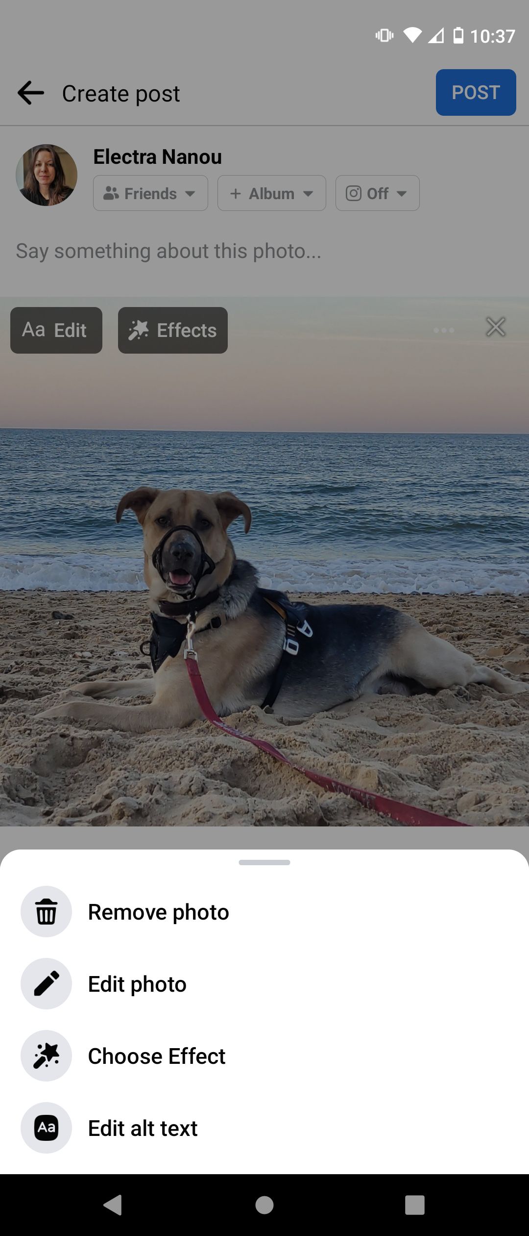
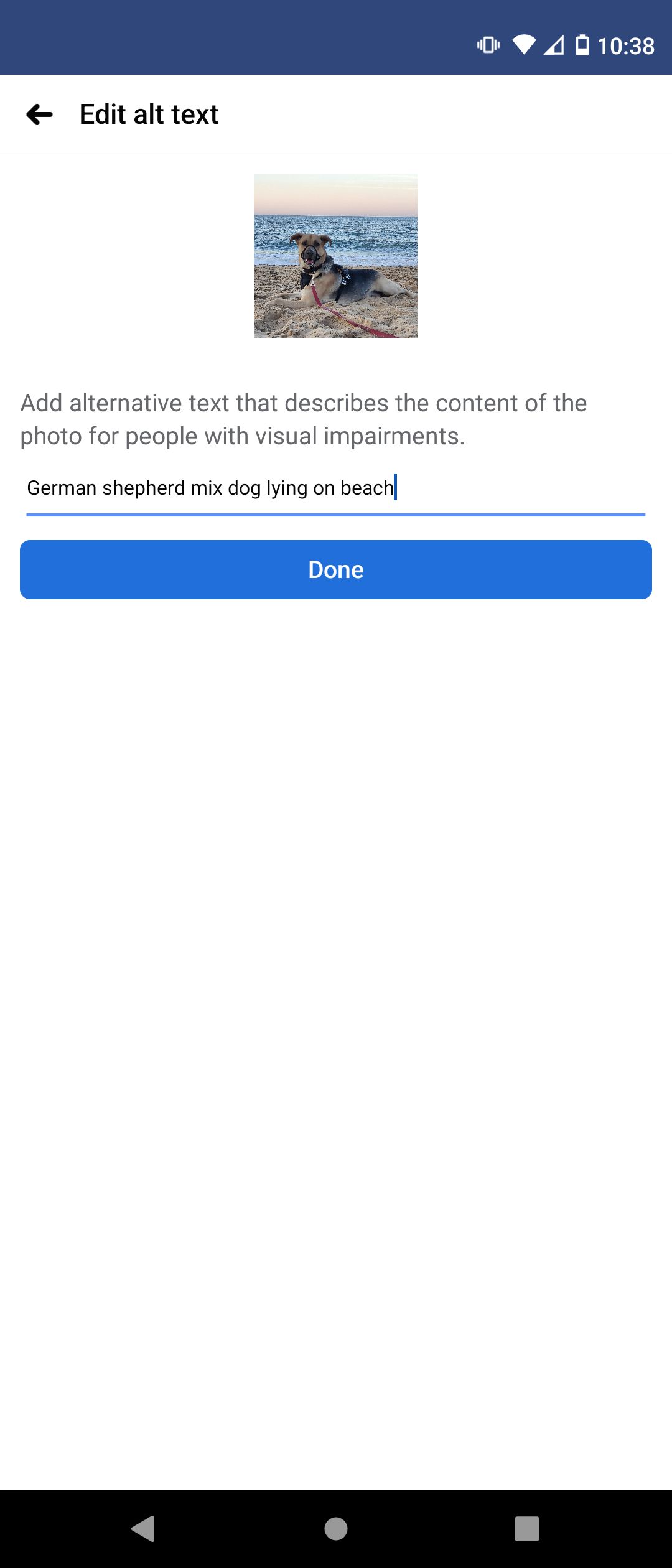
Apps welcome alt text, too, the best example being social media. It’s easier than ever to add alt text to Facebook photos, and the same goes for every platform with visual elements, from Instagram to YouTube.
You just type in a description for your image or video, save it, and your post is instantly visible to a lot more people. Do this for all such content, and your whole profile’s accessibility improves.


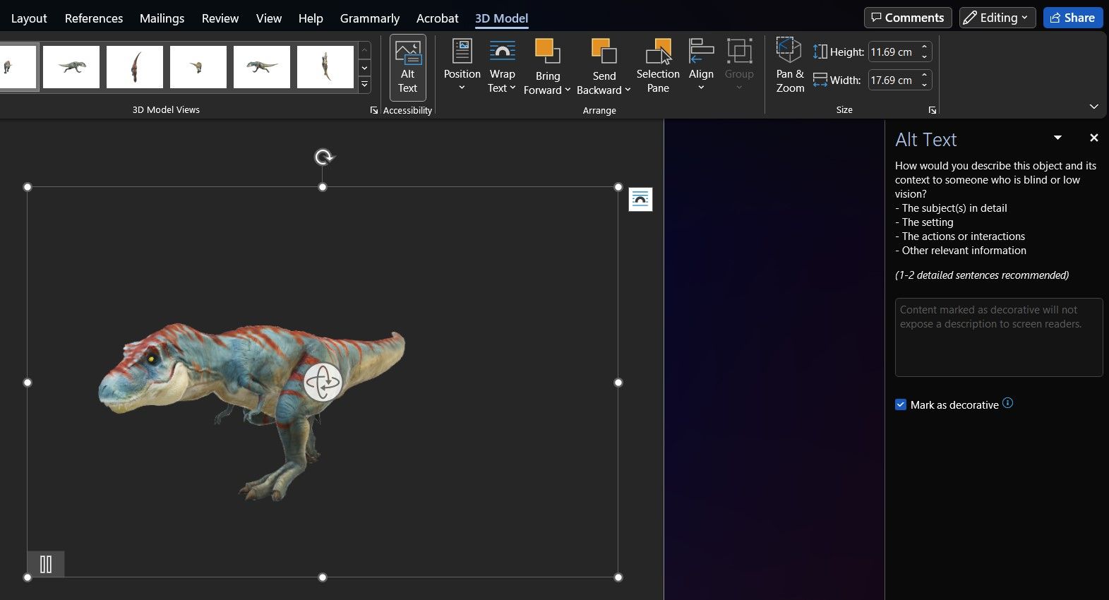
You’ll find alt text tools in other kinds of apps, too. Software for word processing, presentations, teamwork, and more embraces the need for greater accessibility.
Popular apps like Microsoft PowerPoint and Google Sheets are designed to assist the visually impaired when necessary. Besides letting you add image descriptions that serve as alt text, the Slack Help Centre offers tips on using the app with a screen reader.
Alt Text and Screen Readers Help the Visually Impaired the Most
Screen reader technology works well alongside alt text to give blind and visually impaired viewers a better idea of what their monitors show. Microsoft Narrator, for instance, is a built-in tool that reads out text, describes images, summarizes web pages, and even tells you the date and time.
But the growing market for screen readers offers many more options. If you like easily accessible apps on your browser, Google Chrome has the software ready to choose from, like Screen Reader and Pericles, the latter also available on Firefox and Microsoft Edge.
Start exploring, and you’ll find many great alternatives to Microsoft Narrator for visually impaired users. And alt text on images plays an important part in helping such people work comfortably and with greater independence.
What Makes the Best Alt Text?
Writing good alt text isn’t about throwing a bunch of keywords together. The main point of the feature is to describe images to users with visual problems, whether physical or technological, so your alt text needs to be coherent, at the very least.
Here are our top tips to remember when adding alt text to your visuals, aiming for clarity, and relevance.
1. Alt Text Must Be Legible
Imagine someone sitting in front of you who wants to know what’s in a particular photo. They wouldn’t appreciate this description: “car building street busy”. But “a blue sedan in front of a building in a crowded street” makes more sense.
Screen readers and Google bots will think so, too, not just people. The best alt text is a coherent sentence that a human and an algorithm can understand.
2. Keep Alt Text Brief But Detailed
While your alt text could be several sentences long, it’s better to be concise. Your goal is to accurately describe an image in as few words as possible, whether it’s a piece of art or a complex graph.
And accurately means making every word count as you provide the image’s contents and context. Say you created a static advert for your brand displaying a smiling woman using your new product.
It’s not enough for the alt text to say, “new office chair”. Add context along the lines of, “office worker relaxing in her black ergonomic chair by [brand name].” Feel free to use compound sentences if it helps—just make sure everything is relevant, coherent, and grammatically correct.
3. Describe the Image, Don’t Point It Out
A common mistake in writing alt text is to start it with “image/picture of…” Screen readers will instantly identify certain items as images, so introducing them as such is redundant.
Go straight for a description of the item’s contents. If it’s a pie chart, what is it about? If it’s a video, what is its topic, who created it, and so on?
4. Add Keywords Naturally
Keywords in your alt text count towards your SEO, but there are rules. Just writing for Google's helpful content update demands that you put your readers first and not your discoverability.
When it comes to adding keywords to alt text, they must look natural. Search engines, screen readers, and their users will have a better time understanding images, and Google is less likely to avoid indexing them.
Basically, stuffing keywords into your images is a sure way to mark your content as spam, so besides integrating them naturally, you need to be careful how often you use them.
A good strategy is to choose a few secondary keywords to go alongside your primary keyword, all of which you can then distribute across alt text fields. This way, you don't repeat the same phrase over and over, and you give your content different tags for search engines to pick up on.
5. Be Selective About Your Alt Text
Finally, not all images even need alt text. If a photo or shape is just for show, you can leave the alt text field blank. Some services like Microsoft Word provide a button that identifies an item as decorative and tells screen readers not to look for a description.
Understanding where to add alt text is as important as how to write it. And every little tweak makes your descriptions that much more helpful to users with visual impairments.
Explore Accessibility Features Beyond Alt Text
Alt text is a simple but vital tool for making your content more accessible. Enhance your visual elements with appropriate descriptions, and you and your viewers will reap the benefits.
To take accessibility to the next level, get to know other available solutions, from voice control software to equipment that can support people with disabilities.


