In September 2021, the company formerly known as Material-UI changed its name to MUI. This change happened mainly because many people couldn’t distinguish Material-UI from Material Design (a design system).
MUI started as an implementation of Material Design tailored for React applications. Today the brand is expanding and looking to create a new design system, which will be an alternative to Material Design.
The acronym MUI means Material to build UIs, and in this article, you’ll learn exactly how to use MUI to build React UIs.
How to Access MUI in React?
MUI is available as an npm package. Therefore, all you need to do to access it is execute the following line of code within your React project:
npm install @mui/material @emotion/react @emotion/styled
Assuming that you’ve already installed React on your device, you have complete access to the MUI library and all its components. MUI has over a hundred different components that fall into one of the following categories:
- Inputs
- Data Display
- Feedback
- Surfaces
- Navigation
- Layout
- Utils
- Data Grid
- Date/Time
After installing MUI as an npm package, using the library within your project is as simple as importing the required component in the appropriate file and inserting your styling preferences at specific locations throughout the UI.
If you want to create a sign-in page for your React application, they’re several MUI components you can use that will save time and help you to create a clean design.
Creating the React Sign-in Component
To create a new component in React, simply navigate to React’s src folder and create a new component folder. The component folder can be the home to all your components, starting with the sign-in component.
The Signin.js File
        import React from 'react';

function Signin() {
return (
<div> </div>
);
}

export default Signin;
After creating your sign-in component, it’s time to link it to your React application by importing it into your app component (located within the src folder).
The Updated App.js File
        import React from 'react';
import Signin from './components/Signin';

function App() {
return (
<div>
<Signin/>
</div>
);
}
export default App;
Now you can start exploring the MUI components you want to use on your sign-in page.
What Is the Typography Component?
The typography component belongs to MUI’s data display category and has thirteen default variants. These include:
- h1
- h2
- h3
- h4
- h5
- h6
- subtitle1
- subtitle2
- body1
- body2
- button
- caption
- overline
The variant that you select should depend on the text you want to display. For example, if you want to display a heading, you’re free to use any of the six heading variants in your UI. Simply insert the variant prop and the selected value in the typography component.
Using the Typography Component Example
        import React from 'react';
import Typography from '@mui/material/Typography';

function Signin() {
return (
<div>
<Typography variant="h4"> Sign In </Typography>
</div>
);
}

export default Signin;
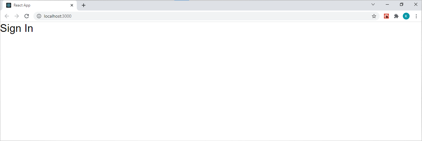
An important takeaway from the code above is that every time you insert a new component into your UI, you’ll also need to import it at the top of your React component file. Updating your sign-in component with the typography component (as seen in the code above) will produce the following output in your browser:
What Is the Text Field Component?
The text field component belongs to the input category. This component has two simple functions; it allows users to enter or edit the text in a UI. The text field component uses three variants, namely outlined, filled, and standard, with the outlined variant being the default one. Therefore, if you want to use the default text field component, you don’t need to include the variant prop. The text field component also uses several other props, including label, required, type, id, disabled, etc.
Using the Text Field Component Example
        import React from 'react';
import TextField from '@mui/material/TextField';
import Typography from '@mui/material/Typography';

function Signin() {
return (
<div>
<Typography variant="h4"> Sign In </Typography>
<TextField
label="Email Address"
required
id="email"
name="email"
/>
<TextField
label="Password"
required
id="password"
name="password"
type="password"
/>
</div>
);
}

export default Signin;
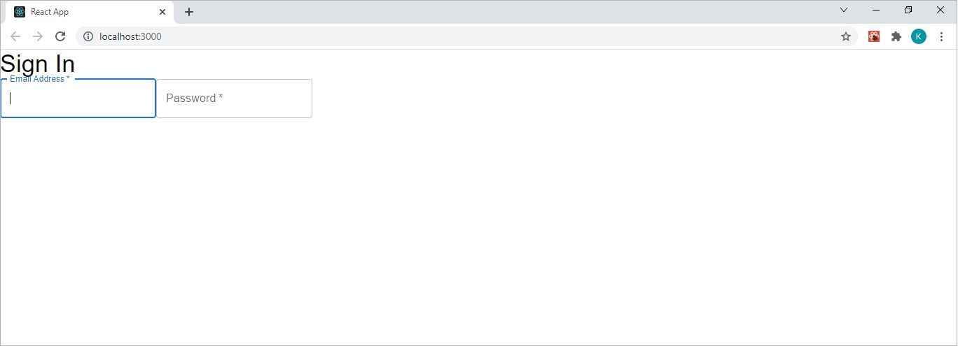
The code above will produce the following output in your browser:
What Is the Link Component?
As the name suggests, the link component functions in the same way as a plain CSS link. It falls into the navigation category and has the traditional href and target props. Additionally, it has a color, a variant, and an underline prop.
However, there’s no need to use any additional props unless you want your link to look unique. For example, the default value of the underline prop is “always” and the other two values you can assign to the prop are “none” and “hover.”
Therefore, you only need to include the underline prop in your component when you want no underline or when you want it to have a hover state.
Using the Link Component Example
<Link href="#">forget password?</Link>
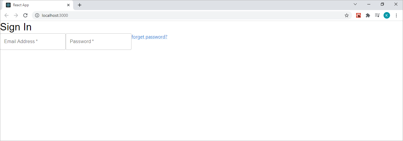
Inserting the code above into your existing sign-in component will produce the following output in your browser:
What Is the Button Component?
The button component also belongs to the input category and adheres to general button functionality---it communicates a user’s actions to your application. This component uses one of three variants (text, contained, and outline), and each variant can appear in one of three states—primary, disabled, and linked.
A button component default variant is text. Therefore, if you want a contained or outlined button, you’ll need to use the variant prop to indicate that. In addition to the variant prop, the button component also has an onclick handler and a color prop—among others.
Using the Button Component Example
<Button variant="contained"> Sign In</Button>
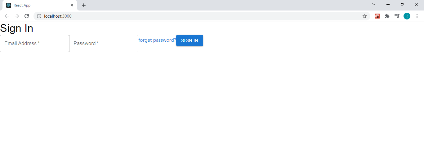
Inserting the code above into your sign-in component will update your UI to look like the following:
Now you have an interactive button that hovers when the mouse runs over it. But all the components are horizontal, and it doesn’t look great.
What Is the Box Component?
The box component is exactly what you need to organize utility components (such as the button component) in your React app. The box component uses an sx prop, which has access to all the system properties (such as height and width) that you need to organize the components in your UI.
Using the Box Component Example
        import React from 'react';
import Link from '@mui/material/Link';
import TextField from '@mui/material/TextField';
import Typography from '@mui/material/Typography';
import { Button, Box } from '@mui/material';

function Signin() {
return (
<div>
<Box
sx={{
my: 8,
display: 'flex',
flexDirection: 'column',
alignItems: 'center',
}}>

<Typography variant="h4"> Sign In </Typography>

<TextField
label="Email Address"
required
id="email"
name="email"
margin="normal"
/>
<TextField
label="Password"
required
id="password"
name="password"
type="password"
margin="normal"
/>
<Link
href="#"
sx={{mr: 12, mb: 2}}
>
forget password?
</Link>
<Button
variant="contained"
sx={{mt: 2}}
>
Sign In
</Button>
</Box>
</div>
);
}

export default Signin;
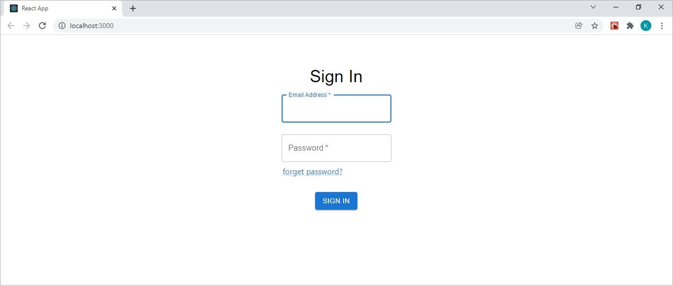
By wrapping the box component around the utility components (and using the sx prop) in the code above, you’ll effectively create a flex column structure. The code above will produce the following React sign-in page in your browser:
What Is MUI Grid Component?
The grid component is another useful MUI component to learn. It falls into MUI’s layout category and facilitates responsiveness. It allows a developer to achieve responsive design because of its 12-column layout system. This layout system utilizes MUI’s five default breakpoints to create applications that adapt to any screen size. These breakpoints include:
- xs (extra-small and starts at 0px)
- sm (small and starts at 600px)
- md (medium and starts at 900px)
- lg (large and starts at 1200px)
- xl (extra-large and starts at 1536px)
The MUI grid component works the same way as the CSS flexbox property in that it has a unidirectional parent-child system based on two types of layouts—container (parent) and items (child). However, the MUI grid component facilitates a nested grid, where an item can also be a container.
Explore Other Styling Options for ReactJS Applications
This article teaches you how to install and use the MUI library in your React applications. You learn how to use some basic components (such as typography) and some of the more advanced structural components (like the box component).
The MUI library is easy to use, effective and works great with React apps. But that doesn’t mean it’s the only styling option available for React developers. If you’re building a React application, you’re free to use the MUI library or any CSS framework to style your app.


