If there's something Google has loved doing to Android over the years, it has to be redesigns. Android nowadays looks wildly different from how it first looked when the first public release launched in 2008. As smartphones and the operating system itself have evolved during the last years, so has Google's design.
Google has sort of settled on a single design language, called Material Design, since 2014, but even that has also evolved. We saw a massive revamp to it in the form of Material Theming in 2018. Now, an even bigger redesign, called Material You, has arrived.
So what exactly is Material You, and why is it so big compared to previous redesigns?
Customization Galore
As its name hints, Material You is focused on "you". Previous iterations of Material Design were colorful and over-the-top and gave leeway to app developers and designers to go crazy with their designs within the guidelines. This was especially so with Material Theming, in which the focus was to allow apps to express their identity through Material Design.
Material You, though, turns back to the users themselves for inspiration on its design. Material You puts a new feature called "color extraction" at the forefront of its whole design philosophy.
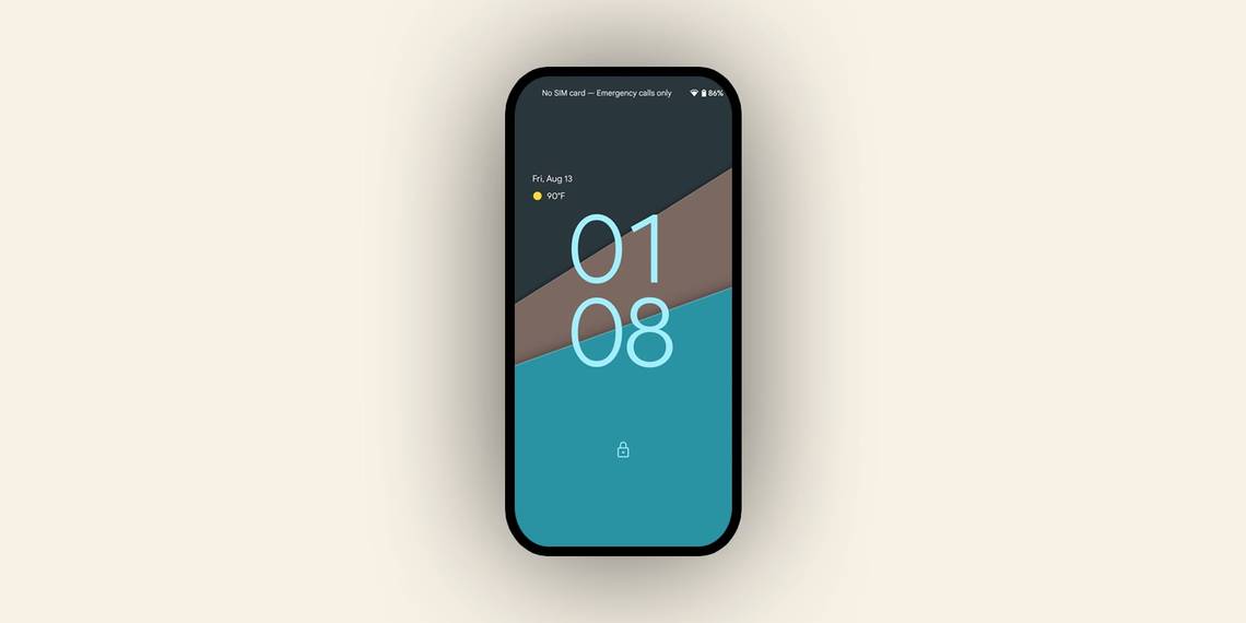
Color extraction grabs the main colors off whatever wallpaper you put in your device and themes your whole phone with it, including the Quick Settings menu and even individual apps.


It's far from a conventional theming strategy where users either download pre-made themes or select the colors themselves. But it's definitely unique and noteworthy.
Material You allows Android to remain as colorful as it's been during the past few years while also serving users a much-needed splash of custom theming.
Unless you were using a third-party skin that allowed for it, customization options were limited. That started to change with the release of Android 10 and the introduction of features such as a dark mode and wider customization options. Now, Material You brings even more customization to the table.
While this isn't a theme engine in and of itself and you can't change some other parts of the UI, as we said before, it's a unique approach to adding the "You" in Material You.
Improved Accessibility
Material You guidelines also put a big focus on big, bold UI items. And in that way, the Android 12 user interface takes pages from both iOS and Samsung's One UI.
Buttons across the UI are bigger and more descriptive, which is immediately noticeable when pulling down the notifications shade: Quick Settings items are now arranged in two rows with two items each for a total of four items, while in Android 11, there was one single row with 6 items.

These items also now have a clear description alongside an icon, whereas previous Android versions only had an icon.
This new re-focus on accessibility also includes changes like UI items that are more easily reachable with one hand, similar to what One UI has been doing since Samsung first introduced its latest skin in 2018. In One UI, we can see that most UI elements are on the bottom half of the screen so you can easily reach them with your thumb while holding it one-handed.
And with Material You in Android 12 we can clearly see that Google grabbed at least some inspiration from there.

The top toolbar is considerably bigger, and list elements are further down in the screen so they can be easily reached one-handed, just like with Samsung phones.
This can be seen clearly on apps like the Settings app, while others, like the Contacts app, take a more traditional UI approach with more minor changes to comply with Material You guidelines and accommodate the new color extraction feature.
Google says Material You can adapt to each and every need automatically, regardless of the phone size or what kind of user is using it. Shapes across the UI are designed to be dynamic and stretchable to your needs. And these accessibility improvements mean that Google is focusing on every user for its new design language.
A User Interface That Feels Alive
The last, but definitely not least, important change Google is highlighting with Material You actually lies in some of the little things. Google says that it not only wants Material You to feel like truly "you" but also like something that's approachable and easy to interact with.
Accessibility-focused UI changes play a big part in it, but there's a lot of other smaller changes, some of them immediately noticeable, while others probably not a lot.
A wider array of shapes is used across the UI. Google's typical "pill" was a standout of Material Theming, and not only is it being used more with Material You, but it's also being used alongside a handful of other shapes.

Some Google apps are getting updates that stick to Material You guidelines already, even on non-Android 12 devices, and while there's no color extraction yet for those phones, the changes are still immediately noticeable.
Google is now using rounded rectangles and squares instead of circles for floating action buttons, and a wide plethora of pill-shaped buttons and navigation menus are also prominent. Notifications feature considerably curved corners and are much bigger in size, and the content of those notifications is more easily readable.
Other things, like more fluid motion across your phone thanks to new animations, and UI elements that are designed to be stretchable, go a long way towards making Android 12, and Material You in general, feel a lot more alive than ever before.
The Biggest Change to Material Design
You won't necessarily need an Android 12 smartphone to experience Material You for yourself, as it'll surely roll out to most Google apps and services once the time comes.
However, one thing is clear: Material You is the biggest change to Google's design language since the introduction of Material Design in 2014. It redefines a lot of things that, to this day, have remained commonplace with Google's design, while going a step further by sprinkling in customization elements as well.
We remain to see whether OEMs like Xiaomi and Samsung will choose to abide by these rules or at least adopt elements like Android 12's color extraction feature in their own custom OEM skins. But if you have a Pixel and you're a fan of stock Android, then you're in for a treat.