A hamburger button sounds delicious, doesn’t it? It might make you hungry, but the hamburger button actually has nothing to do with burgers. Believe it or not, it's a term commonly used for menu buttons in apps.
In fact, most of us use this icon daily. The icon with three stacked lines you see while toggling a menu or navigation bar in an app is a hamburger button.
So where does this name come from and why is it used? Let’s find out.
The Origin of the Hamburger Button
The hamburger button has been around since the 1980s. Its name comes from its design: the three bold horizontal lines resembling a hamburger. Also known as the collapsible menu icon, the hamburger button was created by Norm Cox as a part of the user interface for the Xerox Star, one of the first modern commercial personal computers.
Due to the design limitations of that time, the icon representing a menu with additional options needed to be something simple. The three parallel bold lines fulfilled the need, giving the user interface a minimalist look. The lines are an abstract depiction of a vertical list of options and features contained inside it.
What Made the Hamburger Icon Popular?
The burger icon became more prominent with the advent of smartphones and mobile apps. With the new and smaller user interfaces, it was difficult to fit in most of the options on the screen. To provide ease of navigation, developers had to tuck them away inside a menu, and the hamburger icon proved to be useful for this purpose.
Although it's up for debate which app used it first, the Tweetie app by Twitter might have been one of the first modern apps to use the icon. Soon after, the hamburger icon gained wider popularity when it was adopted by Facebook and Google in mobile apps.
Due to the icon's clean look and clear purpose, the hamburger button has become the go-to icon for apps and websites to place their navigation options in since then.
What Is the Hamburger Icon Used for?
As mentioned above, the design of the icon explains its original purpose. That purpose is pretty much the same today.
However, the function of the hamburger icon in apps is slicker now, due to advancements in technology and design. It’s now often used for menus that slide or collapse in and out from the side of the screen. Tapping on the icon opens up a side menu with a selection of various options and features.
Here’s an example of the hamburger icon used in the Samsung Galaxy Store app. By tapping on the icon in the top-left corner, you can access various menu options.
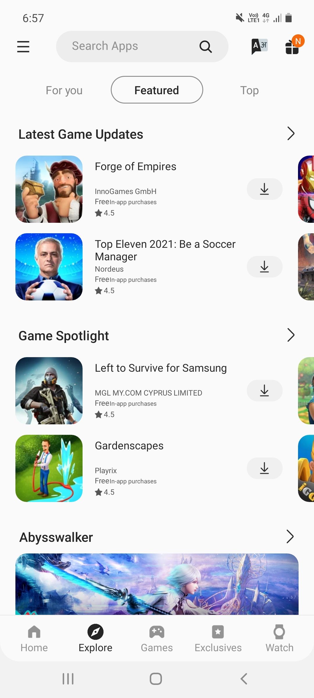
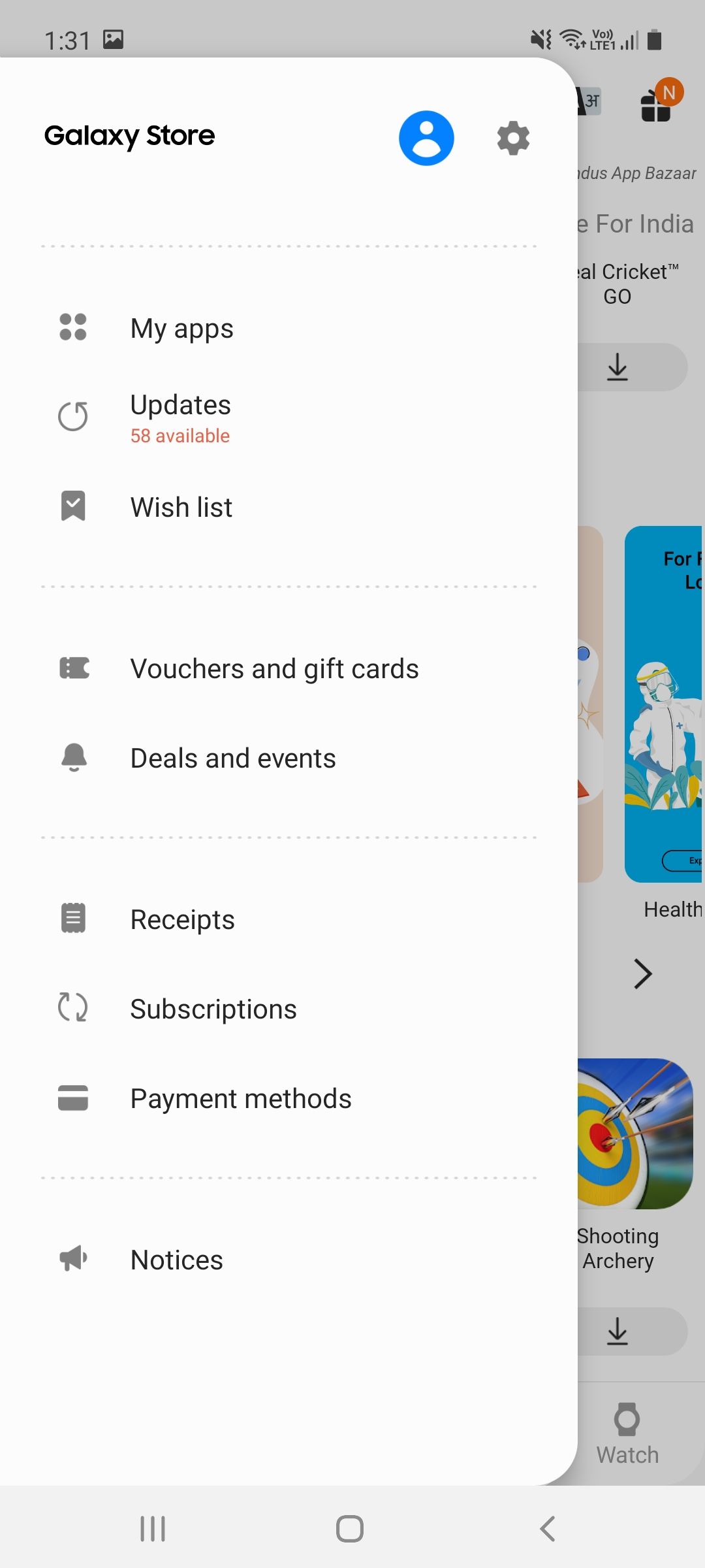
When people use new apps, it can be difficult to interpret the various icons on the screen. The biggest advantage of the hamburger icon is that it is instantly recognizable for anyone familiar with mobile design. The icon is widespread, which makes it easy to interpret without any explanation.
The hamburger icon takes almost no space, making it possible to place it anywhere on the screen without disturbing other elements. Not everything belongs on the main page of your screen, so the icon does a good job of providing a predefined place for navigational elements.
What's Happening to the Hamburger Menu Today?
As we've seen, the hamburger button offers many advantages, like ease of navigation and a clean user interface. However, it does include a few drawbacks, which have made app developers move away and consider alternatives.
With phones getting larger displays all the time, it’s becoming more difficult to reach the places where the hamburger button is usually found. This makes the user experience less engaging and using apps less comfortable.
When you open an app for the first time, you’ll of course look for its key features. The hamburger icon often hides most of the important options, which makes the interface less discoverable for newcomers.
Also, putting prominent features inside a menu button makes them feel less important. It makes you think if those options weren't important enough to put on the home screen, they might not be worth checking out.
Alternatives to the Hamburger Icon
Navigation bars have become a more popular and efficient way of organizing menu buttons. Rather than hiding important features behind the menu icon, the navigation bar arranges multiple icons on the home screen.
The navigation bar provides menu icons that are clear to understand and are therefore more engaging. Hamburger buttons lack this clarity, so they don't get the same level of engagement.
As one example, the Google Play Store simplified its interface by redesigning it with a navigation bar. That bar, at the bottom, showcases important features. To access other options, you tap on your profile icon in the top-right corner.
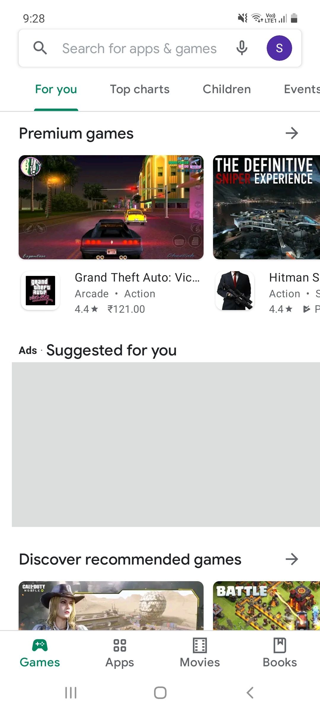
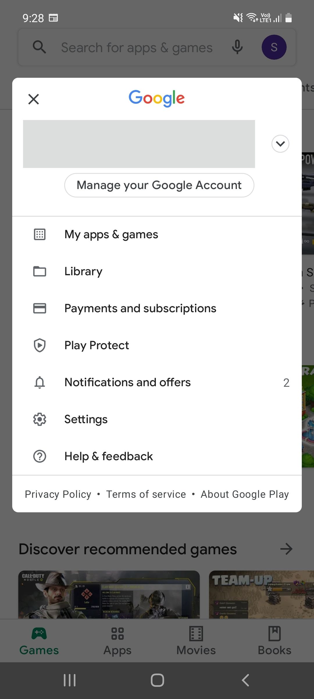
A navigation bar allows you to see more core features and functionality on the home screen. You can see multiple icons on the bar at a glance. Plus, these bars are usually at the bottom of the screen, which is much easier to reach than the top-right or top-left where hamburger icons typically live.
Though like the hamburger icon, navigation bars have their drawbacks. While they do put the top features at the front, they are only limited to only four or five choices. So if the app wants to showcase more important features, it has to use something else in addition to the navigation bar.
Perhaps the best option would be incorporating both a navigation bar and a hamburger icon. The navigation bar could showcase the highlighted features of the app, while the other features could be tucked away in the hamburger icon.
Facebook is a popular example of this. In its navigational bar, you can tap the hamburger menu to access all its other features.
The Future of the Hamburger Icon
The hamburger button has been used as a go-to menu icon for a long time now, so most people are quite used to it. Its minimalist approach and clear purpose have made it widely recognizable to anyone who's used a smartphone.
But due to a few drawbacks of the burger icon, many popular apps including the Google Play Store, Instagram, and Twitter have started embracing the navigation bar instead. The navigation bar might serve as a better alternative to the hamburger icon, but it is not full integrated into every app yet. As a result, we'll still see the hamburger icon used regular for some time.
The hamburger icon isn't perfect, but it can be improved by combining it with alternative navigational elements. It's important to make sure that whatever tools apps use are clear to users.


