Venn diagrams provide a creative way to show the relationship between multiple theories, concepts, or subjects.
Here, we'll go over the many Venn diagram variants you can make using Visme. But since the layout for Venn diagrams is the same no matter what tool you use to create them, you can make the same type of diagrams using other software and sites as well.
1. Two-Circle Venn Diagram
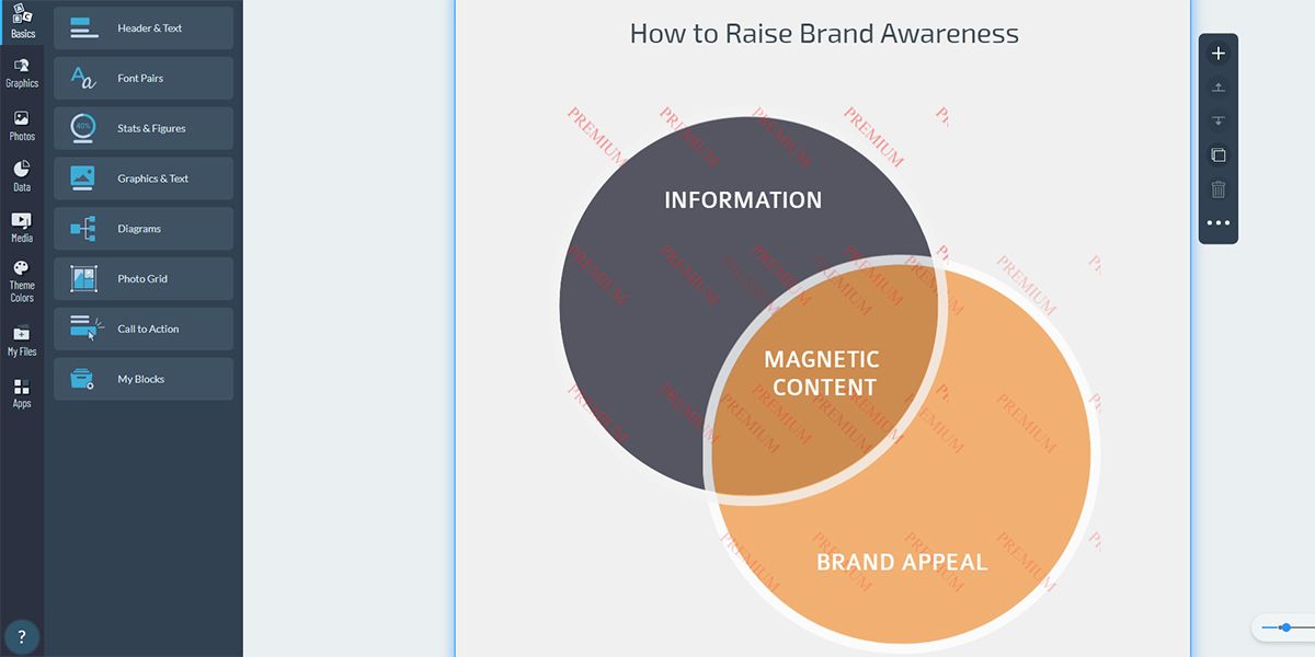
This is the simplest type of Venn diagram, as it shows the relationship between two subjects or elements. This diagram features two overlapping circles. The common characteristics belong in the middle, while the other traits go on either side of the respective circles.
Since it’s super easy to make, you've probably seen the two-circle Venn diagram used in the classroom or during a business presentation. LIke we mentioned earlier, we created this Venn diagram (and all the others on this list) using the templates from Visme.
If you want to make a professional-looking two-set Venn diagram, use colors and fonts that mesh well together. You might want to try adding a contrasting background to the circles to create an interesting visual. You can also try using the black or white border of the circles to define the overlapped section.
2. Three-Set Venn Diagram
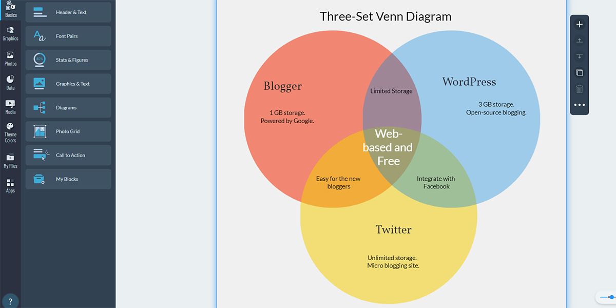
Another common type of Venn diagram is the three-set Venn diagram. This diagram helps you visualize the relationship between three different subjects or elements. Usually, this diagram contains three overlapping circles that are part of a set or theory.
When creating a three-set Venn diagram, you need to focus on two different aspects. Make sure to display how each element compares to its counterparts, and also include how all the elements come together and overlap.
By keeping all these points in mind, you can create an easy-to-understand three-set Venn diagram.
3. Four-Circle Venn Diagram
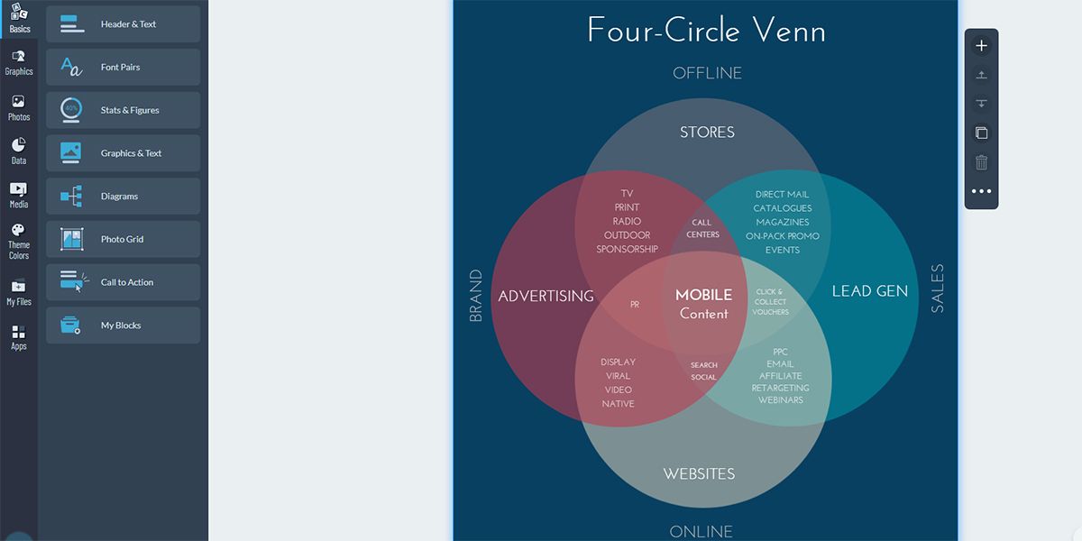
This Venn diagram is a bit complex. Hence, it's used less often than the previous two types. It contains four circles or ovals that overlap with each other. With this diagram, you can represent the commonalities and differences between four subjects.
Each circle in this diagram contains different aspects of a subject. In the intersections, you can show the similarities and differences between the sections. Since there are many overlapped areas here, make sure you leave sufficient space to include all your information.
4. Raindrop Venn Diagram
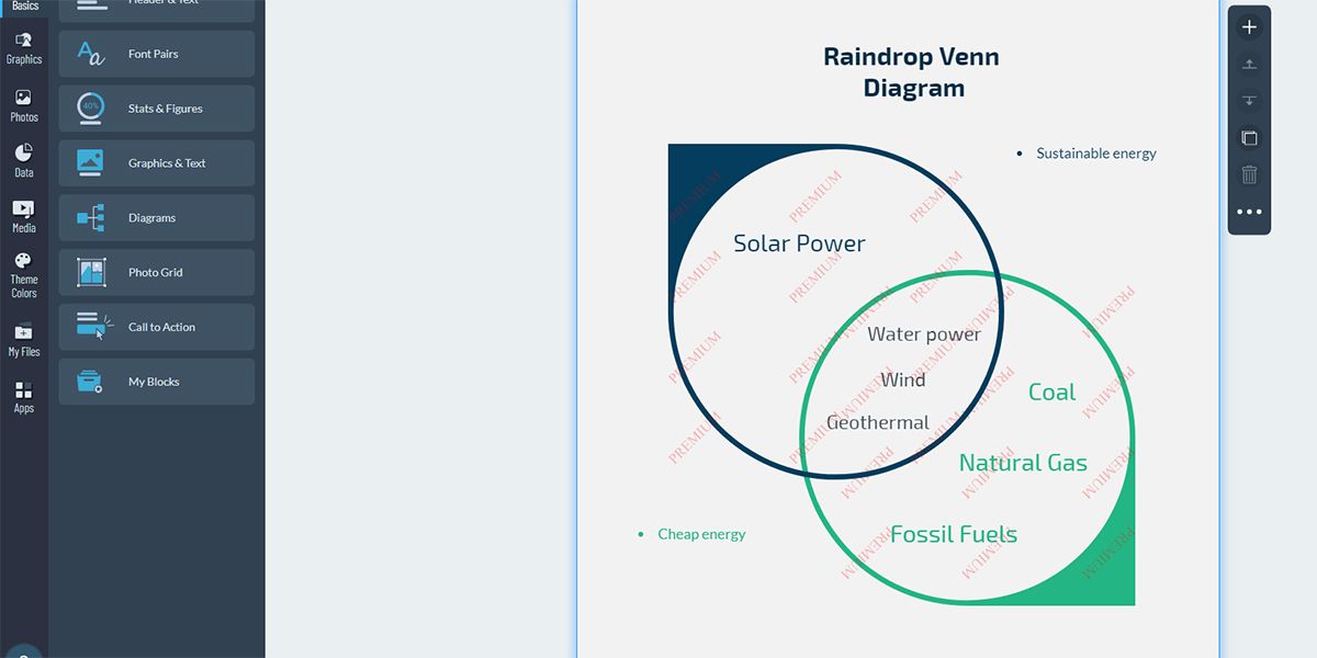
If you're tired of using the common two-set diagrams, you can add a touch of creativity by using the raindrop Venn diagram. It consists of raindrop-like shapes that overlap at each circular end.
Its nature-inspired look makes it suitable for presentations on topics such as the environment, climate, energy, sustainability, etc.
This diagram is only different from the two-set diagram in terms of style. So, you can always use it as a substitute for a two-circle diagram. Any information you would include in a two-circle diagram will fit in the raindrop diagram as well.
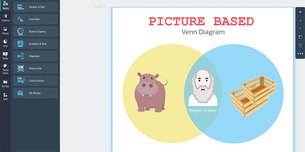
5. Picture-Based Venn Diagram
Picture-based Venn diagrams are very unique. Instead of using text, you fill the diagram with images. These are best used for young children, however, you can still use them if you want to keep your audience engaged.
This diagram includes very little text and uses images to convey the relationship between multiple subjects. You can include photos that represent what you're comparing in the outer circles, and add a picture in the overlapped section that sums up their similarities.
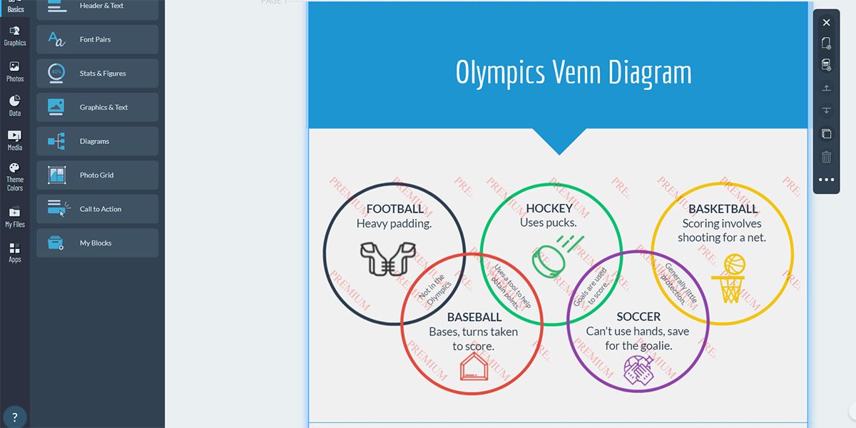
6. Olympic Rings Venn Diagram
As the name suggests, this Venn diagram looks like the Olympic rings. You can use this diagram to show the relationship between any topics. However, it looks best when used for sports-related topics.
Each circle of this diagram represents a different subject. The overlapped sections show how each subject relates. It's a fun twist on the typical Venn diagram, and lets you compare and contrast four different subjects.
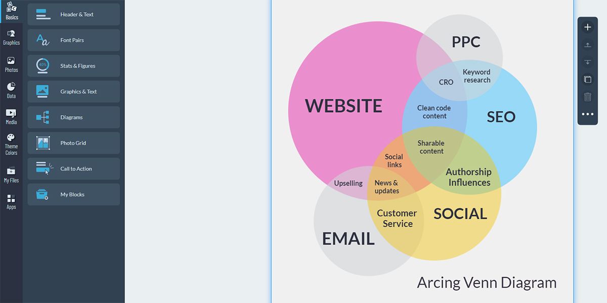
7. Arcing Venn Diagram
When you need to visualize how different parameters interact with each other, an arcing Venn diagram is the best choice.
Let's say you want to visualize the level of importance between different elements in a digital marketing project. In this case, try drawing an arcing Venn diagram displaying each element in the project, including elements like a website, search engine optimization, pay-per-click advertisement, social media, and email.
All of the above units share certain services to some extent, like keyword research, sharable content, authorship, social links, upselling, user services, news, and updates. Now, plot these services in your Venn diagram according to your project data and you'll get a presentable graphic. For a more accurate representation, you'll probably need a few months' worth of data from these departments.
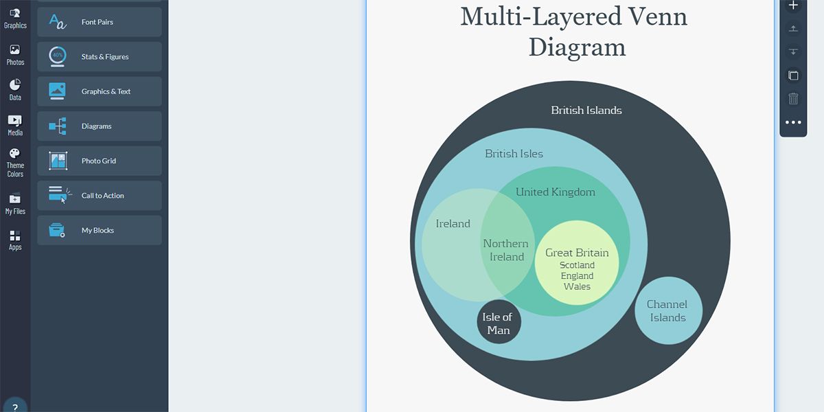
8. Multi-Layered Venn Diagram
If you want to show the relationship between subjects in a different light, the multi-layered Venn diagram is the right choice. This diagram consists of a large outer circle that contains smaller circles inside it.
The nested circles show how each one of them changes the original entity. Meanwhile, the outer circle represents a single subject. Some circles can be standalone entities, and some can be contained within others. You can add as many layers as you want, as there aren't any constraints.
9. Diamond/Rectangle Venn Diagram
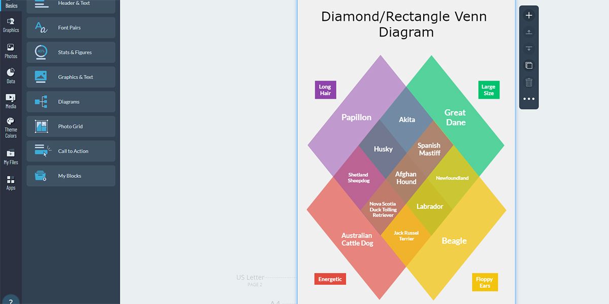
The diamond/rectangle Venn diagram is a variation of the four-circle diagram. However, in place of circles, you use diamonds or rectangles. Besides adding an interesting look to the design, it presents the information in an easy-to-follow manner.
Keep in mind that this diagram can also be relatively complex. Not only are there multiple connections between each diamond, but you also need to use blended colors in the overlapped sections to make it easier to read.
10. Star Venn Diagram
Whenever you need to show something really complex through a Venn diagram, you risk losing your audience's attention. But the star Venn diagram can be a lifesaver in such situations. In addition to its ability to explain a complicated subject or relationship, it can also retain the interest of the audience.
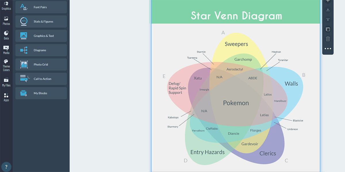
The star Venn diagram contains five different oval shapes. They are positioned in a way so that they overlap each other. The star diagram helps you display the interaction between five different subjects, resulting in multiple unique options.
Though this diagram tends to be complex, you can make it easily understandable with some effort. Use blended colors for the overlapping areas. You can also add labels to make the intersections easier to track.
Represent Data Relationships With Venn Diagrams
Whether you work in the field of logic, mathematics, businesses, teaching, statistics, or computer science, Venn diagrams can help you visualize the logical relationship between different elements.
Choose from any of the Venn diagram variants, and help your audience understand complex relationships easily. While we used Visme in this article, any advanced flowchart software should work for creating Venn diagrams.

