
If you've ever worked with large datasets in Google Sheets, you know how challenging it can get to filter and analyze the data. You can use the filter feature, but applying and removing filters for every criterion is tedious. That's where slicers come in.
Slicers are interactive buttons that let you quickly filter data in Google Sheets without opening the filter menu. You can create slicers for any column or row in your data and use them to show only the values that match your criteria.
What Are Slicers in Google Sheets, and Why Use Them?
Slicers are similar to the filter tool in Google Sheets, as they both filter data, but they have plenty of advantages over filters. When you create a slicer, Google Sheets adds it as a button on your spreadsheet. This alone makes slicers more intuitive than traditional filters.

Slicers show you the available headers in your data and let you select or deselect them with a simple click. You don't have to open the filter menu and scroll through long lists of options. Another significant attribute of slicers is that they reflect on charts as well. When you filter the data through a slicer, the chart will automatically update to display the filtered data.
You can even change the slicer's appearance by tweaking its size, font, or color. This way, the slicer won't be an awkward addition to your spreadsheet. On the contrary, it'll help you create sleek and efficient spreadsheets. So far, slicers sound like the ultimate tool for quickly filtering data in Google Sheets, don't they? Well, the truth is that they are. Open up Google Sheets, and let's slice up some data.
How to Create Slicers in Google Sheets
Creating slicers in Google Sheets is straightforward, as it only takes a few clicks. You'll get to customize the slicer and change its settings after creating it. To create a slicer, go to the Data menu and click on Add a slicer.
Once you do this, a slicer will appear on your sheet. But that's not all. The slicer you just made will only function after you tell it what to slice. A slicer needs a data range and a column header to work. Let's walk through this process with a simple exercise.
Using Slicers With Data Tables
Slicers can instantly filter data tables without affecting other parts of your sheet. Slicers don't remove the cells and only hide them, similar to the filter tool in Google Sheets.

For example, consider the spreadsheet above. This spreadsheet is a long-term shopping list, including each item's cost, status, and tag. Suppose that the goal here is to quickly filter the items based on their tags. Slicers are the easiest way to achieve this.
To use slicers in Google Sheets, you need to ensure that your table has a header row—like the one in this spreadsheet. Here's how you can filter data with slicers in Google Sheets:
- Go to the Data menu and click Add a slicer.
- Select the slicer and click the three vertical dots in the top right.
-
In the drop-down menu, select Edit slicer. This will open the slicer settings on the right.
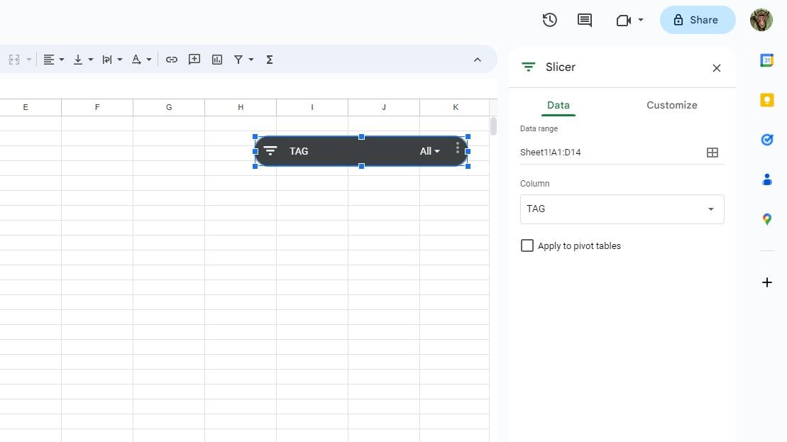
- Enter your data under Data range. That's A1:D14 in this example. Google Sheets will automatically read the column headers from the table.
- Click the drop-down list under Column and select the column you want to filter the data with. That's TAG in this example.


Your slicer is now ready to use! Click the icon on the left corner of the slicer to bring up the filtering options. To select or deselect values in the slicer, click on them and then select OK. The spreadsheet will change to display the desired results.
Note that cells that are not in the slicer data range (B15 to B17 in this example) remain unchanged.
Using Slicers With Charts
Another great use of slicers in Google Sheets is to filter charts. This allows you to create dynamic charts that change based on your slicer selection.
You won't need to create a separate slicer for the chart. Given that your chart is based on the same data range, the slicer will filter both the data table and the chart. Let's try this on the same spreadsheet.

Each chart type in Google Sheets is suited for particular types of data. In this case, the best chart to visualize the data in our spreadsheet is a pie chart:
- Select the data you want to graph. For this example, we're going with A1:B14.
- Go to the Insert menu and select Chart. Google Sheets should automatically determine and create a pie chart. If it doesn't, follow the next steps.
- In the Chart editor, go to the Setup tab.
- Change the Chart type to Pie chart.

Now use your slicer and observe as the pie chart changes to visualize the desired items. Congratulations! You just leveled up your chart from static to dynamic!
How to Edit Slicers in Google Sheets
You can edit a slicer in Google Sheets by changing its data settings, appearance, or position. Here are some of the things that you can do:
- To change the data range of a slicer filters, go to the Data tab in the slicer settings. You can select a different data range or change the filter criteria by changing the column.
- To change how a slicer looks, go to the Customize tab in the slicer settings. You can change the slicer's appearance by tweaking the title, title font, and background color.
- To resize a slicer, select it and drag the blue dots around it. There isn't much space to stretch the slicer's height, but you can stretch or shrink its width as much as you like.
- To move a slicer, click on it and drag it to a new location on your spreadsheet.

Slicing Through Data
Slicers are a powerful and easy way to filter data in Google Sheets. An elegant alternative to the filter tool, slicers let you create interactive buttons that show or hide rows based on specific criteria. You can customize the appearance and behavior of slicers to best suit your needs.
Slicers also filter charts, given that the chart is based on the same data. There's no need to create a separate slicer for the chart and clutter the spreadsheet. The same slicer can filter the according chart as well.
Proper filtering can help you analyze and present your data more efficiently. Now that you know how to use slicers, you have unlocked a robust tool for creating dynamic spreadsheets. Try them out and see for yourself!