The Windows 10 Technical Preview is now available to everyone who wants it, but Microsoft's claim that it's an early build is no joke. There are bugs, driver issues and other problems that make it a poor choice for your primary computer. If you don't have a second PC to install it on, however, don't fret. We'll guide you through the new Windows one screenshot at a time.
The Desktop
No Start Screen
Microsoft has decided to make Windows 10 more desktop friendly. Consequently, the Start Screen from Windows 8 is disabled by default on all systems with a keyboard attached. The result is a clean, simple environment that looks a lot like Windows 7 with a minimalist Taskbar.

New Start Menu With Live Tiles
In the lower left hand corner is the new Start Menu. In function it's quite similar to the old menu, but has live tiles added in the right pane. In Windows 7 this is where a variety of folder and menu options would appear, so in a sense the new Start Menu is still less functional than the old one.

On the plus side, though, live tiles can be used like widgets to show live updates of news, weather and more. It's not as good as actually having widgets (if you like that sort of thing - I don't) but it's close.
Clicking the All Apps option at the bottom of the Start Menu brings up a simple list view of everything you have installed. This can become unwieldy because it includes both traditional software and any applications installed from the Windows Store. I hope Microsoft adds some organizational tools to make this space less cluttered.
Search Is Back Twice
Next to the Start Menu is a magnifying glass which of course represents Search. Keen eyes may have noticed there was already Search in the Start Menu. What's the difference?

Not much, to be honest. The only difference I found is that the dedicated search function can insert photos from web results, while desktop search cannot. They otherwise seem to generate the same results. This aesthetic look of this feature is extremely basic and obviously unfinished, so I would not be surprised if Microsoft combined this feature with the Start Menu search field or vice versa.
Task View & Virtual Desktops
Shifting right once again, you'll find two white rectangles which represent Task View, an important addition to Windows 10. Task view is a lot like Mission Control in OS X. It provides an overview of the windows you have open and lets you manage multiple desktops, each with their own windows.

This is a very convenient addition that Microsoft should have added years ago, but it's better late than never. People who have large, high-resolution displays will love it because Task View can display the content of many windows at once. If you have 10 Word documents open, for example, Task View will help you find the one you want.

No Notification Center
Over in the right corner there's the usual array of tray icons. The notification center that was rumored before release is not in the Technical Preview, so the look hasn't changed much since the days of Windows Vista. Well, one thing has - the current build of Windows 10 still uses the Modern UI (aka Metro) look for its WiFi selection menu.
Explorer
New Home View
You may have noticed the Taskbar has a new folder icon previously unseen in any version of Windows. This is the only place this icon appears (for now) and it takes users to a new Explorer view called Home.

Home is sort of like the favorites section, which remains, but it's not quite the same. Home view includes favorites, frequent folders and recent files all in one place. While it's a simple addition, this new area of Explorer is a convenient link between areas of the file system. And it's part of Explorer's navigation pane, not just a Taskbar icon, so it's accessible whenever you're viewing files.
Icon Design Is Flat
Another noticeable change is the variety of new icons added in Windows 10. This may seem minor, but they indicate the aesthetic direction Microsoft is pursuing. I've taken some of the icons and placed them in a folder so you can see them together.

What do all of these icons have in common? They're flat! Really flat. No more than four colors are used across all of these icons. There's no gradients or shadows to be found. White space is often used to define borders within the icons instead. If you look at the navigation pane to the left, where many of the icons appear, you'll see they scale down extremely well (Click the screenshot for a larger view).
Flat Design Beyond Icons
It's important to note that while the Modern user interface of Windows 8 is also flat, it isn't the same kind of flat. Many colors are included in its live tiles and most its interface elements are large and chunky. The Modern UI was built that way because it was designed for touch. Windows 10 is more about the desktop, so Microsoft has embraced fine details that look great on a 1080p (or greater) displays. This is also the first major redesign of desktop icons since Vista.
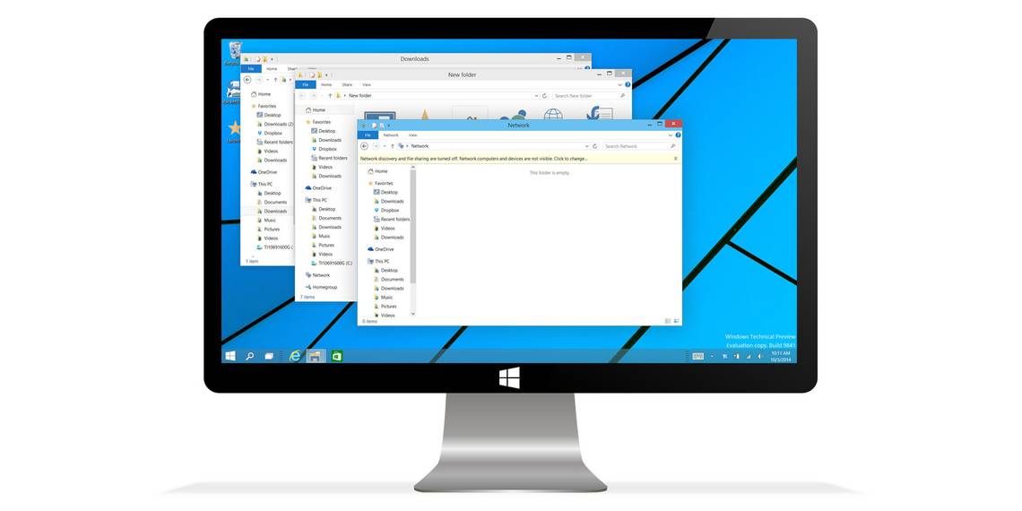
We see the embrace of fine detail carry over to windows, as well. To demonstrate this I've layered a number of Explorer windows on top of each other.

The first thing you'll notice is how little color is present. It's blue, gray and white, and that's about it. What I want to call attention to, though, is the border around each window. It's barely there! The title bar is still as fat as ever, but the left, right and bottom borders are thin, almost invisible depending on the background. This contributes to the new flat aesthetic. However, Microsoft is still using shadow to give a sense of depth when multiple windows are layered.
Delving Back Into Modern UI
I could take your through the Control Panel and other options, but I'll save you some time and tell you this; it's basically the same as Windows 7. That was true in Windows 8 as well, but obscured by the fact some options were more readily accessed through the new Modern UI. Now those have been banished by default, so Windows 10 is a lot like Windows 7 on desktops and laptops without touch.
Start Screen Hasn't Changed
What happens when you turn the Start Screen back on, though? You end up with Windows 8.

Microsoft hasn't changed the Start Screen in the Technical Preview and didn't announce any at its reveal event. Does that mean nothing will change? Not necessarily, but with the company's attention now directed at the desktop, we might not see anything ground-breaking. And you know what? The Start Screen probably doesn't need it. This interface works well - if you're on a touchscreen device.
Windowed Modern Apps On The Desktop
One change does become noticeable when you open a modern app from the Windows 8 store, though, whether you have the Start Screen enabled or not. These apps now open in a normal window.

Microsoft brought these apps to the desktop in Windows 8.1, but they didn't behave like normal windows. They could not be minimized or re-sized. Now those options are available. Microsoft has further improved the use of these apps on the desktop by placing Charms Bar options in a "..." menu on the title bar. With these changes in place, using a Windows Store app on the desktop is no longer a hassle.
Snap View Is Buggy
There's also a new four-way snap view that's supported by all windows including Store apps, but it doesn't always work right.

Here we see the result of trying to snap four Store apps simultaneously. They just won't do it without significant overlap, and often Windows become confused and opens the Task View. In other situations it doesn't open Task View and actually fills empty spaces with a blank gray hue, which is obviously some sort of error. It's a preview, remember?
Charms Bar Still Opens With Touch Gestures
The Charms Bar, by the way, is still enabled by default, but it won't appear as a result of hovering the cursor in desktop's right corner. Instead it appears only with a touchpad or touchscreen gesture.

Here too the interface is unchanged, which means there's actually three ways to search a Windows 10 machine. The PC Settings menu that desktop users despised in Windows 8 still exists as well, but the Start Menu's return means it's no longer the easiest way to access some Control Panel options. Also, PC settings can be used as a standard window like other modern applications, so it's not as painful for desktop users when it is accessed.
The Command Prompt
Finally, Microsoft has added some features to the command prompt. Well, kinda. Have a look for yourself.

So, it looks the same. If you were expecting Microsoft to turn it into something as beautiful as Notepad++ (and it's kin) you're out of luck. It's still a simple black screen. But it does include word wrap and pasting from the Clipboard, so that's progress.
Windows 10 Is Looking Good
The new version of Windows looks good if you're a desktop owner. A new look has been introduced alongside the Start Menu, Task View and a new type of desktop search. It's clear that this is, in fact, an early build; yet a lot of things do look or work as you'd expect. I think Windows 10 has promise.
What do you think of its design? Would you upgrade to Windows 10 from Windows 7, or do you think Microsoft is delivering too little, too late? Let us know in the comments.