What would you say if I told you that you have the tools at your disposal to do ground-breaking, Earth-shattering research? Well, you do, and I'll show you how.
Governments, academic institutions and non-profit research organizations publish tables full of data to the public domain. Without anyone using this information, its true value will never be known. Unfortunately, few people have the insight, the skills or the tools to take the data and make interesting correlations between seemingly unconnected information.
Background
A lot of the research that I do for my own blog involves digging through what's known as the invisible web, to uncover data that has been released to the public, but hidden from search engines inside an online database. This is the deep web, and it's rife with valuable data. Very often, I come across webpages just chock-filled with some of the most valuable data on topics that run the gamut from census data to epidemiological studies on rare diseases. I constantly have new ideas on how to try and correlate those disparate data sources using various tools - and one of the most valuable tools that I've found is the Web Query inside of Microsoft Excel.
Finding Interesting Data Correlations
What I'm going to show you today is an example of how you can make use of Excel Web Queries to pull in data from different websites, and chart them against one another in order to search for potential correlations between the data.
The way to start an exercise like this is to come up with an interesting hypothesis. For example - to keep things interesting here - I'm going to randomly postulate that skyrocketing autism rates in the United States are caused by either vaccine inoculations or the increasing presence of electromagnetic fields in and around children, such as cell phones. It's a crazy hypothesis the likes of which you'll find on most conspiracy theory websites, but that's what makes this fun. So let's get started, shall we?
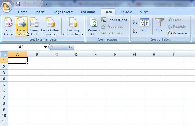
First, open up Excel, go over to the data menu item, and find the "From Web" icon in the menu ribbon.
This is what you'll use to import the different data tables from the many website out there that have published them.
Importing Web Data Into Excel
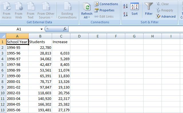
So, in the old days you'd have to try to copy the data from that table on a webpage, paste it into Excel, and then deal with all of the crazy formatting issues involved in doing that. Total hassle, and a lot of times it just isn't worth the headache. Well, with Excel Web Queries, those days are gone. Of course, before you can import the data, you'll need to Google your way around the Web to find the data you need in table format. In my case, I found a website that had published the Department of Education statistics for the number of U.S. public school students who were identified as having autism. A nice table there provided numbers from 1994 all the way through 2006.
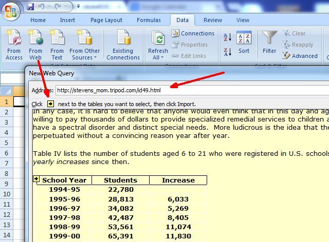
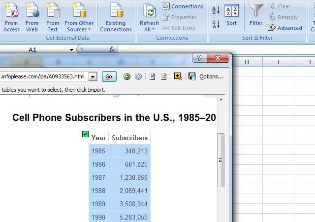
So you just click on "From Web", paste the webpage URL in the query address field, and then scroll down the page until you see the yellow arrow next to the table with the data you want to import.
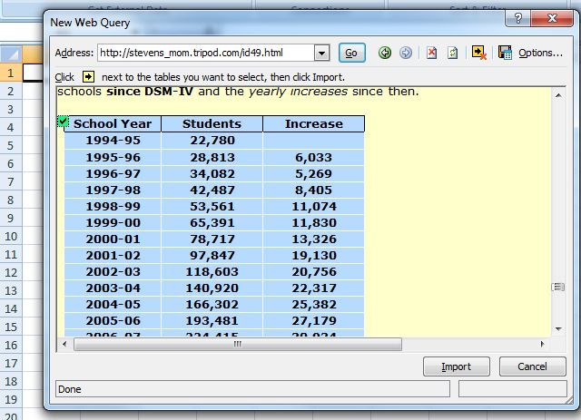
Click the arrow so that it becomes a green checkmark.
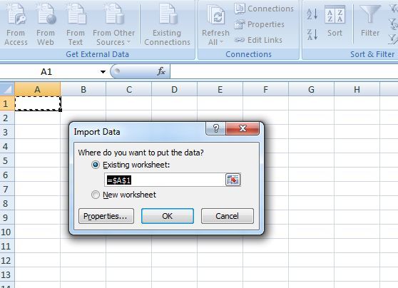
Finally, tell Excel what field you want to paste the table data into inside of your new spreadsheet.
Then - Voila! The data automatically flows right into your spreadsheet.
So, with a trend of public school autism rates from 1996 - 2006 in place, it's time to go out in search for vaccination and cell phone usage trends as well.
Luckily, I quickly found trends for cell phone subscribers in the U.S. from 1985 through 2012. Excellent data for this particular study. Again, I used the Excel Web Query tool to import that table.
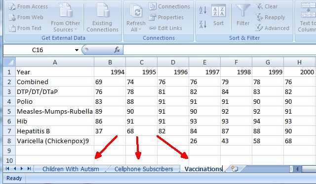
I imported that table into a clean, new sheet. Then, I discovered vaccination trends for percentage of school children vaccinated for different diseases. I imported that table using the Web Query tool into a third sheet. So, finally, I had three sheets with the three tables filled with the seemingly unconnected data I had discovered on the Web.
The next step, is using Excel to analyze the data and try to identify any correlations. That's where one of my favorite data-analysis tools comes into play - the PivotTable.
Analyzing Data in Excel With The PivotTable
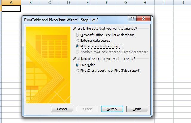
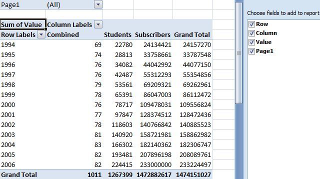
It's best to create your PivotTable in a brand new, empty sheet. You want to use the wizard for what you're about to do. To enable the PivotTable wizard in Excel, you need to press Alt-D at the same time until a notification window pops up. Then let go of those buttons, and press the "P" key. Then, you'll see the wizard pop up.
On the first window of the wizard, you want to select "Multiple consolidation ranges", which allows you to select the data from all of the sheets you've imported. By doing this, you can consolidate all of that seemingly unrelated data into one, powerful pivottable. In some cases, you may need to massage some of the data. For example, I had to fix the "Year" field in the autism table so that it showed "1994" instead of "1994-95" - making it line up better with the tables on the other sheets, which also had the primary year field.
That common field between data is what you need in order to try and correlate information, so keep that in mind when you're hunting the Web for your data.
Once the PivotTable is done and you've got all of the different data values displayed in one table, it's time to do a visual analysis to see if there's any obvious connection that jumps out at you.
Visualizing Data Is Key
Having a bunch of numbers in a table is great if you're an economist, but the fastest and easiest way to have that "aha!" moment when you're trying to find connections like a needle in a haystack, is via charts and graphs. Once you have your PivotChart in place with all of the data sets you've collected, it's time to create your graph. Usually a line graph will do best, but it depends on the data. There are times when a bar chart works much better. Try to understand what kind of data you're looking at and what form comparisons work best.
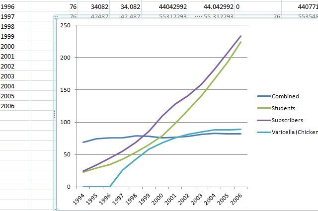
In this case, I'm looking at data over time, so a line graph is really the best way to see trends over the years. Charting autism rates (green) against scaled-down vaccination rates (dark blue), chicken-pox vaccines (light blue) and cell phone use (purple), an odd correlation suddenly appeared in this sample set of data that I was playing with.
Oddly enough, the trend in cell phone use from 1994 through 2006 almost perfectly matched the climb in autism rates over the same period of time. While the pattern was completely unexpected, it's a perfect example of how tying together interesting data can reveal fascinating leads - providing you with greater insight and motivation to keep pushing forward and searching for more data that may further bolster your hypothesis.
One correlation like that above does not prove anything. There are plenty of trends that rise over time - the pattern could be coincidence, but it could also be an important clue in your ongoing quest for more data on the Internet. Thankfully, you have a powerful tool called Excel Web Queries that'll make that quest just a little bit easier.
Photo Credit: Kevin Dooley via photopin cc


