If you're using Adobe Lightroom to edit your photos, the histogram is a tool you need to get familiar with.
Briefly put, a histogram is a graphical representation of the tonal values within an image. By learning how to interpret and work with histograms, you can quickly see if an image is made up of the right tonal values to create a well-exposed shot, and easily make corrections as necessary.
This article will tell you everything you need to know about using the histogram in Adobe Lightroom.
Understanding Histograms
When looking at a histogram, you're looking at a graph that shows the tonal values that are present in your image. That is, how many dark tones, light tones, and mid-tones are in your shot.

The X (horizontal) axis represents the entire tonal range, from black on the left, to white on the right. The Y (vertical) axis represents the number of pixels within your image with a particular tonal value.
Therefore, the left third of the histogram represents shadows (dark tones), the center represents mid-tones, and the right represents highlights (light tones).
Judging a Photo by Its Histogram
There is no such thing as a perfect histogram. The ideal histogram varies depending on the type of shot you've taken, and the effect you're trying to achieve.
Full Tonal Range
For most photos, a histogram with a healthily distributed set of tones can be taken as a thumbs-up. This will usually look like a hump (of no particular shape) in the center of the histogram, which peters out to either end.
This suggests that there aren't too many shadows, nor too many highlights, but that all tones are still present. In very vague terms, it's "well-exposed".

Heavy on the Highlights
If a histogram is very heavy toward the right-hand side, this can often (but not always) mean you've overexposed the shot. And if you've got loads of activity on the extreme right end of the histogram, this will result in highlight clipping. In your image, this will show as areas of pure white, completely lacking in discernible detail.
If there is absolutely no detail whatsoever in those areas, it is known as "blown highlights". If you've shot a JPEG with blown highlights, these areas cannot be fixed, as there is no information stored on those areas.
Generally speaking, all photos that are naturally bright—such as a snowy shot—will have a histogram that's heavy to the right. But highlight clipping (and especially blown highlights) are usually things to be avoided. These result in things like a sky (or clouds) with no texture, and pretty terrible effects when you print your photos.

As long as all those pixels aren't bunched up right against the right border (highlight clipping) of the histogram, you should still be able to make out detail in the snow. That being said, some product photographers will deliberately have tons of highlight clipping to really make the subject stand out.
Heavy on the Shadows
Alternatively, nighttime shots or photos with lots of shadows will have a histogram that's heavy on the left side.

What you ideally want to see in these kinds of shots is the histogram still petering out (albeit rapidly) to the extreme left side. This will mean you can still make out a little detail in those shadows. If the histogram is instead pushed right up against the extreme left border, you'll get shadow clipping, where all discernible detail in those shadows will be lost.
Again, some photographers look for small, deliberate areas of shadow clipping, as it can add depth to the shot.
A Hair-Comb for a Histogram
If your histogram looks like a hair-comb, with lots of sharp vertical bars, this suggests a lack of color data. Although this may be what you're going for, editing the coloring of the image, or applying filters, could easily cause results that you're not hoping for.
Understanding the Colors in a Histogram
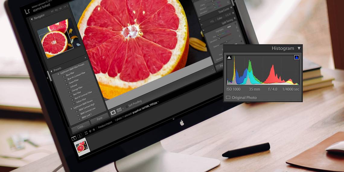
Some histograms you come across will be monochrome, but Lightroom offers a color histogram. The colors that you see represent the three composite colors—red, green, and blue—with the gray areas representing areas that are a mixture of all three. The yellow and turquoise areas below represent the green that's hiding behind the red and blue.

As you move your mouse across the photo, underneath the histogram you'll see the proportion of red, green, and blue pixels that make up the visible color beneath your cursor. The more blue that is in your image, the more blue will be displayed in your histogram, and so on.
If the bright areas of your image are pink or red (like when shooting a sunrise), expect to see lots of red in the highlights area histogram, as above. This basically gives you a better understanding of how colors are distributed throughout the image.
Working With Histograms in Lightroom
Knowing how the histogram works can really help you to understand the exposure of your shots in Lightroom. But it's also extremely useful when it comes to printing your photos.
Calibrating your monitor can only go so far, as there will always be a difference in how your photos appear on the screen and on paper. The histogram, therefore, offers an objective look at the tonal values of your shots without the need to rely solely on monitor settings and your imperfect eyesight.
Noticing Clipping in Lightroom
When you're viewing a photo in the Develop module in Lightroom (the histogram in the Library module is just there for show), take a look at the histogram on the right-hand side. In the top right corners of the histogram are two small triangle icons.

If both icons are dark gray, there is no clipping. That is, there is no loss of detail caused by overly bright highlights or overly dark shadows.
If the left triangle icon is light gray, it means there is shadow clipping. You'll also see a spike of pixels on the left border of the histogram.
If the right triangle is light gray, it means there is highlight clipping (see above). You'll see a spike of pixels on the right border of the histogram.
Hover over those triangles to see exactly where that clipping is present in your shot. Click on the triangles (or press J) to toggle between clipping view and no-clipping view.
Fixing Clipped Areas in an Image
If you notice areas of clipping in your image that you don't want, these can usually be fixed.
Look closely at the histogram, and you'll notice it's split into five columns. Hover over these to see their names: blacks, shadows, exposure, highlights, and whites. These are settings you'll also see in the basic widget in the Develop module.
To fix any clipping in your image, you'll want to change one or more of these relevant settings. You can do this by dragging that specific section of the histogram to the left or right. But a much easier option is to just use the sliders in the Basic panel.

Bear in mind that if you move, say, the whites slider, the entire histogram will be impacted—but more so in the whites region. The same goes for the other sliders.
Play around with these options until you have either removed all the clipping or reduced the clipping to a more acceptable amount. This will always work best with RAW files, as opposed to JPGs, as RAW files contain so much more data.
If you are working with JPGs, you can achieve similar effects on a smaller scale, unless the photo was originally largely over or under-exposed—in which case, there's not much you can do.
Using Histograms for Contrast
Although histograms are mainly used for understanding tonal range in an image, they also represent contrast.
If the histogram is all bunched up, with lots of empty areas on the right and left with no data, that means there is not much contrast in the image. If there are two bulges on opposing ends of the histogram, that means there is a lot of contrast between a few colors.

It's up to you if you think your contrast needs "fixing". If you want your image to have more contrast, just drag the contrast slider on the Basic panel to the right. You could also drag the shadows slider to the left, and the highlights slider to the right to increase that tonal range. To reduce contrast, do the opposite.
Using the Histogram in Lightroom Creative Cloud

In addition to Lightroom Classic, you can also view a histogram if you're editing photos in Lightroom Creative Cloud. It works the same as in Lightroom Classic, and you can move the sliders to even it out as you feel is necessary.
However, there is one big difference to note when using the histogram in Lightroom CC. Whereas you can physically drag the histogram in Lightroom Classic to make edits, you can't do this in Lightroom CC.
Making the Most of Histograms
As you can see, the histogram is a pretty basic graphical representation of the tonal values in your image. Its uses may be limited, but they are extremely important. But it's the way in which Lightroom enables you to use the histogram that makes this just one of the reasons why photographers should consider using Lightroom.
By learning how to interpret and use the histogram you can quickly understand and assess the exposure and contrast of every shot you import into Lightroom. This helps you to make correctional adjustments in a more precise way than you may otherwise have been able to.