Because it has the burden of carrying the meaning of a layout, typography can make or break a good design. However, it isn't something only for artists and advertisers to think about. People from all walks of life can benefit from understanding how typography works.
To take full advantage of typography, you need to understand the elements that go into it. We've compiled a list of basic terms together with their explanations that will help you navigate the world of typography.
1. Typefaces and Fonts

What we commonly refer to as fonts, such as Arial and Times New Roman, aren't actually fonts. They're typefaces.
A typeface, also known as a font family, is a set of fonts that share the same fundamental design elements. On the other hand, a font is a specific variation within that family based on a number of characteristics, namely:
- Weight: This refers to how thick or how light a font is. Most typefaces have a spectrum of weights with descriptive names, from ultra-light or thin to bold or heavy. The middle of a range of weights is called "medium" or "regular."
- Italicization: This refers to whether or not a font slants to the right. Italicized fonts are called either "oblique" or "italic."
- Condensation and Width: These refer to how broad or how narrow the width of the font is. When a font is narrow, it is usually referred to as "condensed" while broad fonts are referred to as "wide" or "extended."
- Style: This refers to a change in the presentation of a typeface rather than its core design. For example, some families have an "outline" font, which is essentially the same as the regular font except only showing an outline of each character.

To get a better idea of this, we'll use the most common font in design---Helvetica Neue---as an example. Helvetica Neue is a typeface, as there are many fonts within its family.
Under Helvetica are a variety of weights, such as black, medium, and thin. There are also extended and condensed versions. For each weight and width, there is a corresponding oblique version. All of these variations on weight, width, and italicization are individual fonts.
2. Serif, Sans-Serif, and Script

If you've ever been around designers, you'd know that one of the first things they think about when designing a layout is whether to use Serif or Sans-Serif. But what exactly do these two things mean?
"Serif" means "tail" in Latin, while "sans" means "without." Therefore, a serif is a typeface with a tail at the end of the body. On the other hand, a sans-serif refers to a typeface that does not have a tail.
In addition to sans-serif and serif, there are three additional classifications that designers use to refer to typefaces. A script refers to one that simulates curved handwriting or calligraphy. These are especially popular for wedding invitations.
A display has unique, eccentric characteristics and is normally intended to be seen in large sizes. These are the fonts you see on Halloween posters or billboards.
Lastly, a monotype typeface has characters that all have the same width. Programmers use these in order to view blocks of code more easily.
Here are a couple of examples of each that you will likely recognize, as they are word-processing defaults:
- Serif: Times New Roman, Georgia, Garamond
- Sans-Serif: Arial, Helvetica, Calibri
- Script: Lucida Handwriting, Brush Script, Rage Italic
- Display: Chiller, Bauhaus 93, Jokerman
- Monotype: Lucida Console, Courier New
3. Alignment

If you've ever used a word processor, you probably already know what alignment is. It refers to which side of the margin a block of text lines up with.
A paragraph can be aligned to the left, the center, or the right. By default, you should try to keep most blocks of text left-aligned, as the human eye automatically starts reading from the left.

Most programs have a fourth alignment option, which is justified alignment. Justified alignment means that the lines in a block of text align themselves to both sides of the margin. This is normally achieved by changing the width of spaces between words.
Justified alignment can be further divided into four types, depending on which side the final line aligns itself to. If a block of text is fully justified, that means that all lines in a block of text will align to either side. This normally looks a bit messy but can be useful when designing certain materials.
4. Contrast and Hierarchy

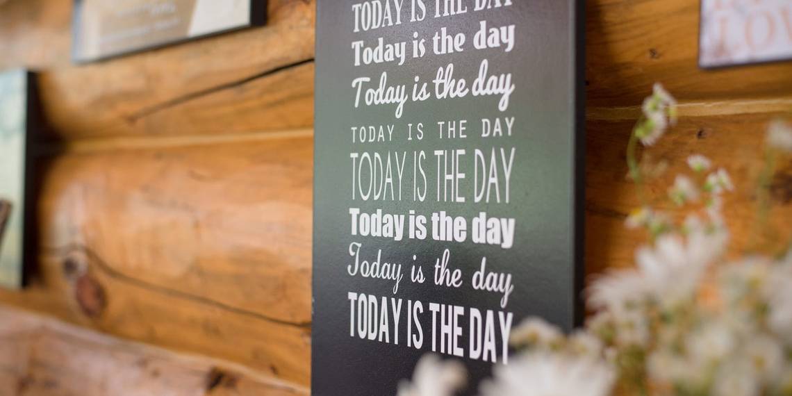
In the above image, your eyes probably looked immediately at the second sentence. That is because of the size, the variation in fonts, and the use of the striking red color. The second sentence uses the principle of contrast.
In design, contrast refers to the idea of creating noticeable differences between elements in a layout. When working with typography, it means changing anything from the typeface and weight to the color of text.

On the other hand, hierarchy refers to the use of contrast to highlight the importance of certain elements over others.
For example, in a typical PowerPoint presentation, the header of a slide is normally the biggest element and uses a thicker font. On the other hand, in a research paper, the citations at the bottom of a page have a smaller font size than the rest of the body text.
5. Tracking, Leading, and Kerning
One of the most confusing things for a novice designer is the difference between tracking, leading, and kerning.
Tracking refers to changes in the spacing between all characters in a line. When you increase the tracking of a word, you are uniformly increasing the spaces between every letter. Changes in tracking normally happen for printed posters and social media layouts. And these are the tools you need to create shareable social media images.
This is different from kerning, which refers to the changes in spacing between each character. In the example above, the kerning between the letters "K" and "e" was decreased, while the kerning between the other letters remained the same. You normally take kerning into consideration when you're designing very large layouts with few characters.
On the other hand, leading is the amount of space between lines in a block of text. In word-processing, when you change a paragraph to "double-space," you're doubling the leading between lines. Leading is especially important if you're typing something with a large amount of text, such as a report or a magazine layout.
Typography Is for Everyone
Whether you're a professional designer making a layout for a client, a student writing a paper, or a corporate professional working on a slideshow, the way that your text is presented can make all the difference. So, with that in mind, it's important to understand the most important elements.
If you've learned enough about typography to design your next project, here are some free alternatives to Photoshop, Illustrator, and Lightroom that you can use to make beautiful layouts. And if you haven't found the perfect typeface yet, here are websites to discover and download free fonts.