Good evening. I'm back again to bring you some of the latest and greatest in web tech for the web-savvy Photoshopper.
Up until now, every time I have to design something, anything, I automatically reach for my trusty old Color Index book. If not for the convenient vinyl colors in this little book, I probably would have destroyed the little bugger a long time ago from wear and tear.
Don't get me wrong, I've been around the net. I've seen all the little color pickers and color schemers, and they're useful but theres always something missing. None of the color schemers I've seen have everything.
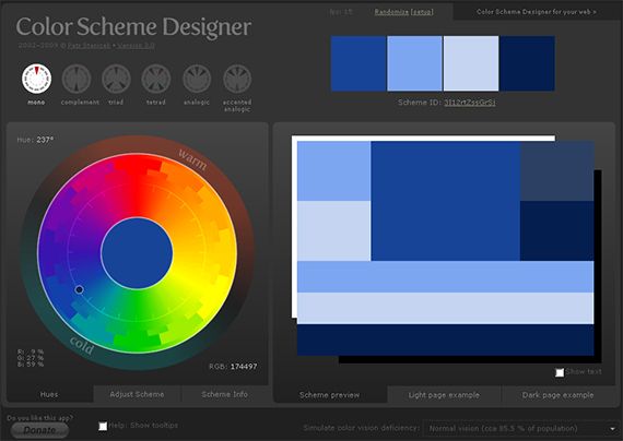
This awesome view is what you will see when you first load up Color Scheme Designer. At first glance, it seems daunting but when you dive into it, you quickly get a feeling for the raw power of this app and how really simple it is to use; a marvel of UI.
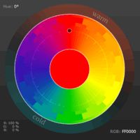
First and foremost, you want to decide how many base colors you're allowed to work with and then take it from there. The top left corner has the color formulas you will start from. Initially, you can choose one color and the app breaks it out into its non-clashing, complementing counterparts, as shown above. At most there can be four colors but the following depicts the initial variations, starting from my favorite shade of blue, where the black dot is on the color circle.
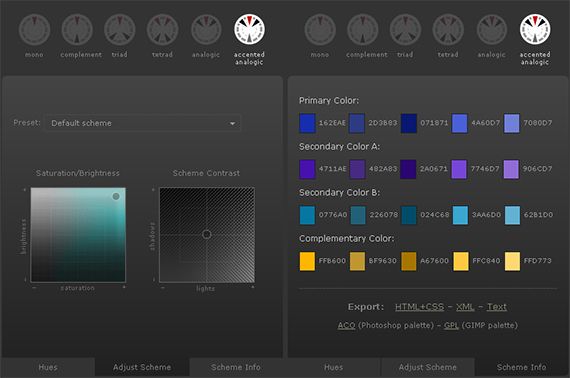
This results in the following color breakout schemes, which in and of themselves are useful, and with the HEX values immediately selectable, copyable and pastable. Color hex values are also accessible via mouseover:
But that's not even all! The application allows for custom controlling of the resulting color scheme, as well as at-a-glance color value table, Voila:
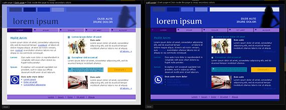
And now, the defining feature this app provides is the fully interactive light and dark page previews, which I've generated from the Triad version of my color scheme based on my original choice of my favorite blue, in a completely eye-candy friendly application of color theory:
That's still not the end of the features this app provides! Most notably is the ability to simulate various color deficiencies for accessibility, as well as the ability to export HTML/CSS, XML, and text as noted above.
I hope this app helps everyone out there as much as it has helped me. I realize that inspiration is in very short supply these days, and my trusty old color index has provided me countless blasts of inspiration. In light of that, this app is ground-breaking in that arena and will provide you with blasts of inspiration as well.
Are there any better color schemes or pickers that you have used or prefer? Let us know your choices in the comments. If you have any questions about color and color shemes, please add them into the comments as well.


