No one likes looking at a spreadsheet filled with raw numbers and trying to figure out what it all means.
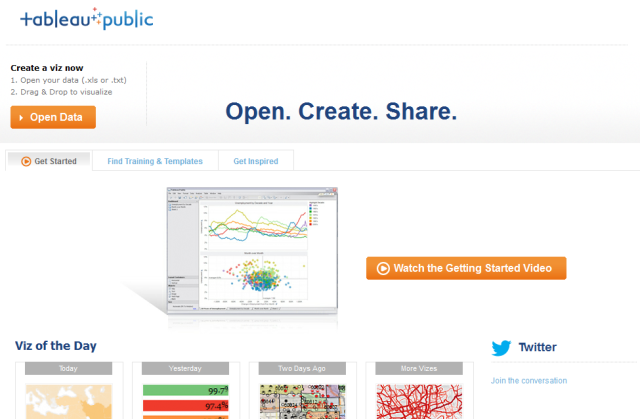
With Tableau Public, free for Windows & Mac, you can import .xls or .txt data, and turn them into meaningful visualizations such as graphs and charts.
We reviewed Tableau Public as a way to create visualizations, but this article will show you step-by-step how to create them yourself, using population data I downloaded from the World Bank. Feel free to download it too and follow along!
Getting Started
Formatting your Data
You may need to format your data before you start, like I had to with the data sheet I tested. Ensure that the first row of your spreadsheet is the names of the variables or indicators. The data should begin in the very next row.
Each row should have only one piece of data, too. You might find Tableau's Excel Plugin useful for transforming your data if, for example, you have data for each year in its own column that you need to reformat. I used it to transpose the population data from my sample set into separate rows. (Download the formatted Total Population Data set if you want to just get started.)
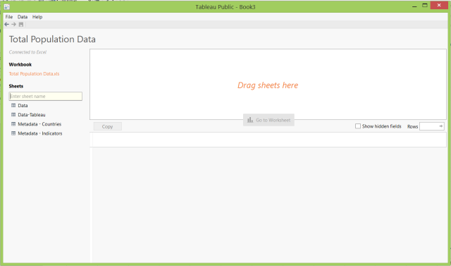
Once you download Tableau Public and upload your data, you'll notice that Tableau has separated your data by sheet.
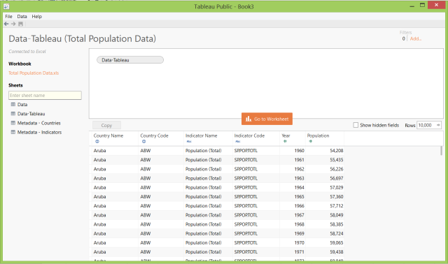
Drag-and-drop a sheet you want to work with into the box labeled 'Drag your sheets here' and the data within the sheet will appear, and Tableau Public will see the data types you're working with.
Next click the big orange 'Go to Worksheet' button and give Tableau a few seconds to process your data.
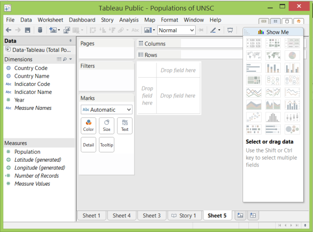
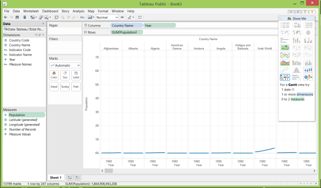
Once you're looking at your worksheet, choose a Dimension (qualitative data, typically described with words) and a Measure (quantitative data, described with numbers) you want to look at. For example, drag the Year dimension and Country Names into Columns, and Population into Rows. It's not visually-useful quite yet, but it's getting there.
It needs filtering, because right now this data set mixes in income demographics with continents with countries with the world total, and other groups of countries.
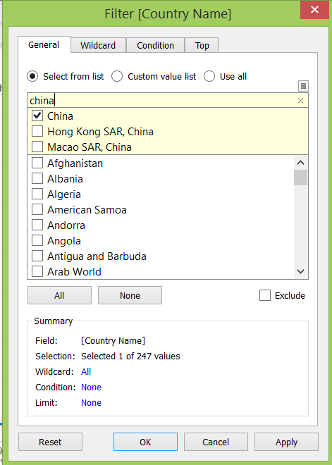
You can filter your data by dragging Country Name onto the Filters field.
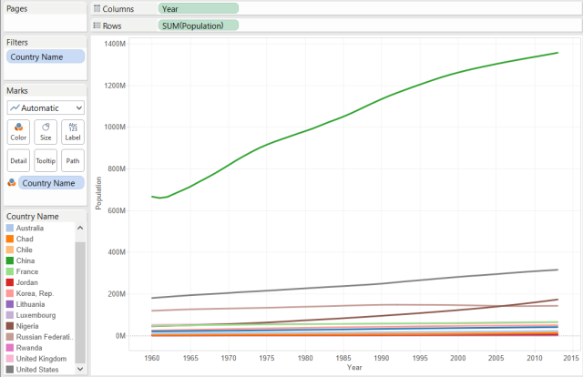
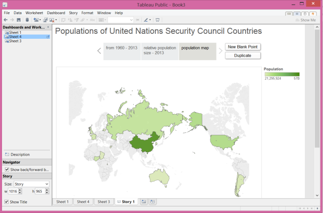
I was curious about the populations of the countries who are currently members of the United Nations Security Council, so I filtered my set to:
- People's Republic of China
- France
- Russian Federation
- United Kingdom
- United States
- Argentina
- Australia
- Chad
- Chile
- Jordan
- Lithuania
- Luxembourg
- Nigeria
- Republic of Korea
- Rwanda
You can also filter by the year, so that only the time frame you're concerned with is covered in your visualization.
Types of Visualizations
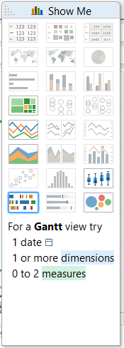
With a data set like the one demonstrated in this article, you can create a wide variety of visualizations. One of the nice things about Tableau Public is you don't even need to imagine the possibilities yourself - it has a feature called 'Show Me' that will highlight some of the options that could be interesting for your data types.
You can show how a variable like population changes over time with the Line Graph.
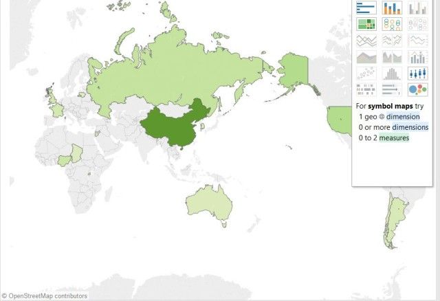
The Filled Map tool will let you start to show geographically where larger and smaller populations are through colour intensity.
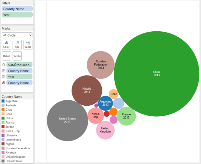
If you just want to communicate relative size of populations though, you can always use Packed Bubbles, where of course, the bigger the bubble, the bigger the population.
Saving and Exporting
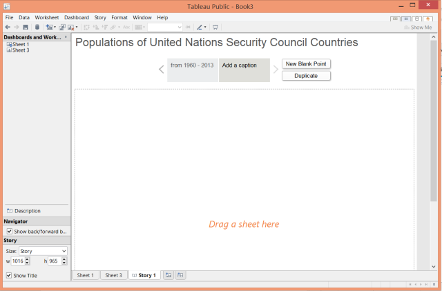
You can save individual sheets, or you can save 'Stories' which pull together multiple sheets to show how the data looks when visualized in different ways. To create a Story, in the top menu, go to Story > New Story.
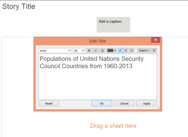
Give your story a name that represents the overall message you want to convey - what's the point of the set of graphics?
Next drag a sheet from the left (Dashboards and Worksheets) into the area labeled Drag a Sheet here, and then give it a caption.
Each of the sheets becomes like a page that your reader can turn to to see a different aspect of your data set.
If all you need is a picture of your visualization, you can always just take a screenshot of what you created. However, if you want to retain interactivity, you're going to need an account with Tableau to Save to Web.
Final Visualization
You can test the visualization I made. It's interactive, so you can see different views, and put your cursor on the country you're interested in for more details.
Need more?
If you're looking for inspiration about data to visualize, you should check out Tableau's gallery, which is filled with examples from the community.
There's really no end to the kinds of visualizations you can make. Google Analytics even gave a tweet-endorsement for Tableau to create visualizations of your website statistics.
Great stuff from @tableau: Using Tableau and Google Analytics to Build Beautiful, Useful Maps http://t.co/9dcI4u2LEc /by @conrock_media — Google Analytics (@googleanalytics) August 15, 2014
If you need to be able to look at data in more formats than just .xls and .txt, or to save files locally, Tableau has other product offerings to cover those needs. You can also learn much more about Tableau through their online training.
Tableau is not the only way to visualize data out there, so be sure to explore some of your other options for visualization and infographic-creation too.
Final Thoughts
Data about the world, and yourself, is being collected every day. Some of it is used to make marketing decisions that help a wealthy company get more wealthy - but some of it is used to help ordinary people understand the world better to motivate social change, or help politicians make cities better, or help designers understand the needs of their clients better.
Have you seen any great data visualizations out there that really helped you understand a complex situation? What questions do you have that you'd like to see someone explain with data-driven visualizations? Share them in the comments!

