Quirky Nimbus Smart Dashboard
If you're a very active social media user who puts great emphasis on how many likes their latest Facebook post received, and live in the US - go ahead, you might love it! For international users, developers, hackers, and anyone hoping for customisation - move right along.
The internet is full of data, yet most of us can only can access that wealth of information through a computer or tablet. The Nimbus Dashboard is a physical implementation of live data - four individual dials that can be customised to display information relevant to you. That's a pretty awesome idea - but how useful is the end product, really?
To find out, we purchased the Quirky Nimbus Dashboard with our own money to help us determine if you, in turn, should spend your hard-earned money on it. At the end of this article, we'll be giving our review unit away.
http://youtu.be/j_tYrrtPhjs
From the company namesake, "Quirky" is an apt description for this product, but it also describes the production process. Quirky is a user-driven company: users design products, vote on those they'd like to see made, and Quirky then takes those designs to reality - paying a fee to the idea creator. Products are hit and miss, understandably, but they're almost always unique and designed to solve real world problems. The Nimbus was designed by Ryan Pendleton, apparently.

The Nimbus is named after cloud formations, I assume because it gathers data from the cloud. The premise that it takes a source of information, and display that in both an analogue dial form and digital output - a customisable, real world dashboard of data thats important to you. It costs $130, and there's not really any similar products on the market. The Thingm Blink(1) is a USB LED that can be linked to different datasets, but it's only output is a range of colours. There are numerous DIY projects to achieve something similar to the Nimbus, but nothing that can be purchased.

Design
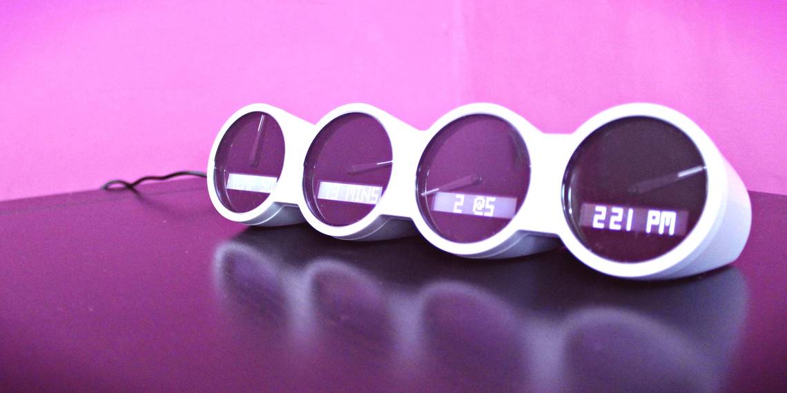
In black, or white - as we chose - the Nimbus is much smaller than I expected, the diameter of each dial being about 5 centimetres total. For some reason, I expect larger: clock-sized or like a car speedometer.

For reference, here's the Nimbus compared to a banana - because that's how we measure things on the internet.

When placed flat, there are two microswitches at the front corners, such that pressing down on the Nimbus anywhere will trigger them - these are used to turn off the alarm and display alternate data views such as current weather for the temperature module.

It's certainly pleasing to look at, except for the hideous glossy plastic - seriously, can we just agree right now to only use matte plastic coating on anything from now on?
The dial hands themselves have a hairline white indicator but are otherwise black. Given the face of the dials is also black, the hands simply don't contrast as much as I would like - which is a shame really, given how much of this product is focussed on them. The LED screen directly below glows a satisfying white, so it would have been nice to see that replicated on the dials.

Overall, it feels a little tacky; from the plastic dial faces to the hastily painted hairline whites of the hands. It strives for simplicity, but not in an Apple way. For the price, it's an acceptable build quality - but I think there could be a market for a premium brushed aluminium and glass version with glowing dials - the Nimbus Pro. Get on it Quirky, and I'll take that 10% cut, thank you kindly.
The App: Wink
Setup and configuration of the Nimbus - any Quirky product in fact - is done through the 35 megabyte mobile Wink application (have you ever wondered how many iOS apps there are called Wink? A lot. You're looking for "Wink: Instantly Connected").
After registering an account, an 8-screen simple walkthrough is displayed. Like the Remeé lucid dreaming headset I reviewed last year, Wink-enabled devices are programmed by a kind of optical morse code - sequential flashes of light sent from your mobile - but you'll also need to add your home WiFi details so they can fetch data over the Internet, as the light flashes are only used for the initial setup of the device.

After entering your WiFi password, the app instructs you to locate the "home sensor" on the Wink device - since it's compatible with a variety of devices, there's no specific mention of Nimbus at this point. The Home sensor is around the back of the Nimbus, hidden discreetly between the rear of the central two dials.

I must say, I really liked the way they eschew the more common USB cable method - you don't need a computer at all, and it saves packaging yet another cable in the box. There are no "drivers" to worry about, for one.
Unfortunately, the Nimbus flat out refused to connect to my usual home network provided by an Apple Airport Extreme - I've had this problem with other embedded WiFi chips too, so it could be related to the AC and dual band technologies in the router. It worked fine through a standard A/B/G/N test network, but this is something to bear in mind if you're buying the device. Although ultimately unable to help me, support was generally good - they were happy to call me and walk through some troubleshooting procedures.
What Can You Display?
The nimbus is currently limited to 9 different display modules.
- Time: The alarm function however is separate, so you needn't include the time display if you just want an alarm.
- Weather: Locked to Farenheit, with the dial showing as a change from yesterday - central being no change, a swing left meaning colder, a swing right meaning hotter.
- Traffic: Surprisingly rich in options compared to the "select city" weather report, traffic can be set to display either predicted travel time between a start and end point, or live traffic. It relies upon Apple Maps for info though, so make sure you have a post code handy.
- Calendar: Only for Google Users, can display time of or time until next event.
- Email: Again, Google only - displays the number of unread messages from a single account.
- Facebook: Probably the most pointless of all the displays, though you have a choice of unread messages, likes on your latest post (seriously), comments on your latest post, or pending friend requests - the last one presumably for celebrities who find the daily chore of accepting requests too overwhelming.
- Instagram: likes or comments on your latest post.
- Twitter: Number of mentions or retweets.
- FitBit: Calories burned, steps taken, or sleep duration
If you don't think a combination of any 4 of the supplied modules would be of use to you, forget it. At the very least, I was expecting a stock price module - it's stupidly simple to get from Google or Yahoo Finance - but, no. I was also optimistically hoping that it could read any arbitrary JSON or RSS feed - the standard format for information exchange between millions of websites.

This might be too advanced for most average users, but it does open up the Nimbus to thousands of willing developers and existing data sources. The iPad Status Board app for example does just that, so there's a thriving community of user-contributed widgets. None of that on the Nimbus: you have any info you want displayed, as long as it's one of these nine - most of which are a pointless exercise in social media diarrhoea.

The dials themselves - the central premise of the Nimbus in the first place - are just a pointless addition of unnecessary information. They're supposed be an "at a glance" display, but the numbers they represent are arbitrarily defined in the Wink application and cannot be adjusted. On the predicted time to destination traffic module for example, 15 minutes is displayed as it would be on a clock, all the way up to 59 minutes being just left on the dial's central point. There's a disjoint between that, and the weather module for example, which swings left or right of the central point depending on whether it'll be hotter or colder than yesterday.
The arbitrary decision of where the dial should swing would be acceptable if the Nimbus itself had a completely digital display so you could see context on the dial face - as it is, there's no indication of what they mean except for on the iPhone app. I would, for instance, like the traffic display to show a neutral dial if the time is 15 minutes: this would be a reasonable time to take to drive my wife to work. On days of higher traffic, swing right; less traffic it would swing left. In fact, throw in a RGB LED so you can get immediate at a glance good or bad and that would be just great.
The premise of the Nimbus is awesome: a customisable, physical display. The practical realisation of this is atrocious, verging on utterly worthless - it's a glorified alarm clock, and not even a very good one.
Should You Buy The Nimbus Dashboard?
If you're a very active social media user who puts great emphasis on how many likes their latest Facebook post received, and live in the US - go ahead, you might love it! For international users, developers, hackers, and anyone hoping for customisation - move right along.
[recommend]MakeUseOf recommends: Don't buy.[/recommend]
How do I win the Nimbus Dashboard?
You may enter by submitting your name and email address. You'll receive one entry simply by doing so.
After that, you'll also be offered various methods to earn additional entries. They range from sharing a link to this giveaway on social networks; to commenting or visiting a specific page. The more you participate, the higher your chances of winning! You will receive 5 additional entries into the giveaway for every successful referral via your shared links.
This giveaway begins now and ends Friday, January 10. The winner will be selected at random and informed via email.
The Winner
Congratulations, Claire Blaney! You would have received an email from jackson@makeuseof.com. Please respond before January 15 to claim your prize. Enquires beyond this date will not be entertained.
Send your products to be reviewed. Contact Jackson Chung for further details.