It's great to have a large amount of data and metrics at your disposal to identify the strengths and weaknesses of a business. However, facts and figures can be difficult to digest without being properly processed.
Whether you're looking to supercharge your own analysis, or take some of the legwork out of presenting your findings, Microsoft's Power BI is a potent tool to have at your disposal. Follow this guide, and you'll be well on your way towards transforming data into information.
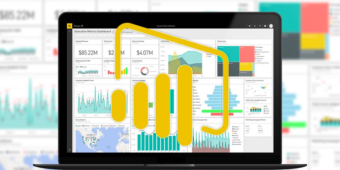
What is Power BI?
Power BI is a fast and flexible method of taking data and turning it into visualizations and reports. It works by feeding your data into a framework that can produce charts and graphs on the fly, and even continue to update these diagrams as the datasets they're drawing from continue to receive more information.
That makes it easy to experiment with different methods of visualizing your data, putting you in complete control via a more streamlined interface than similar tools in Excel. However, it really comes into its own when you start to use Dashboards, a manner of assembling charts and datasets that can be referred to over time.
Once a Power BI Dashboard is set up, it can continue to deliver information on a rolling basis without you ever having to tinker with the details ever again. Once you do need to make a change, however, it's very easy to refocus its reporting on the particular areas that you need to keep an eye on.
Microsoft is currently offering trials of this powerful set of tools for free, so it's a great time to give Power BI a test drive and see what it could do for your business.
Getting Started
The first step towards mastering Power BI is registering an account on its web portal. Once you're set up, the next step is to import some data so you can see how the various tools on offer work.
Power BI can accept a wide range of different sources, from a simple Excel document or .CSV file to a connection with a third party product like Salesforce. If you're simply looking to test the package out, Microsoft offers a test document that can be used to demonstrate a large portion of its functionality before you start inputting your own data.

To give Power BI something to work with, use the Get Data button in the bottom left-hand corner of its UI. There are several import options, but if you're using the test document supplied by Microsoft, choose Files > Get > Local File and navigate to it on your hard drive.
Working with Data
Now that Power BI has some information to work with, we can start getting into what makes the package so valuable. Click on the document you just imported to open it as a dataset. From this screen, we can produce all manner of visualizations by using the buttons on the right hand side of the UI. Experiment by checking a couple of boxes in the Fields section.

I've chosen to select the Country and Profit fields, so they're displayed by default as a Clustered Column Chart. However, by selecting a different option from the Visualizations column, we can produce anything from a pie chart to an annotated map.

The options below the Visualizations section offer even more ways to customize your chart or graph. You can also explore more ways of presenting your data by combining more than one field in the same graph.

Now that I've made a chart that I want to keep track of, I'm going to use the push-pin icon in the top right-hand corner of the content to attach it to a Dashboard. This will keep the visualization handy for later reference — but there's plenty more that you can do with a Dashboard, too.
Using Dashboards
While individual reports form the building blocks of Power BI's visualization suite, the software really comes to life when you start to create Dashboards. By pinning several reports to the same Dashboard, you can present them together to give an at-a-glance overview of the data at hand. Once you've pinned the individual pieces of content, head to the relevant Dashboard to start experimenting with layouts.

With a little bit of tinkering, you can produce a Dashboard that presents your raw data in a way that's easily to digest in seconds. Click on a particular component of the Dashboard, and you'll be able to examine it in more detail.
Dashboards can be used to present information to others, with the Share Dashboard command at the top of the above screenshot, offering up options to invite remote viewers via email. However, it can also be a potent method of engaging with data in its own right.
You can ask the Dashboard questions about the data that it contains, and for the most part you'll receive very useful responses. Power BI has no problem understanding prompts like "how much profit in France?" or "what are our gross sales for 2014?" — if you stick to terms used in column headings and the like, the software will usually follow your logic.
Next Steps
Hopefully, you're now feeling comfortable with the basics of Power BI. Although with a piece of software this powerful, there will always be more things for you to learn and introduce into your workflow.
Dashboard design is one area that can separate beginners from experts. It's easy to put together something that works, but it takes a little more know-how to construct a Dashboard that really makes the most of your data. Some basic principles apply far beyond Power BI, but Microsoft offers its own tips specific to the software, too.
If you're looking to learn more about the technical side of Power BI, a good place to start is by looking into the ways it interlinks with the brand new Office 2016 suite. Microsoft offers plenty of documentation regarding this too, like its informative guide to Power Query.
Do you have your own tips for getting up and running with Power BI? Share your knowledge with other users in the comment section below.