Creating a PDF is a great way to ensure that your document is read just as you wrote it. No matter what device is being used, your file will be presented exactly as you expect.
If you want your document to be read, it's important to make sure that it's reader-friendly. Unless you take the time to polish up your work, there's no guarantee that your audience will give it the proper respect when it's in their hands. For effective, clear communication, you need to create a crisp, concise document.
Follow these tips, and you'll be well on your way to a professional quality PDF, ready for circulation.
Ensure That The Document is Tagged
Tags are a crucial part of making any PDF accessible. You might not be able to see them, but they're the information that applications use to decode the document and present is as intended. It's best to check that tagging is enabled before you create a PDF so you can be confident that it will look exactly as you want it to when another user opens it up.
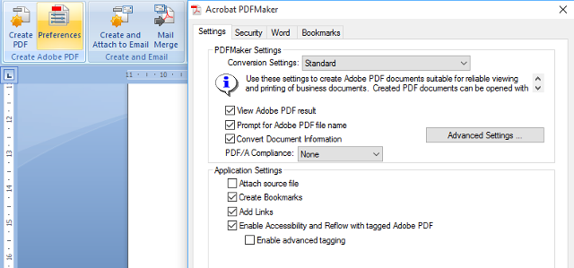
If you're creating a PDF with a program like Adobe Acrobat, tagging will be enabled by default. However, that might not be the case if you're using Microsoft Word. To check, head to the Acrobat Ribbon and select Preferences from the Create Adobe PDF section — you may need to install Adobe Reader or Adobe Acrobat to see this.
Here, you need to make sure that Enable Accessibility and Reflow with tagged Adobe PDF is ticked. Now, when you create a PDF in Word, use the Save as Adobe PDF option rather than the basic functionality that comes with the Office suite.
If your document calls for it, you can also tag manually by using Adobe Acrobat. However, in most cases automatic tagging will be sufficient.
Make Your Text Engaging and Legible
Typography is crucial to any document that's heavy on text, so there's a lot of value to the time you spend formatting your PDF. Find an appropriate, legible font and stick with it throughout. A sans serif type of font is likely your best option, as it makes for the most easily readable text.
Since you can rely on the PDF file type to keep your formatting intact, make full use of bold and italic type. If you want to draw attention to a few words in particular, make them bold — if it's a long passage that you want to set apart from the rest of your document, put it in italics.
Include Images as Appropriate
A lengthy PDF document that's filled with nothing but page after page of text is going to wear out readers fast. Wisely selected images can break up that monotony, and make it easier for your audience to take on the information that you're trying to get across.
Of course, this shouldn't be taken as cause to shoehorn images in with no rhyme or reason — it really has to be something that supplements your text. If a picture doesn't fit the bill, why not try to present some of your information as a chart or a diagram? With the proper consideration, that will add some variety without acting as a distraction.
The key here is that any image you include has to add value, or else you're simply adding bloat to the overall document. Don't wait until you've finished writing up the document to make considerations like this; instead, think about adding visual interest as you're creating the file.
It's also worth remembering that images can display incorrectly, and that some users might use a text-to-speech program to listen to your document, rather than read it. As such, it's worth adding concise captions to any image you use to make sure the meaning isn't lost.
Choose Colors That Minimize Eye Strain
One thing that can immediately turn a reader off from your PDF is eye strain. Black text on a white background can be rather tiring to look at for long periods of time, so it can be well worth choosing a less grating color scheme.
Fortunately, this is something that's very easy to fix. In Adobe Reader, navigate to Edit > Preferences and select the Accessibility category. Then, tick the box marked Replace Document Colors and select a set custom colors that will be easier for you to read over long periods of time.
While this is an easy fix when you're working with documents created by others, it's also something to consider when you're creating your own PDFs. How easy it is to read might be the difference between your work going unread and your points being ingested and understood.
Be Aware of Transfer Methods and Devices
Access is a key element of accessibility — if a user can't get their hands on your file, they won't be able to read it. There are two major points to consider when you're distributing a PDF; who it's being sent to and how they're going to read it.
The first consideration will vary case by case. For instance, if this is a project for work, the best way to distribute it is likely your company's favoured internal messaging system. If you're looking to target a broader audience, it might be worth looking into online file storage like Dropbox to make sure that anyone can gain access to the document.
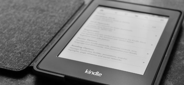
The device that your reader is going to view the PDF on is also important. If it's just their computer, then there's a certain degree of flexibility with regards to how they bring the file to their chosen PDF reader. However, should they want to use an eReader, it might not be such a simple task.
However, if that eReader is a Kindle, there's a particularly easy way to transmit your document. Find out the device's Send-to-Kindle email address by heading to Manage Your Content and Devices > Settings > Personal Document Settings > Send-to-Kindle E-mail Settings. Just email the PDF as an attachment to that address, and it will be available for viewing on the Kindle.
Do you have a great tip for users looking to make their PDF documents accessible? Let us know about it in the comments section below.


