One thing I love about the Internet is how it perennially exists in a state of evolution, adopting new ideas and discarding ones which have ceased to work.
Take Flash, for example. From the mid-90s to the mid-2000s, it was the dominant tool used to add interactivity and panache to websites. Countless security vulnerabilities and the mass adoption of touch-screen mobile devices later, Flash has faded into irrelevance, declining both on the desktop and being a non-player in the mobile field.
Another concept which is being heavily challenged by the rise of the touch-screen device is traditional menu and multiple-page based website design. Given that a significant amount of web browsing is done on screens of ever shrinking sizes, this doesn’t really work as well as it used to.
Enter The Single Page Layout
The single page layout is one which eschews having multiple pages, each encapsulating a piece of text or some media. Instead, we use a single continuous page which contains absolutely everything.
This design paradigm has found countless fans within the web developer community, and has found itself used in a variety of settings, including marketing pages and personal portfolios. This adulation has had the effect of spawning countless Javascript libraries, which make it easy to create single page websites (of which my favorite is fullPage.js). But why? What makes this paradigm work? Here are three reasons why.
You Can Create A Narrative
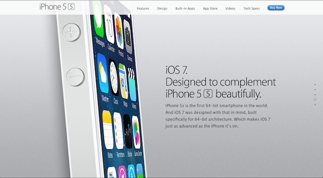
Don’t be confused. Stories are everything. Take, for example, Apple’s official website for the iPhone 5s. This uses the single page paradigm to its fullest, and shows how you can create a captivating story with using this design paradigm.
When we first browse to the iPhone 5s’s official site, we are first told that the iPhone 5s is ‘Forward Thinking’. As we scroll down, we are told that Apple’s latest Instagram device has been meticulously considered and precision crafted. As we scroll down further, more information about the design and development of the phone is unveiled, painting a picture of vigilant craftsmanship and quality. Eventually the page reaches its climax, and we see its call to action, where we are told how we can buy this miracle device. Would we be able to create the same flowing, linear narrative if we were using separate, individual web pages? Perhaps not.
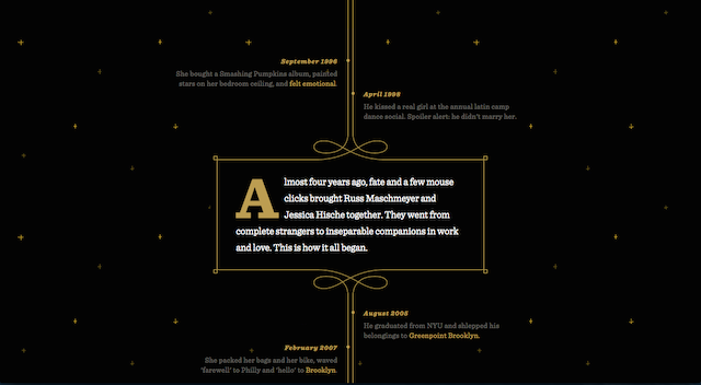
Perhaps my favorite example of how the single page layout can be used to tell tales is seen on jessandruss.us. This site was created to invite their friends and family to their wedding, and uses parallax scrolling and all kinds of javascript trickery to tell their story of how they met and fell in love. It’s ridiculously charming, and you totally should have a look.
It Will Make Your Copy Better (And Your Readers Will Love It)
I did some web design consultancy recently. The customer I was working with wanted a website being created for their small business. He had emailed me a 365mb ZIP file which contained a massive cache of photos and copy. I’m not just talking about information that was immediately pertinent to the business, but a biography about each individual staff member. Company news. Just… Fluff.
My immediate reaction was ‘his customers don’t care about this’! I was also concerned about how it would effect the layout and flow of his webpage, which was using a one page design. After a bit of negotiation, he acquiesced and let me take a sharp knife to his copy where I took great pleasure in exorcising all extraneous blubber.
The end result was that his website only offered information that the customer would find useful, and nothing else. Choosing a single page design forced us to write copy that was incredibly concise and as a result, phenomenally readable.
It Works Well On Mobile Devices
Confession time: I have fat fingers.
Seriously, I do. At times, they look more like Vienna sausages than they do actual human appendages. As a result, browsing the Internet from the modest screen of a mobile device often sends me into fits of tumultuous rage, as I frequently click links I didn’t intend to by accident.
This rage is compounded when I come across most website navigation bars which simply don’t work on mobile devices. Some simply aren’t optimized for smaller screens. Perhaps the worst navigation offender is where menus exist buried within menus, and can only be reached by hovering with your mouse on an area of the page. As you can imagine, this doesn’t work on touch-screen devices.
Simply put, the old paradigms of website navigation no longer work as well as they used to. The beauty of single page web design is that it reduces navigation to one of two directions - up or down. On most mobile devices, this can be expressed by a single push of your finger in either direction, resulting in navigation that is incredibly intuitive.
Conclusion
I’m quite fond of single page websites. As a natural storyteller, I love how they make it easy to construct engaging narratives which immediately grab the attention of the reader. If you’re looking for inspiration, check out One Page Love, which is a comprehensive compendium of websites using this captivating paradigm.
Will your next website be a single page website?
Photo Credit : Code (Nigel Pepper)


