If you're like me, you love the idea of Excel charts and can think of dozens of useful applications for them. But what happens when you need to add more data? It can seem like a lot of manual work to make changes. Well, no more! I'm going to show you how to make a graph in Microsoft Excel that updates automatically.
Once you set it up all you'll have to do is add data to the spreadsheet, and the chart will automatically graph it.
All you do need to understand are the fundamentals of Microsoft Excel charts to get started.
Why Use Excel Charts?
Charts allow you to use data in Excel to make decisions. They're a nice change from staring at rows and columns of numbers.
They help shorten the decision-making process, as you can immediately see your results and where changes may need to happen. The difficulty in handling data and charts is that you constantly have to go back to the chart and update it for new data.
Creating charts in Microsoft Excel may seem intimidating, but it's easy to create a chart in Excel and even one that updates automatically.
1. Set Up an Excel Spreadsheet
To create a chart that will update automatically you need to set up a spreadsheet that can house the data you want to use. The formatting is important because you want to be able to add more data without having to re-arrange everything.
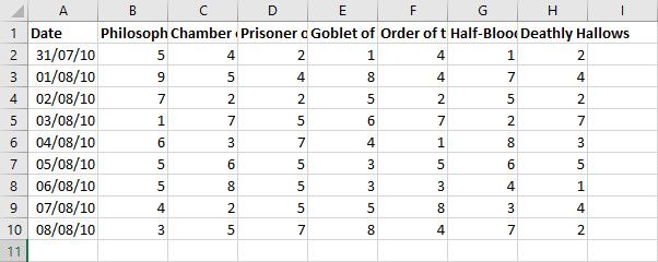
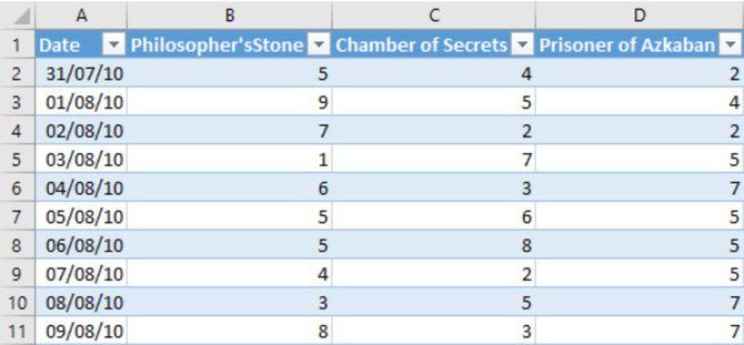
Here is a basic layout with some neat formatting:
Input your information and make sure that each column has a header. The headers are important for labeling data in your table, and your chart.
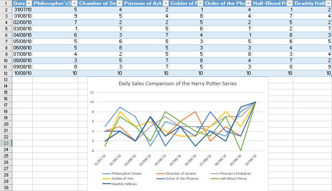
For this project, I'm creating a chart that tracks sales of each Harry Potter novel at a bookshop.
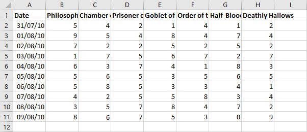
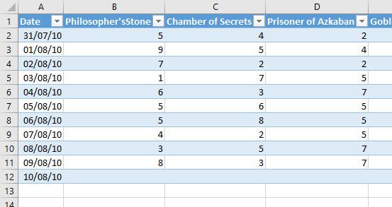
This format works best because you can extend entries into new rows below. In this example, as new sales data is recorded you would add it to the spreadsheet starting in row 11. Here is the table with a new row added to show how easy it is to add information.
Now that the range is formatted, headers are labeled, and data is filled, you're ready to move on to the next step.
2. Create a Table
In Microsoft Excel, tables a powerful way to work with a range of data.
In addition to making your data look neat and tidy, they have many more tools to organize and sort your information. The goal here is to create a table that feeds data to a chart. Linking these two pieces together allows the chart to check for new data in the table and automatically update.
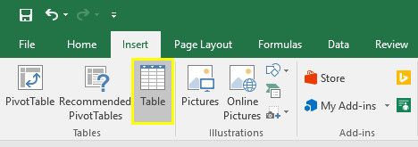
To create a table, select all the data you would like to turn into an Excel chart. Then head to the Insert tab and select Table. Alternatively, you can use the shortcut CTRL + T.
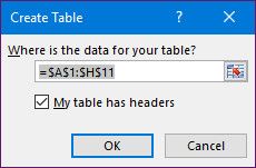
In the Create Table prompt, you can adjust the cells included in the table. Since you are using headers in the range, check the box labeled My table has headers, then press OK.
Your data will now be transformed into an Excel table! Notice the formatting change, which means it has been converted from a regular range. You can also change the color scheme if the default isn't quite your favorite.
Now that the information is neatly arranged in a table, it's time to create a chart.
3. Insert a Chart and Add Data
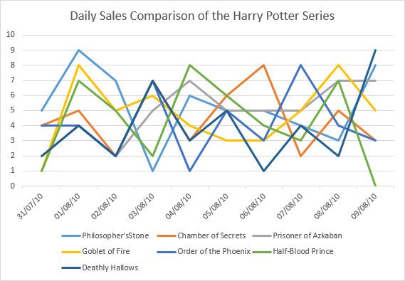
Highlight the table and head to Insert > Charts to choose what kind of visualization to use. The chart will depend on what kind of data you're working with. For my example, I'm using a line graph. This allows me to compare several different columns worth of data in one chart, and it works very well with automated updates.
Here is the line chart comparing the book sales by date, Excel will automatically color the lines for you. If you move your mouse over any point on the line, Excel will show you that value in your table.
Now we can test out how well our chart works by adding new data into the table. Fortunately, this is by far the easiest part of the process.
To add more data, simply add another row at the bottom of your existing chart. Since the Date column dictates the values on the X-axis of your chart you will want to start there.
The Excel table will match the formatting of previous rows, so your date will automatically match what you have entered so far. This is a neat feature built into Excel tables.
You may see a dialog warning you that the table inserted rows into the worksheet — this is fine. Your chart should have already updated to include the new entry on its X-axis.
Now you can add all your new data, and the chart will update automatically with the new information.
Above, you can see that I added a sales count of 10 for each book to prompt the chart to update.
Now you can update the chart over and over again, simply by adding more rows to the table. However, you may have to tweak its size and formatting to present all the data properly, depending on how much you're planning to add.
Make Microsoft Excel Work for You
One of the most powerful aspects of Microsoft Excel is the ability to create sheets that update automatically and save you time. This might be something as simple as creating a basic self-updating chart, as we've seen here. It might be something more challenging like learning how to make a box and whisker plot in Excel.
By putting in a little effort up-front, you can save plenty of time later on. Challenge yourself to learn something new in Microsoft Excel, and it will pay off in the long run. If you're wanting to try out some more charts, check out these six Excel charts to learn a little more.

