There are two terms that I hate when people talk about video – "cinematic" and "film look". Personally, I think it's such a variable term, and in a way, it's seasonal. What was the "film look" yesterday will not be the "film look" tomorrow. (But for some reason, it will always be 24 frames per second.)
However, there's a current trend today with video in which shadows tend to have deep blue look and highlights have a warmer, yellowish-red hue added. For those of you who are video hobbyists with a decent editor this will be a piece of cake. Granted, this is not territory for the iMovie or Windows Movie Maker enthusiast. Below, we're going to give you an idea of how to make all this work.
How To Make Your Social Circle Love You
Now, I'll be first to admit that in order to properly color grade (with matching hues and the whole nine yards), you wouldn't be coming here. You would be writing your own color grading blog while sitting in your mansion sipping wine with your super model wife on your right and your greyhound named Alexander on your left.
Colorists are probably some of the highest paid video professionals out there, and the science behind it all is super involved. Really, this is a quick and easy way to make your friends and family go "Oooh!" and "Ahhh!" and "When did Instagram do video?!"
The Real How-To
What you'll need for this quick edit is properly color corrected footage and some version of a Three-Way Color Corrector (I use Adobe Premiere's). Keep in mind that while shooting, it is best to use a flat picture style if you plan on color grading later. Here on MakeUseOf, we already have a few articles on color grading and even the Technicolor CineStyle mode for Canon DSLRs.
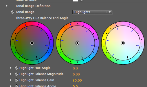
After laying a clip down on the timeline, go ahead and apply the effect to your footage. In the effect editor, it should look a little something like the image below.
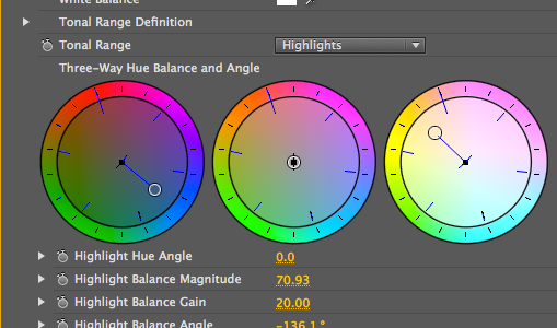
Above, you'll see that the colors are separated into three parts. The left color wheel is for shadows, the middle color wheel is for midtones, and the right color wheel is for highlights. Right now, for shadows, you should drag the center circle (or what have you) to the blues and for highlights, you should drag it to the yellows.
As for the midtones, I would leave it to your discretion based on what you believe is more visually appealing in the final footage. At this point, your color corrector should look a little bit like what we have below.
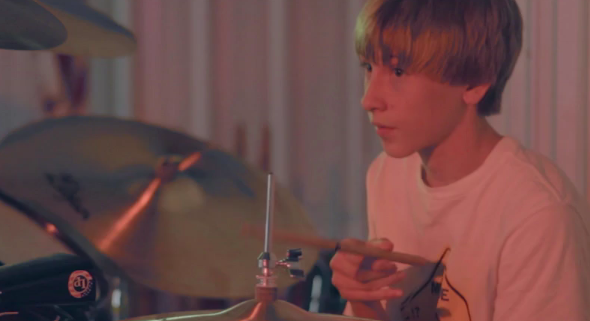
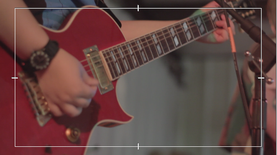
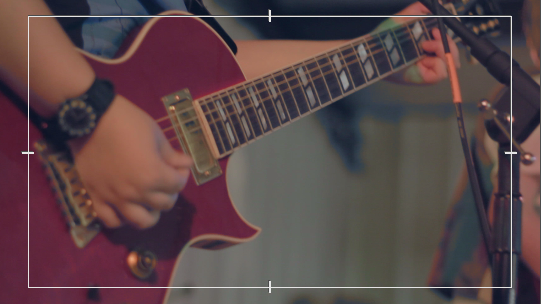
This was... surprisingly simple. After this, you should play around a little to see what suits your taste. Ultimately, this helped me make the before and after shots of the footage screencaps that you'll see below.
Before:
After:
It's a small change, but it adds almost a nostalgic feel to the video. Granted, the lighting conditions for the area we were shooting at were perfect for this style.
Some Tips
Personally, I think this color style works best with unnatural lighting (particularly reds and blues) with mostly dim spots mixed in. My reasoning for dims is that I really like how the blacks are turned to blues, so aesthetically, I prefer adding them in quite a bit. Basically, I would do it at concert-style settings where artsy shots are a must.
Furthermore, I've struggled with using the style in woody areas during the day. My best guess for this is that there is often a lot of green when in the forest, so with some tweaking (perhaps using a Curves tool) you may be able to knock down the greens a little.
Beyond this, while shooting, I want to reiterate how important it is to record your footage in a flat picture style. Also, shallow depth of field makes all this look really nifty.
Conclusion
So to the video hobbyist, I bring you another trick to stuff up your sleeve. It's a little easier than most, so I would love to see what you can do with it.
What other color styles do you like? Do you have any videos to share with us here at MakeUseOf?

