Google's new card-styled design concept has now come to Google Alerts. The understated alerts email service gets the same card-style layout that is now part of Google search results and Google Now on Google’s mobile apps.
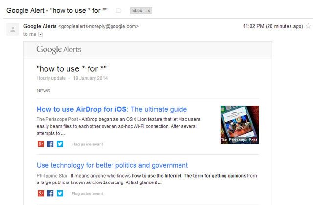
Searchengineland.com reports that the new alerts tells you the frequency of the updates, larger and more prominent headlines, and three newly introduced social sharing buttons for Google+, Facebook and Twitter. Also, on view is a useful “Flag as irrelevant” link that could help to fine-tune the alert search results with user feedback.
It can be said that the new design concept has arrived late to Google’s much-used automatic monitoring tool, even as people were beginning to write it off. The new look is cleaner and more user-friendly. The changes have been rolled out without much ado, so here’s a snapshot from my own mailbox that displays the new layout.
Google quite obviously is reaching for consistency across all its offerings. It’s good to know that Google Alerts is getting some attention that underscores its importance. Do you use Google Alerts regularly? What do you feel about the little changes?
Source: Searchengineland


