Typography can make or break a presentation. You can work for hours on templates and colors but if you choose illegible or funky fonts, it can hurt your presentation.
In a professional setting, it’s important to choose fonts that convey a sense of seriousness while still being playful. This balance is tough to achieve. However, the following free Google Fonts are perfect for professional presentations, whether you create the presentations in PowerPoint or one of its alternatives.
Serif Fonts vs. Sans-Serif Fonts
Fonts (or typefaces) are mainly divided into two categories: serifs and sans-serifs. Serif means tail in Latin. A serif font is one which has strokes at the ends of the letters. Times New Roman is the best example of a popular serif font.
Sans stands for without. So, sans-serif font is a font without strokes at the ends of the letter (think Helvetica or Arial).
For a professional office presentation, it’s best to go with a sans-serif font. But some new-age serif fonts can also work quite well for title slides. They perfectly complement modern sans-serifs. If you’re curious, read our guide to typography terms to understand them better.
1. Playfair Display
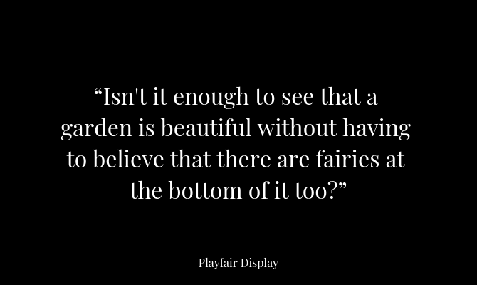
Playfair Display is a serif font with a bit of flair. It can be traced back to the Age of Enlightenment in Europe during the late 18th century when broad nibs were replaced by sharp steel pens. This gives Playfair a graceful, feminine twist. A stark contrast from boring serif fonts like Times New Roman.
Playfair Display makes for an elegant header text for presentation; especially when paired with pastel color backgrounds.
Pairs well with: Open Sans
2. Arvo
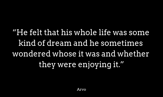
Arvo is a slab-serif font designed for perfection. It’s a geometric typeface that’s a mix between classic and modern. Arvo Regular is a thin, modern version of the slab serif, While Arvo Bold has a thicker stroke and sharp corners.
Arvo Bold works best in bigger font sizes, as a title for business or corporate related presentations. When paired with the right colors, Arvo can be quite powerful.
Pairs well with: Lato
3. Crimson
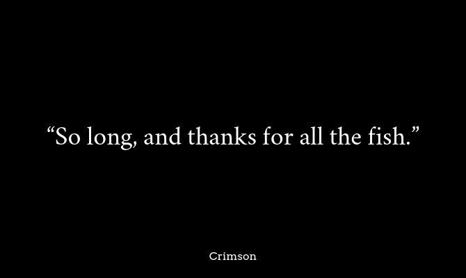
You can’t say this about many fonts but the Crimson font is quite simply beautiful. If you’re trying to dazzle your audience with a classy-yet-fun presentation, consider using Crimson for titles and subtitles.
Crimson is a sans-serif font inspired by the Garamond font, but it goes beyond that. It is a modern take on the traditional old style fonts and is designed from the ground up to look good on screens and websites. If you’re tired of using Times New Roman in a presentation, switch to Crimson.
Pairs well with: Montserrat
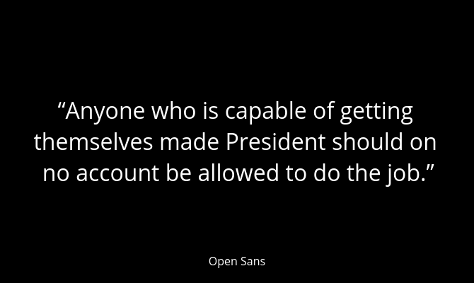
4. Open Sans
When preparing to make a professional presentation the first rule is to avoid a wall of text. Even a list of bullet points can be a little too much. But if you need a couple of lines to explain something, or if you’ve got a long quote in the form of a slide, try using Open Sans.
Open Sans is an open-source humanist sans-serif font. It is the typical workhorse of a font and will work well in almost any circumstance when paragraph text is used. It is a comfortably legible font, even at small sizes. The semibold version of the font works just as well as a title font.
Pairs well with: Raleway
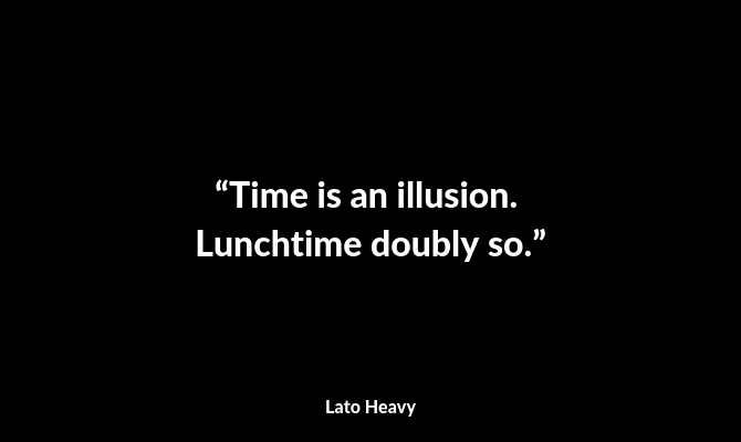
5. Lato
Lato means Summer in Polish and this font truly feels like a draft of the early Summer breeze. When you look at the font closely, it’s astonishing that a font with such attention to detail is available for free under the open-source license.
Lato was commissioned as a font by a large corporation which later decided to go in another direction. Lato was then turned into a free font. And you can see its corporate roots here. The font is playful with its semi-rounded details, but in a way that’s still professional. Lato font family is quite varied, starting from the Hairline version all the way to Heavy and Black.
Since Lato was designed to be a versatile font, it can be used as paragraph text and as title font as well.
Pairs well with: Open Sans, Raleway
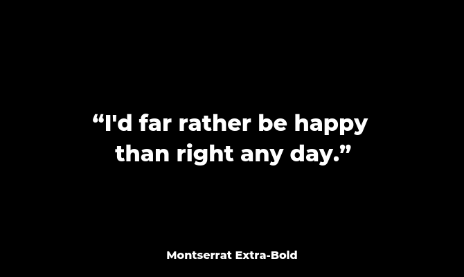
6. Montserrat
Montserrat set in Extra Bold is the perfect way to convey youth and forward-thinking in a professional presentation. Montserrat is a font you’ll often find in the landing pages of technology startups. The font is inspired by old posters and signs from the Montserrat neighborhood in Buenos Aires.
Thanks to its geometric shapes, Montserrat is one of those fonts that pairs very well with other sans-serif fonts. For example, Montserrat in Bold will work well with Open Sans and Lato.
Pairs well with: Open Sans
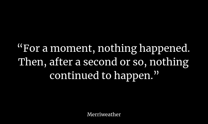
7. Merriweather
Merriweather is a serif font that was designed for reading on screens. It’s a traditional serif font but it has more room to breathe. The letterforms themselves are condensed, with a higher x-height, leaving more room between letters.
Pairs well with: Open Sans, Roboto
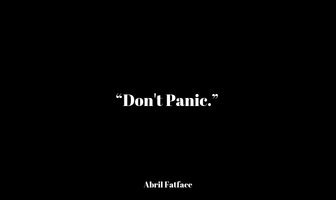
8. Abril Fatface
Abril Fatface is part of the larger Abril family which has 18 different typefaces ranging from Display to Text versions. The Fatface version is not for everyone. In fact, it’s more of a stylistic choice.
It has thick, swooping strokes coupled with thin serifs. This gives the font a unique personality and a powerful presence on the screen. Its serif roots give it gravitas while the tilting stokes give it a sense of playfulness. If you want your text to stand out while still maintaining a professional look, try using Abril Fatface as the title font.
Pairs well with: Raleway, Open Sans
9. Ubuntu
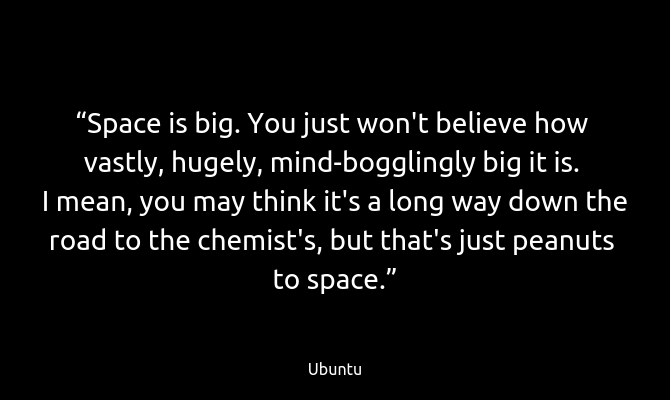
Think of Ubuntu as the stylistic version of Open Sans. It’s also an open-source humanist sans-serif font. Its development was funded by Canonical, the company behind Ubuntu Linux (which is one of our favorite distros).
While Open Sans has symmetrically rounded edges, Ubuntu curves strokes from a single edge. This is most evident in letters like "u" and "n".
Pairs well with: Open Sans, Raleway
10. Raleway
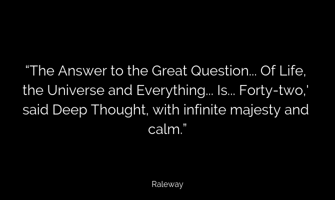
Raleway brings the elegance of a serif font to a sans-serif font. It’s a thin font designed to be used for headings, making it the perfect font for title slides.
If you find the regular version to be a little too thin, then you can try out the semibold version.
Pairs well with: Roboto, Merriweather
Learn the Art of Font Pairing
The most important aspect of designing a presentation is not overdoing it. Just select one or two fonts and use them across the entire presentation. The same goes with color and the template as well. Keep things simple and consistent.
If you’re still coming to grips with the different types of typography, and you’re confused about serif and sans-serif fonts, just pick a simple sans-serif font like Open Sans and stick with it.
Once you’re comfortable playing around with type, you’re off to the races. Try different combinations of sans-serif and serif fonts. Pair Crimson with Lato or Playfair Display with Open Sans and see if it works.
Font pairing can be done quickly and easily online. You don’t even need to download all the fonts on your computer. Use websites like Google Fonts and Font Pair to find the perfect font pairing for a presentation.

