For the past few months, you may have noticed a new look for your Facebook web app, featuring a dark-themed sidebar. Well, if you didn't like that, there's some good news: that was only a beta test and Facebook is finally rolling out its new News Feed design without the sidebar.
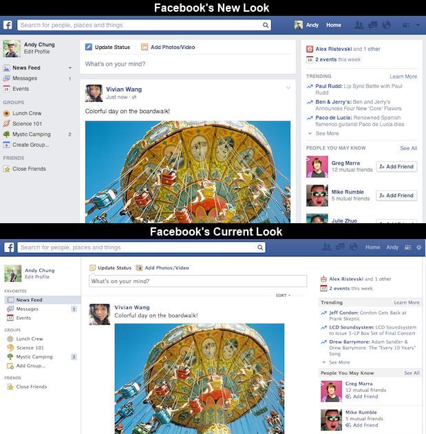
Instead, the new Facebook looks a lot like the old Facebook, with the sidebar almost untouched. The big change is in the main News Feed itself, which now features the larger images first shown in the beta and a new font for easier reading. This whole look is also more consistent with how the mobile app looks.
Here's a quick look at the old and the new:
Facebook explained the decision in a blog post: "People who tested (the experimental beta design) told us that they liked the bigger photos and images, but found it more difficult to navigate Facebook overall. The updated design has the best of both worlds: it keeps the layout and navigation people liked, but offers bigger images and photos, as well as a new font."
This redesign only affects the look of the content, not the nature of the content or the algorithms. But Facebook has been making an effort to clean up the News Feed as well, such as the recent decision to cull viral and sensationalist content.
The new updated Facebook design should be rolling out in the next few weeks, so if you get it, let us know what you think about it.
Source: Facebook | Image Credit: mkhmarketing via Flickr


