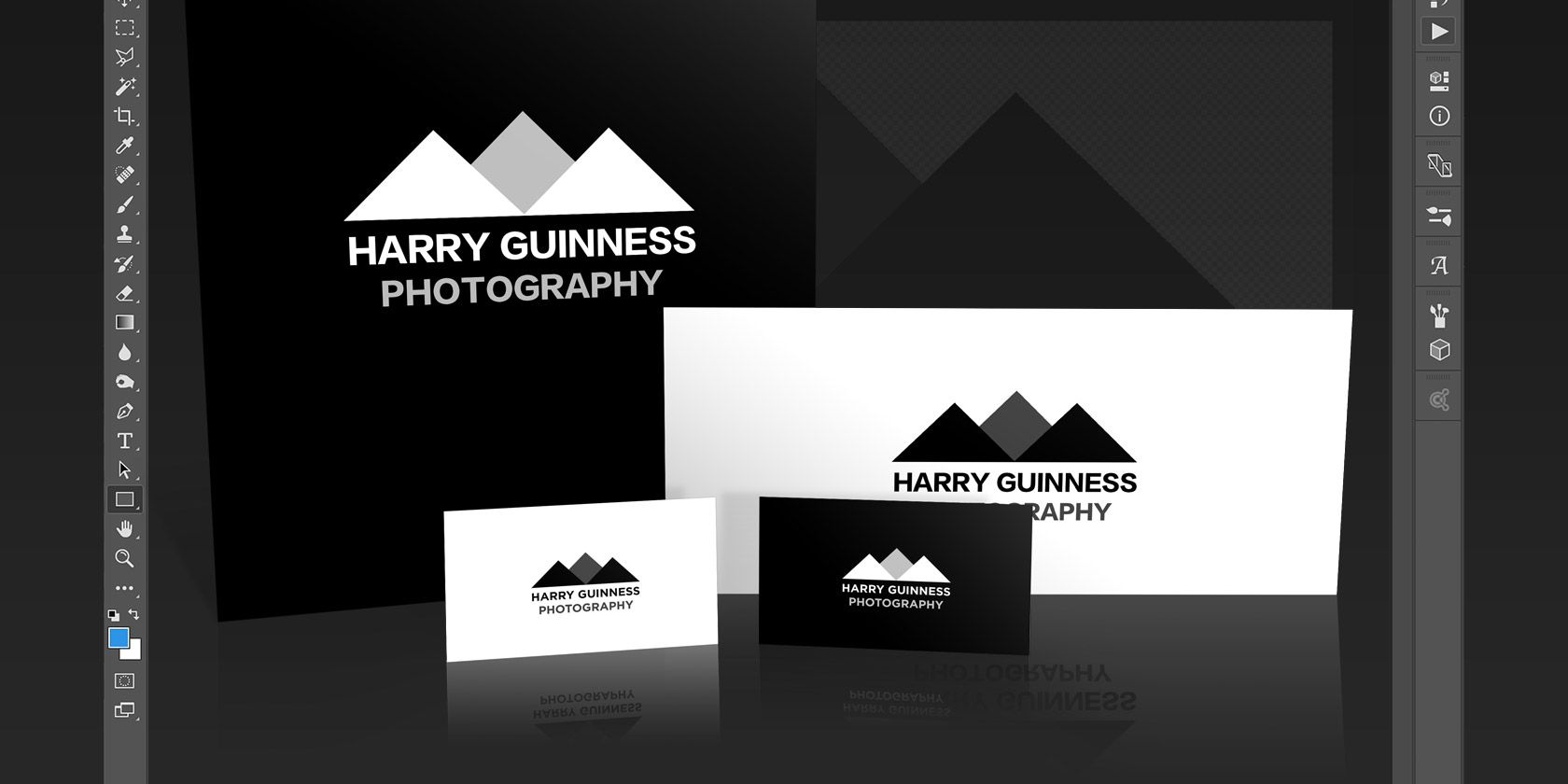
Photoshop can do a lot more than just edit photos. It's not quite as powerful as Illustrator or InDesign but it's still more than capable of simple design work. Today I'm going to show you how to make a simple geometric logo in Photoshop.
Clean, modern logos are easy to create and look great. If you have a small business and can't afford a professional designer, it makes sense to put something together yourself. I'm going to create a sample logo for my adventure photography business. You can then use all the tools and tricks I show to make your own.
In the short screencast below you can see me work through the process of creating my new logo; read on to find out exactly what I'm doing.
Coming Up With Ideas
The hardest part of logo design is coming up with good ideas. I do a lot of adventure photography during the winter so I wanted my logo to represent that. I brainstormed different concepts and came up with the idea of using simple geometric triangles as mountains. This would give my logo a clean, modern look while still having the outdoor vibe I wanted.
When you're coming up with ideas for your logo, think about what you want it to represent. Sketch out a few ideas on a sheet of paper — it's faster than using Photoshop — and play around with different shapes. Circles, squares, triangles, and other, more complex shapes are easy to work with and combine in Photoshop. I'm just using three triangles but you can use whatever combination of shapes you like.
Once you have an idea of what you want the logo to look like, it's time to jump into Photoshop.
Step One: Setting Up the Canvas
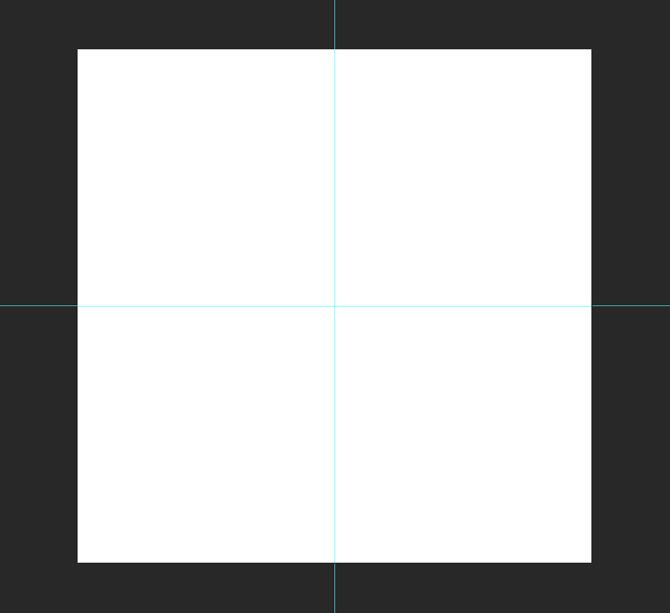
Start by creating a new document. For my logo, I created a 1000 pixel by 1000 pixel square canvas. This gives me enough flexibility to work through a couple of different configurations.
Next, you need to create some guides to make positioning the logo elements easier. Go to View > New Guide and create both a Horizontal and Vertical guide at 50%. You can create more guides if you need to.
Step Two: Building the Base Shape
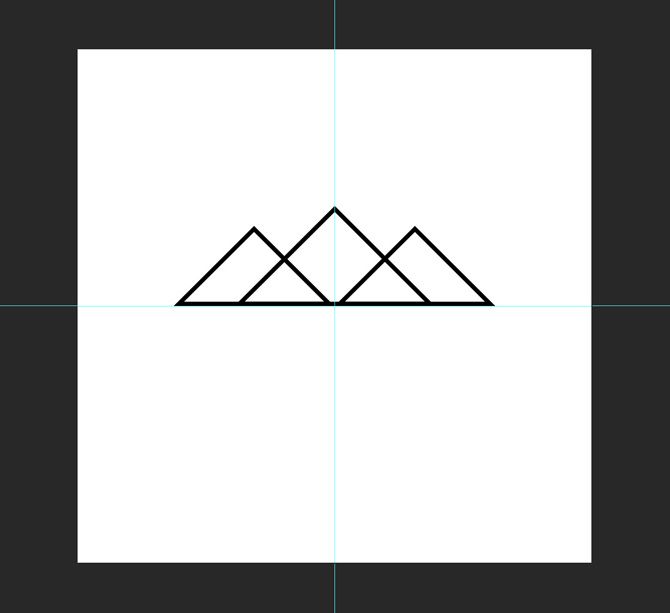
For this logo, I'm using three right angled triangles. The easiest way to create them is to start with a square.
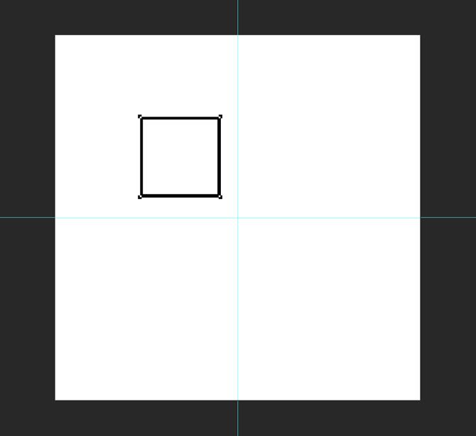
Select the Rectangle Tool (its keyboard shortcut is U) and make sure Shape is selected. Hold down the Shift key to confine the proportions and draw a square roughly 220 pixels a side anywhere on the canvas.
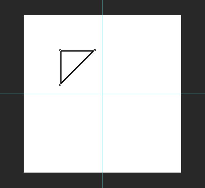
Next, grab the Pen Tool and click on the bottom right anchor point of the square you just drew. This will delete the anchor point and turn the shape into a right angled triangle.
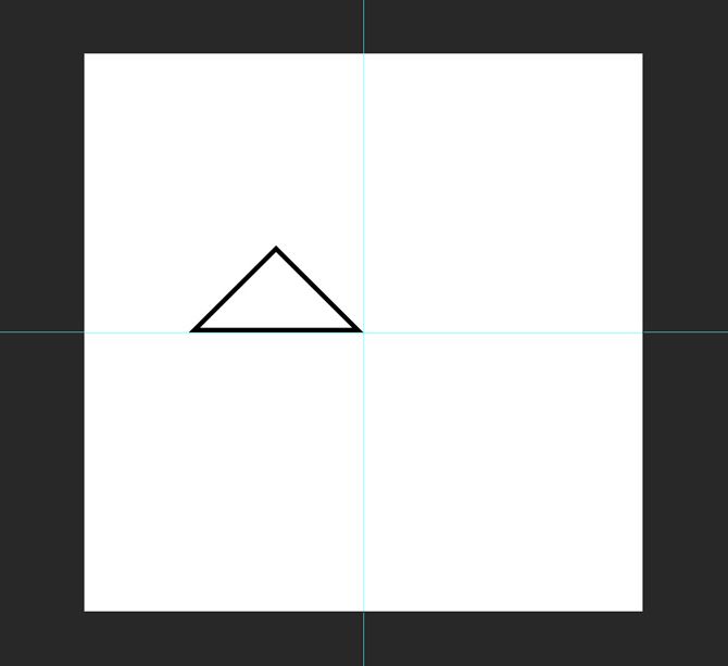
Use the keyboard shortcut Command- or Control-T to transform the triangle. Rotate it so that the right angle is pointing up.
With the move tool (the keyboard shortcut is V) position the triangle so that it's right corner is in the center of the canvas.
Step Three: Positioning the Shapes
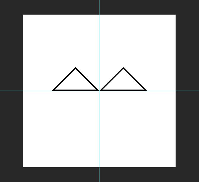
Now that the base triangle is built, select it and duplicate it (Command or Control + J) twice.
Take one of the copies and, with the move tool, position it so that its left corner is in the center of the canvas touching the other triangle.
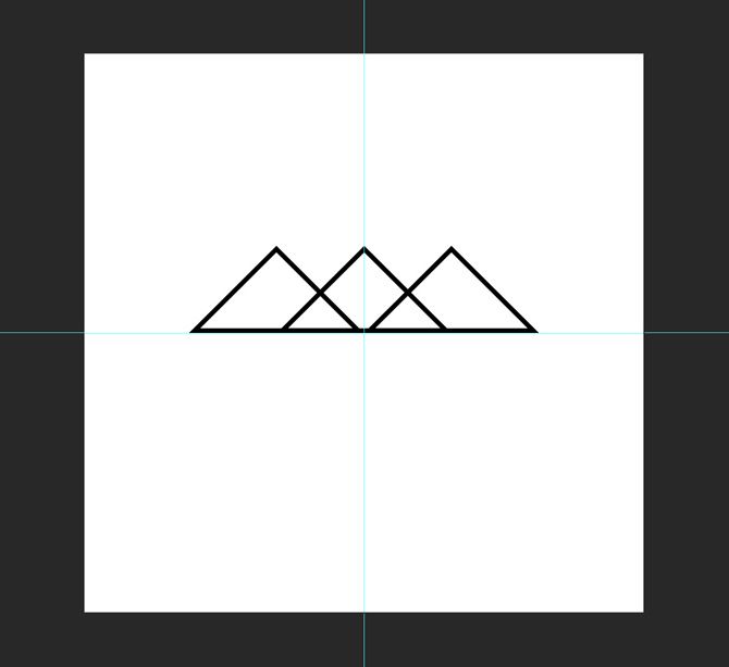
Select the other copy and transform it so it's 125% larger vertically and horizontally. With the Move tool, position it so its base is aligned with the other two triangles and its top corner is positioned on the center guideline.
Step Four: Coloring the Shapes
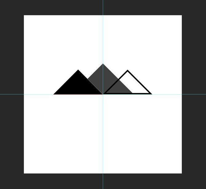
To create a sense of depth, I want the closer mountains to be darker than the one in the distance. Select the Rectangle tool and then select one of the foreground triangles. Change its Fill and Stroke to black. Do the same for the other foreground triangle.
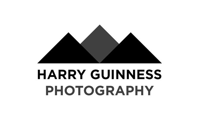
For the background triangle, change its Fill and Stroke to a dark gray. I used #404040. If the background triangle appears above either of the foreground triangles, drag it to the bottom of the layer stack.
Step Five: Adding the Text
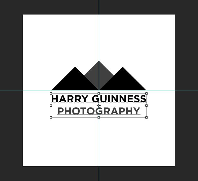
With the actual logo shape made, it's time to add the text. With the text tool (the keyboard shortcut is T) click somewhere on the canvas and enter the name of your business; for me, it's Harry Guinness Photography.
Center align the text and choose a font that fits the look you're going for. I went with Gotham Bold in all caps. With the Move and Transform tools, position the text so it works with the logomark.
To finish and tie the text and logomark together, I changed the color of Photography to the same dark gray I used for the big triangle.
Step Six: Try Some Different Variations
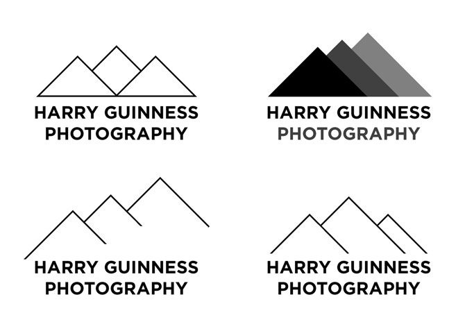
The secret to good logo design is trying loads of different variations. You're unlikely to stumble on the perfect logo first time. When I was working on this logo, I tried a load of other variations around the same idea. You can see them below.
Some of the variations will work, some won't. The trick is to combine all the bits that do work. Once you've got your first variation done, go back in and see what changes you can make. If you've used color, try it in black and white. If you've just used outlines, try it with shapes and vice versa. Keep experimenting until you've something awesome.
Wrapping Up
Photoshop is such a powerful program, there's very little you can't do with it. Creating a simple logo uses only a fraction of the design tools available. If you're interested in learning more advanced design skills, check out these great courses.
I'd love to see any logos you create by following along with this article. Share them, and ask any questions you have, in the comments below.

