Logos are everywhere, all around us. Just look at what you're wearing---chances are you've been branded like a Nascar pony without even realizing it. And now it's your turn to add to the mix, because you've been asked to design a logo.
Before we go too much further, let's talk about what exactly you've been asked to do. For starters, what, exactly, is a logo?
The Elements of a Logo
A logomark is a graphical element that represents something about a company and the associate brand. Most logos are made of two elements: the logotype and logomark.
The logomark is the illustration or graphic.
The logotype is a typographic treatment of a word or phrase. Most logotypes have been stylized in some way, but there are those which have been crafted from unadulterated type, or are even created by hand. The qualities displayed in the logotype also speak to the brand and the message.
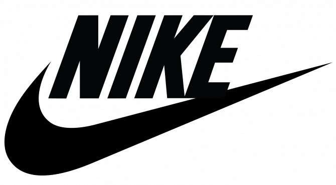
Let's use the Nike logo as an example:
Nike's logo is made up of two distinct elements, the swoosh and the word "Nike." The swoosh is the logomark, while "Nike" is the logotype.
So what do these things represent? The swoosh logomark represents the wings of Nike, the Greek goddess of victory. But the swoosh also embodies much more about the Nike ethos: speed, grace, power, agility, or the face of that kid that blew by you on the soccer pitch.
The stylized "NIKE" is the logotype. Nike's logotype leaves no doubt that the brand is all about confidence and courage.
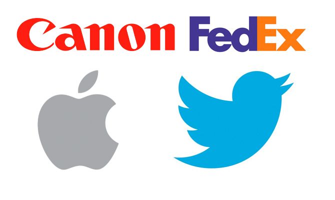
Some brands opt for just one or the other. Apple and Twitter chose the logomark, for example, while Canon opted just for logotype. FedEx went with the logotype, but in a way that creates an additional shape, creating an arrow out of the negative space between the E and the x.
Creating a Strong Logo
There's no way you can know all the different ways that your logomark may be used in the future, but there are some things you can do now to make sure your work endures.
1. Logotype and logomark independence. It is important that the logotype and the logomark work together to bolster the brand, but it is just as important---if not more so---that they each be able to stand on their own.
Think about it; you don't need to see anything other than that swoosh to know what brand of gear you're looking at. And how many times have you seen sweatshirts with just "Nike" emblazoned on them?
All the best logos are made of elements which can fend for themselves.
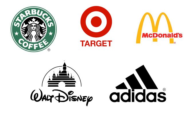
Here are a few more examples of logos you would still recognize without any text:
2. Strive for simplicity. Look at a collection of famous logos. Chances are that they are all relatively simple marks. You're not likely to find too many colors, gradients, myriad line weights, or overly complex shapes among the bunch.
3. Anticipate its usage. Think about how your logo is likely to be used. Will it be tiny, on the side of a building, on a hat, on a cake, on a screen, or somewhere else? The simpler your mark, the easier it will be for it to meet all these challenges without falling apart, or even worse, costing your client an arm and a leg to reproduce.
The Starbucks logo, for example, appears on signage, packaging, and much more.
Why Create Your Logo Using Illustrator?
That rule of simplicity brings us to the crux of this article, and what you probably came here for: Adobe Illustrator. Yes, there are other programs that will do some of what we are about to discuss, but none of them will handle the job with the same level of universal confidence and ease.
Using Adobe Illustrator to design your logo is smart for a number of reasons, but let's focus on the biggest one: vectors.
When you work within Illustrator, you are working with vectors.
Put simply, vectors allow you to draw using math. Don't worry, you won't have to know what a sine is or able to define a bezier curve; the program will do all that messy computation for you.
All you need to know is that when you design with vectors, you're designing with precision, and your work can be resized to any size without losing a bit of detail. That means that a given vector image can be a small as an index card, or projected onto the face of a building, and it will look exactly the same.
This mathematical precision gives you, the designer, an astounding level of control over your work. You can control line weights, perfect curves, round corners, edit typography, and so much more.
Steps for Creating a Logo
There's no right way to create a logo. Some designers jump straight into pixel pushing, some sketch on paper first, and there's probably at least one who dabbles in black magic to get things going.
Whatever path you choose, make sure you keep track of your work, label your layers, and keep the brand's message in mind.
This is the method we suggest:
1. Do Your Research
Look at other logos in the industry and design trends in the field. You don't want a logo that looks like everyone else's, but you also don't want to stick out for the wrong reasons.
2. Understand the Mission
If this is a logo for someone else, talk to them and understand what they want to achieve. Also be sure that you're both on the same page in terms of deliverables.
Does the client expect multiple file formats? Do they expect different sizes for use on social media? How many revisions are you willing to make? What is the deadline? All these things should be worked out beforehand.
Aside from the logistics, for a smooth and successful experience you need to understand their brand: what product or service does the company offer? Who is their target audience? Who are their competitors?
If it's a logo for yourself, make sure you have a clear idea for yourself of all the things that you would ask a client. Think about colors, aesthetic, and mood---all of the things the client should convey to you, or that you'll need to figure out yourself.
3. Start on Paper
If you're overwhelmed by Illustrator or digital design, start on paper. Everyone can sketch out an idea with a pencil or pen. A blank piece of paper can be less intimidating than a blank screen. Sketch a few different ideas. Having multiple options is good, especially if you're dealing with a client.
4. Move to Illustrator
Now it's time to replicate and refine that design in Illustrator. In the next section of the article, we'll go into more detail on the actual how-to that goes into creating a logo in Adobe Illustrator.
5. Present, Revise, Deliver
The final step is to present your work to the client, take on their edits, and deliver the final product based on your prearranged deal. We would suggest showing no more than three to five strong options to a client.
This logo could become a part of your portfolio and you want to be sure that the work that you present always represents who you are as a designer.
Designer Aaron Draplin has a great video on his logo creation process which you can view below:
Creating the Logo in Illustrator
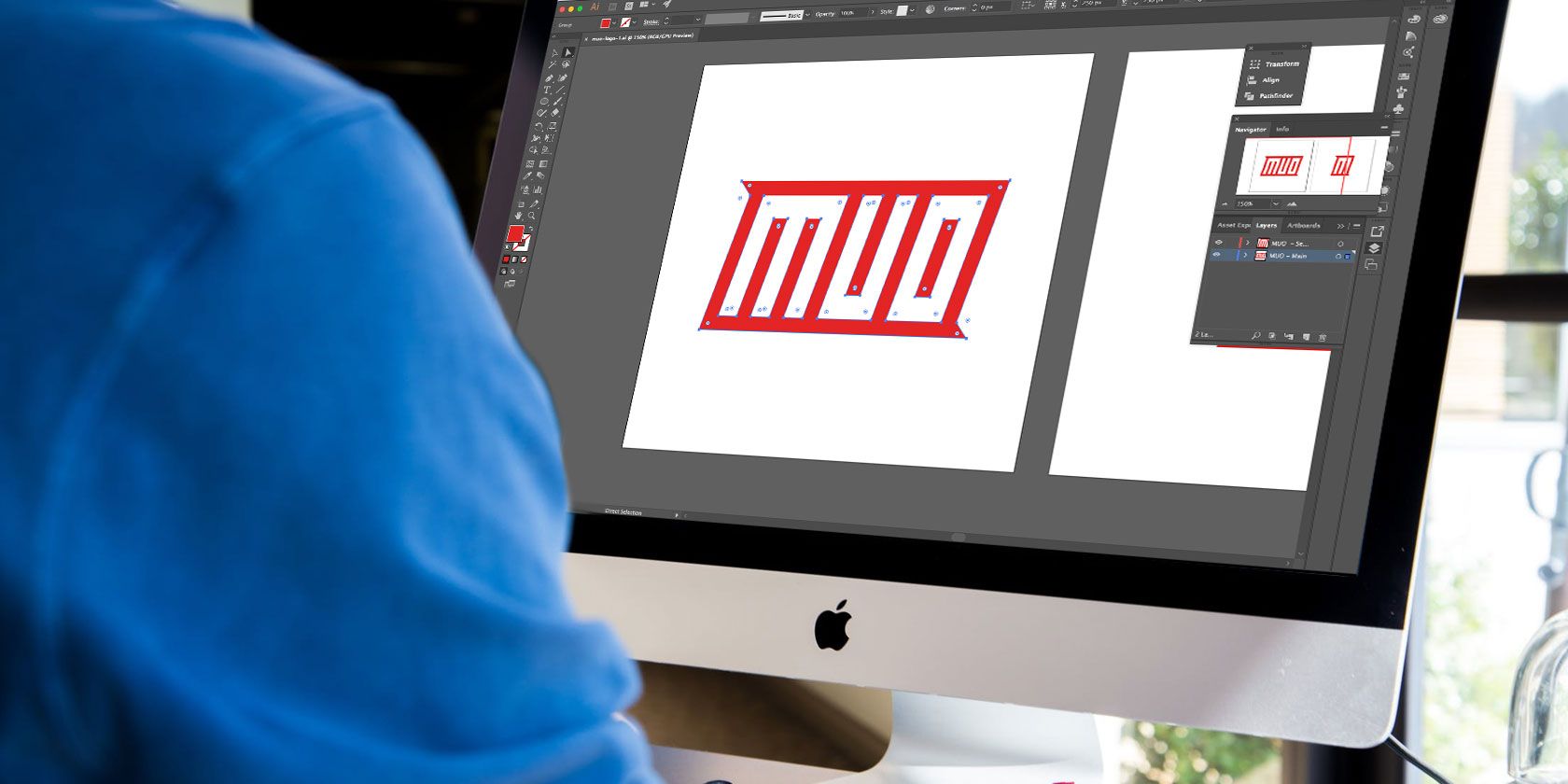
Adobe Illustrator can be a little overwhelming at first with its many panels and more, but once you learn how to use the program, there's a ton you can do with it.
Watch the video below to find out how to get Illustrator set up for logo design:
There are several tools you can use in Illustrator to create the shapes and text that will make up your logo. This is a good place to start if you're just getting started with design.
The Shape Tool
Using the keyboard shortcut M or clicking on the shape tool in the Tool Menu, you can create rectangles, rounded rectangles, circles, polygons, and stars.
The video below is a great introduction to the Shape tool for the complete beginner:
The Pen Tool
One of the more challenging tools to use in Illustrator, the Pen Tool (Keyboard shortcut P) is great for creating free form shapes.
You can use the Bezier Game to help you understand exactly how the Pen tool works.
The Line Tool
Add thin or thick lines to your design using the Line Segment Tool (Keyboard shortcut \) by adjusting the stroke size.
The Type Tool
Add your logotype using the Type Tool (keyboard shortcut T).
There are lots of sites that make it easy to find the perfect font, but be sure to adhere to the font's license, particularly if this logo relates to a commercial venture.
With the Type Tool, not only can you select your typeface, you can also adjust the spacing between the letters (kerning) and the spacing between lines (leading).
The Create Outlines Tool
Remember how I mentioned that Illustrator is great for logos because it allows you to create vectors? If you want to vectorize your text, you can do this by right clicking the text and selecting Create Outlines.
Only use this tool when you're sure that your text looks exactly the way you want it, or if you plan to move the letters individually. Creating outlines out of your type means the text is no longer editable.
It also means that if you need to share a logotype with someone who doesn't have the font you used, it won't matter.
Alternatively, you can use this feature to resize or move letters closer or further apart without having to go into the Character panel.
Shape Builder Tool
If you want to create your logo entirely out of shapes, The Shape Builder Tool (Shift + N) is your new best friend. You can use this to combine shapes in a powerful way.
It does require you to be able to look at a series of shapes as more than just shapes---there are endless possibilities when you think about combining shapes or remove parts of overlapping shapes.
You can see exactly how the shape builder can be used in logo design in the video below:
Pathfinder
If you find the Shaper Tool confusing, the Pathfinder panel (Windows > Pathfinder) offers an easier, but less robust, method of combining and subtracting objects.
The Color Tool
When you know what colors you're working with, you can create a color palette in Illustrator and keep it on hand. When you want to change the color of an element in your design, having that swatch ready to go means you can just use your eyedropper tool to easily change the color. See this in action in the video below:
Versioning Your Logo in Illustrator
Aaron Draplin also has some great advice for your process in Illustrator. He recommends creating a shape, duplicating it, working off of the second shape, and continuing to do so throughout your entire design process.
This way you can easily step back to an earlier stage of your design if you're unhappy with your progress. It also allows you to easily build multiple versions of a logo starting from different points.
See It All Come Together
You can see most of these tools come together to create a logo in under a minute:
What If You Don't Have Illustrator?
Adobe's products are expensive. If you're looking to start a career in design, you'll probably want to invest in a Creative Cloud account. But if you're just looking to create a one-off logo, there are alternatives to consider.
You can create a logo with Microsoft Word or with free online logo generators. A few online and desktop alternatives to Illustrator will offer you a similar capability.
Plus, you can get Photoshop and Lightroom for a lot less than the entire Adobe CC suite, so you could use Photoshop instead to create a logo. Just don't forget that Photoshop uses pixels so your design won't be scalable.
Want to create other types of visuals quickly? Try PicMonkey for powerful design and photo-editing tools.


