The power of a good graph is undeniable. Taking numerical concepts and displaying them visually can make all the difference in whether someone grasps your idea or not.
Charts and graphs do not need to be complicated. Remember the graphs you made in Excel when you were nine? Exactly! Comic Sans in lime-green is not the way to go. However, we can make this right for you now. Here's how to make good graphs in Excel—even for boring financial spreadsheets.
We are using publicly available UK government data. Obviously, if you have your own data, please feel free to use it.
The Quick Graph Use Outline
One of the biggest crimes against any chart or graph is its improper use. Here is a jolly quick outline of what to use, and when:
- Use a line chart to display and emphasize trends in data over time
- Use a bar chart or pie chart to compare categories, though the latter usually compares parts of a whole
- Use an area chart to highlight the change of values over time
- Use a scatter chart to plot multiple data points
These cover the core charts you may encounter, and equally, the charts you are most likely to use. There are other chart types—bubble, sparkline, bullet, and more—but we're not focusing on those today.
Formatting a Line Graph
This table shows us UK Population Change from 1951-2011. A precursory look shows us that, yes, the population has grown throughout the last 60 years. But we have a few variables to look at, and it is easier to visualize the mass of numbers using a graph.
One of the best graphs to display trends throughout the passage of time is the line chart, allowing us to display a range of data points and specific categories.
I've highlighted the first two columns.
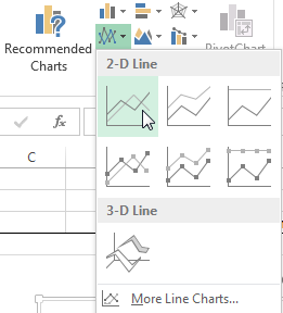
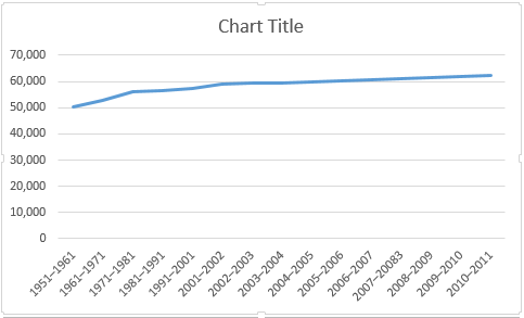
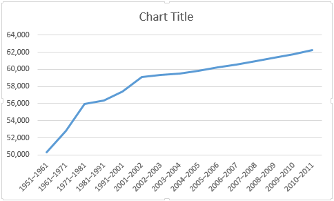
Now, head to the Insert tab, and select Insert line chart—it's the small box with plotted lines. You should now have a nice new plain chart. From here, you have two options: use the inbuilt Excel styles, of varying quality, or customize the chart yourself.
Using Chart Styles to Make Nice Graphs in Excel
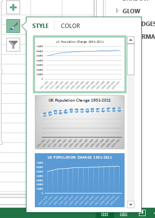
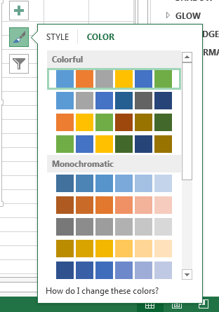
Chart Styles can be accessed to the right of the chart area, as illustrated below. You can choose from a number of styles, as well as colors.
Our graph currently only features one set of data, so the color choice will have little effect, but as more are added, colors will help your potential audience discern between different sets of information.
Axis Formatting Your Graphs in Excel
Note the vacuous space underneath our line? It is space we could be putting to better use. Click the vertical axis. It will open the Format Axis window. Here we can change the bounds, units, tick marks, labels, and more. We can see the bounds of our data range from around 50,000 to just over 62,000, meaning we can raise the minimum bound from 0.0 to 50000.
See the immediate effect this has on the graph? The rising population is now pronounced, whereas before, it could be considered a gentle increment.
We should also give our axis a title. Press the plus symbol to the right of the chart, then Axis Titles, followed by Primary Horizontal and Primary Vertical. You can now edit each title to match your chart.
I've used Population for my vertical, and Period for my horizontal. I'm also going to increase the font by one point, and make the titles bold so the audience can actually read them.
Adding a Secondary Axis to Graphs in Excel
Now, we'd like to add additional data series to our chart, but simply expanding the data selection range won't do the job. Why? The values in the first column are in the tens of thousands.
However, the values in the following columns are only in the hundreds, and at points down to single digits. Our current vertical axis range cannot accommodate the lower values, adding a secondary axis.
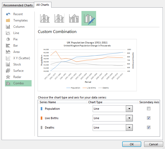
First of all, I'll expand the data selection range to encompass Live Births and Deaths. Next, right-click the chart area and select Change chart type. Select Combo from the left-hand column. It should all become clear now!
I can now select the chart type and axis for each data series. I'm going to use a line chart, and add the final two data series to the secondary axis, as per the below image:
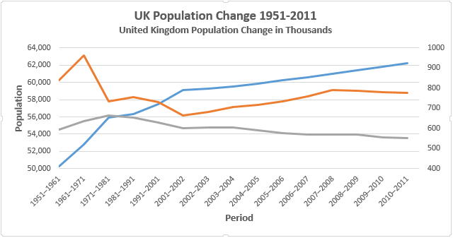
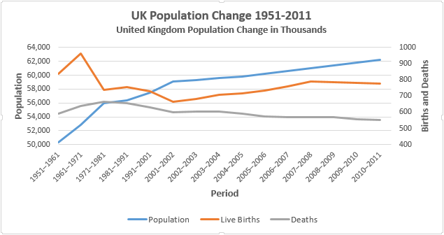
And the chart itself:
Remember, you can also create charts using data from two different Excel sheets.
Now that we've plotted our new data series, we'll need a legend. In some cases, a legend is unnecessary, but when you have intersecting lines, using two-axis, it is worth giving your audience a chance of understanding your data.
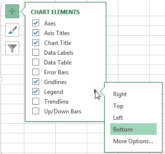
Turn on the legend by pressing the plus symbol to the right of the chart, then legend. If you press the small arrow, you'll be able to select the legend location. In this case, the legend should be placed at the bottom of the chart.
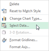
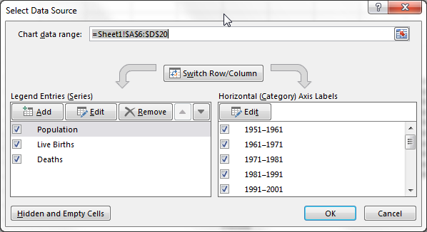
To change the legend titles, right-click the chart area and click Select Data. In the left-hand column of the new window, you should spot your unnamed data series. Select the first one and press Edit. You can now enter your preferred name for the data series.
When you're ready, press OK, and your legend should automatically update.
Now, go ahead and add a title to the second axis using the same method we explored earlier. Again, I would make the font one point larger, and make the title bold.
Our newly introduced data series is looking a little flat. We can see a couple of major variances in both births and deaths in the raw data, so let's make sure the chart reflects that.
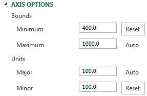
As we did with the first data series, we'll adjust the secondary axis options. Click on the secondary axis. I'm going to adjust the minimum bounds to 400, and the minor unit to 100.
Margins and Titles
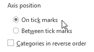
Next, we've got some large margins at either end of our chart, and that won't do. Double-click the horizontal axis—Period—and change the Axis position from Between tick marks to On tick marks. Our lines will now fill the entire chart area, rather than denying the passage of time.
Finally, choose a snappy, descriptive title, and do not be afraid to use a sub-title to convey exactly what your chart is showing. I've gone for UK Population Change 1951-2011; United Kingdom Population Change in Thousands.
Okay, so maybe it isn't that snappy, but my audience will know exactly what they're looking at, and what values the numbers are expressing.
Formatting a Bar Chart
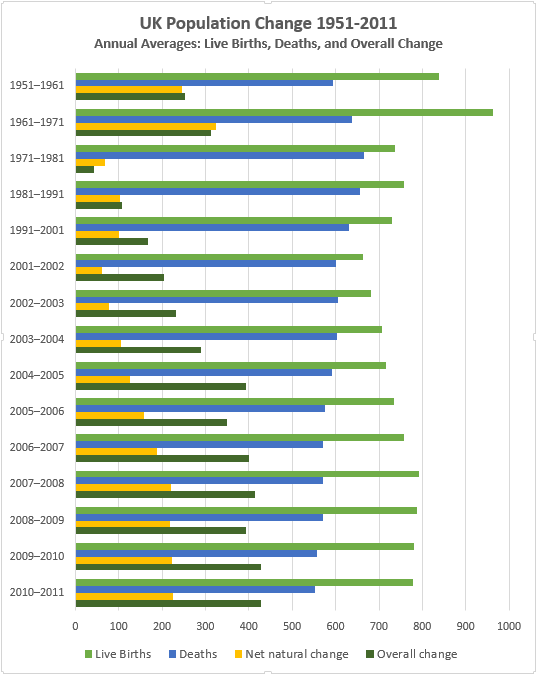
That was a line chart, good for emphasizing trends over time. Now we'll look at the bar chart. This time, using the same table, we are going to look at the Live Births, Deaths, Net natural change, and the Overall Change.
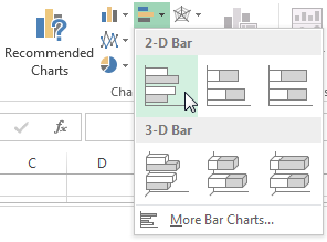
Start by selecting each of the aforementioned columns, and heading to Insert > Clustered Bar.
Upside Down?
You'll immediately notice your chart is upside-down. That is to say, Excel has reversed the organization of your chart categories. My chart begins with 2010-2011, and finishes with 1951-1961.
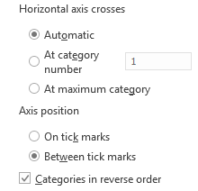
This won't do, as most people will logically read the chart from top to bottom. Double-click the vertical axis (or press Ctrl+1 when the axis is selected) to bring up the Axis Options. Locate and select Categories in reverse order.
You'll now spot your horizontal axis has jumped to the top of your chart. In the same Axis Options panel, select At maximum category.
Axis and Chart Area Formatting
Double-click the horizontal axis to open the Axis Options. Our data doesn't contain a value higher than 1000, so reduce the Maximum Bound to 1000. You now have two options: keep the Major Unit as 200, which is quite suitable for our chart, or reduce this to 100, which also works.
I'm going with 100 as we have a number of data series with similar values between the two potential units. This will make it easier to discern between similar values.
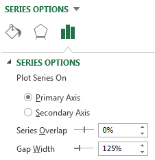
Our bars are quite thin, too. Make them stand out by clicking one of the data series and, in the Series Options sidebar, reduce the Gap Width to 125%, adding some visual weight to our data.
Title and Legend
As our table contains more than one form of data, Excel has kindly supplied a legend detailing each data series. Increase the font size of the legend by one point.
Give your bar chart a snappy, descriptive title. If your chart is part of a series, make sure the title reflects the rest of your data.
Using the same title as our line chart—UK Population Change 1951-2011. We will give it a contextual subtitle: Annual Averages: Live Births, Deaths, and Overall Change.
Chart Styles
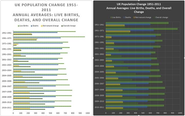
Our chart is now formatted, and if you were to show it to an audience, they'd understand the data. But we haven't looked at Excel's built-in styles.
Some are slightly useless, their colors and general formatting the antithesis of useful, while others are surprisingly handy.
We can also choose from a range of color schemes.
To the right of the chart is a paintbrush icon, located underneath the plus symbol. Depending on your audience, move through the preset styles and consider if this would make the impact you need and if the style allows your data to do the talking.
Consider the preset colors, too. I've changed my chart from the standard blue, yellow, orange, grey affair to a color-set exemplifying the differences between Live Births, Deaths, and the Net Natural Change.
TL;DR
If you just want the juicy details of how to clear your chart up and engage your audience, here are some of the vital points:
- Pick the right graph. Use the right tool for the job.
- Sort your data; don't leave it for Excel to decide where your data will appear.
- Adjust your axis. Keep your number formats and category titles clean.
- Check your margins. Those line charts will start in the middle of nowhere.
- Remove unnecessary styling. Let the data talk.
- Pick your colors. Make your chart easy to understand.
- Format your legend. If you don't need it, get rid of it.
- Choose your title. Keep it snappy. Tell your audience exactly what they're looking at.
While not the be-all and end-all of chart design, running through this quick checklist can help you spruce up your data, and make your chart easier for everyone to read.
Chart Experiments
We've shown you a nice range of Excel charts, and we've given you some tips on when to deploy them. If you're still unsure of the power of graphs, consider this experiment where individuals were presented with clear, factual information contradicting their worldview, but the data was displayed in a more compelling format. The researchers tested three strategies:
- Presenting a paragraph of text that summarized the factual evidence
- Presenting the evidence in a chart
- Building up subjects' self-esteem so they'd feel less threatened.
The most effective method of data transmission? Simple, clean charts, displaying information in a language that was easy to understand.
So the next time you're grasping for a better way to reach your audience, consider a graph.
And if you'd like to stick with a chart, but use Google instead, here's how to create charts in Google Slides.

