Whether planning a holiday, running a marathon, or saving for your dream house, you will want to track your progress.
A great way to do this is with an Excel thermometer chart. It is a simple, effective way to keep track of a financial goal and share it with your team, partner, or friends.
Setting Up Your Spreadsheet
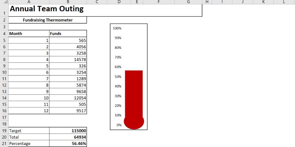
Before we construct our thermometer, we need to establish our goal. In this case, we will look at tracking fundraising for a team trip.
- Open a new worksheet in Excel.
- Create an Excel table with two columns: one for the Month and one for the Amount Deposited.
-
Underneath your table, note the Target, Total, and Percentage cells. Here we will create the formulas for the thermometer.
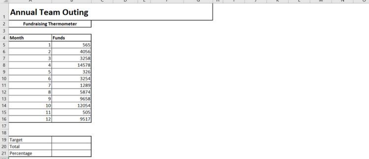
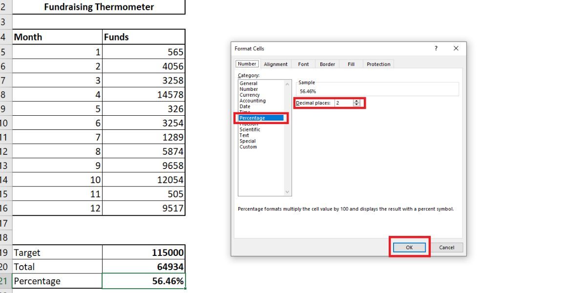
- Next to Target, type in your goal amount in column B. Our goal is $115,000.
-
Beside Total, write in the formula:
=Sum(B5:B16) -
Finally, we can calculate the Percent using:
=B20/B19 -
Change the format to a percent by right-clicking the cell and selecting Format Cells. Change the category to Percentage, select the number of decimal places you want to show and press OK.


Creating a Thermometer Chart in Excel
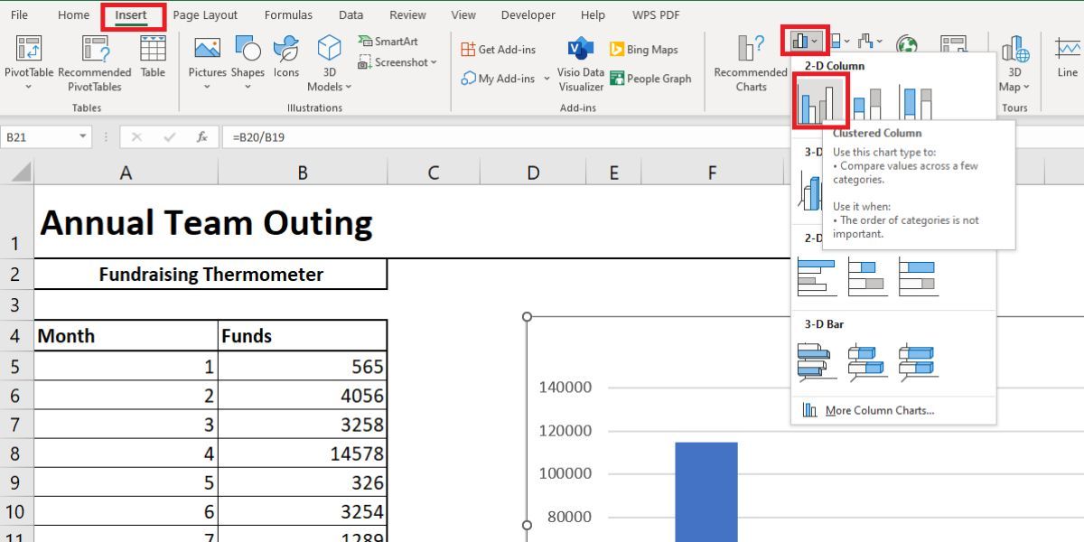
Now that we have set up the table, we can focus on creating the thermometer chart in Excel. Here are the steps to follow:
- Click on the Insert tab.
-
Under the charts section, click on insert column or bar chart and select the 2-D Clustered Column.
This will create a chart next to your table.
-
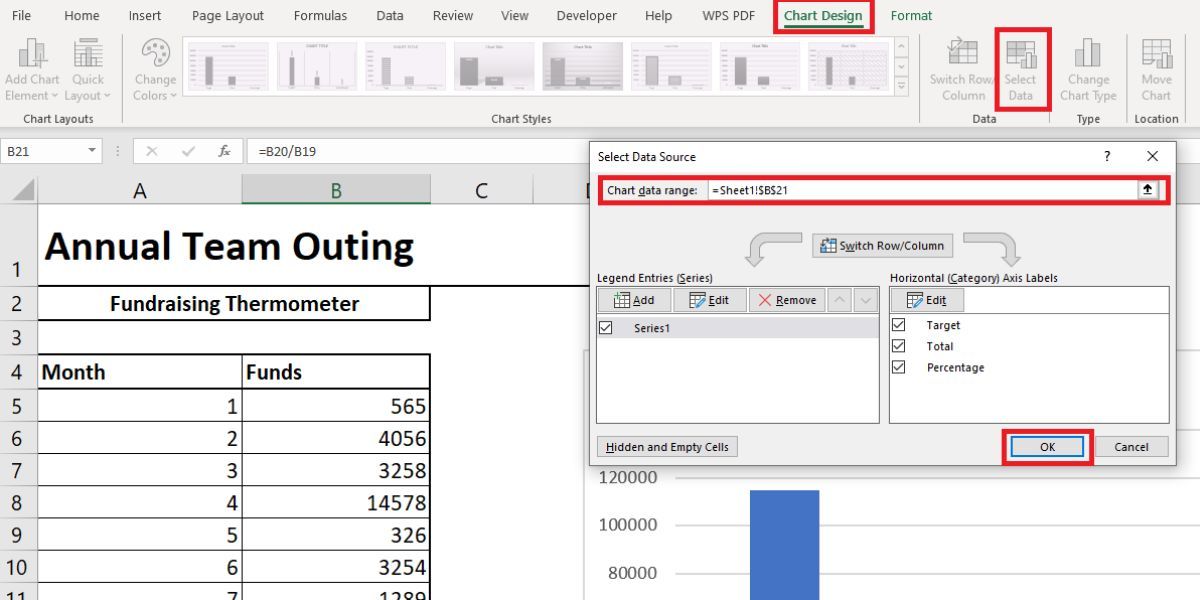
Next, we will add a table to the chart using Select Data. Select the cell containing the percentage of your total. Press OK to populate the chart.
-
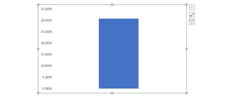
Now we can strip the chart back. Right-click the chart title and delete it. Do the same for the column title, and the horizontal lines.
Note: If you do not want to delete them, you may hide chart axes in Excel instead.
-
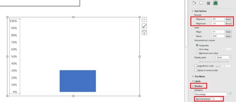
Double-click the y-axis (percentages) to open the dialogue box. From there you can change the minimum and maximum bounds of the chart to 0.0 and 1.0, respectively. Before closing the menu, select Numbers and change the decimal places to 0.
-
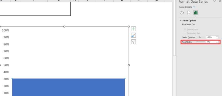
Right-click the column and select Format Data Series. Adjust the Gap Width to 0.
This will ensure your column fills the chart area, instead of trying to hide in the corner. You can now reduce the chart to a more thermometer-like size.
-
Finally, head back to the Insert tab, select Shapes, and find a nice oval. Draw an oval and add it to the bottom of the thermometer chart, then resize the chart area. It should fit nicely around the bell of the thermometer, like so:
- Note: You can change your thermometer to red by right-clicking the colored portion and altering the fill color.


Adding Details to the Thermometer Chart in Excel
If you are tracking a large amount of money over a prolonged period, it can be useful to look back at which days you have raised the most cash. This can be especially useful for charity drives—you can analyze what your team did differently on those occasions and tie it into your next fundraising event.
First, we are going to alter your Excel table. We need more details, including dates and the names of those who donated. You need separate columns for the date and amount received. This way, we can monitor each variable.

Next, we will need to set up a Dynamic Named Range. Named ranges are handy for giving us control of a set of cells without having to update our formulas. We can automatically ask our formula to account for any additions to our table.
Setting Up a Dynamic Named Range
To make things easier later, turn your table into an official one. Do this by selecting the entire area of your table. Select Format as Table, then pick the style you want. Check the box next to My Table Has Headers and click OK.

You have now made a searchable table with headers.Next we can link our table to our total (Cell B20).
-
In your total cell, input:
=SUM(Table1[Amount])- This formula asks the cell to total the Amount column. The Percentage information remains the same, by dividing the total by the target and is still linked to our thermometer.
- Select the contents of your Amount column (C26:C41).
- Select the Formulas tab and locate Name Manager. Click New.
- In the Refers to box you should see =Table1[Amount]. We need to add the formula below so that each time you add a value to the Amount column, your total will automatically increase.
=OFFSET(Sheet1!$C$1,0,0,COUNTA(Sheet1!$C:$C),1)
Your formula should look like this:

Adding Dates Using SUMIFS
SUMIFS is a powerful formula that lets us correlate information from two or more sources. We are going to use SUMIFS to find out how many donations we took within a 14-day period.
This is what the end result will look like:

- Enter your required start date (cell G26).
-
In cell G27, type:
=G26+14 -
Cell G28 will contain our SUMIFS formula. In the cell, type:
=SUMIFS($C$26:$C$95,$A$26:$A$95,">="&$G$26,$A$26:$A$95,"<="&$G$27)If you are unsure of how to use the SUMIFS function, here's a breakdown of its components: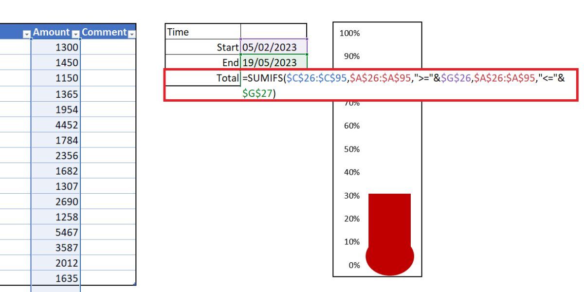
- $C$26:$C$95: The range of cells we want to include.
- $A$26:$A$95,">="&$G$26: Tells SUMIFS to check column A for any dates on or after.
- $A$26:$A$95,"<="&$G$27: Tells SUMIFS to check column A for any dates on or before.
- Cell G28 should now express the value of donations received between your specified dates.

Start Tracking Your Goals With Excel
With the Excel thermometer chart, you can easily track your financial goals and see your progress from beginning to end.
Staying on top of your objectives is the best way to ensure you accomplish them. Fortunately, there are numerous apps available today that can not only help you manage your goals but help you achieve them as well.