Are you disappointed by the photos you take? You aren't alone. The truth is that stunning photography is harder than people think, mainly because photography is more about how you shoot rather than what you shoot.
Even the most beautiful scenes and subjects can turn out awful if the one behind the camera doesn't have a solid sense of how to take a shot the way they want it to turn out. This entire process of "taking a shot" is called composition, and if you want to get good at it, there are some rules you should consider.
Note: Even though we call them "rules", they aren't set in stone -- nor should you adhere to all of them in every shot you take. Learn why these rules exist, then apply them as necessary for each photo you take in the future.
1. The Rule of Thirds
For a lot of photographers, the Rule of Thirds is the first piece of photography theory that they learn.
If you already know this one, feel free to skip ahead to the next section. If you haven't heard of it, pay attention -- this is the most valuable rule you'll learn.
The first time you picked up a camera, you probably felt compelled to center the subject. After all, attention should be on the subject, and attention is most drawn in the center, right? It sometimes works, but often this results in a photo that feels off somehow.
A perfectly centered image, in most cases, loses its sense of balance. It sounds contradictory, but it's true. If a person's head is smack in the center, then their body is below and empty air is above... and that's unbalanced. The Rule of Thirds is one way to resolve this.
Imagine splitting a photo into a 3x3 grid and looking at the four corners of the center section. These are the intersection points of the "thirds" -- a third from the top, a third from the bottom, from the left, and from the right. When shooting, place the subject in one of these four spots.
Stock photography experts do this a lot because it's an easy way to make photos more compelling. Remember that the Rule of Thirds isn't enough to produce spectacular photos -- but it's definitely an important ingredient.
2. The Golden Ratio
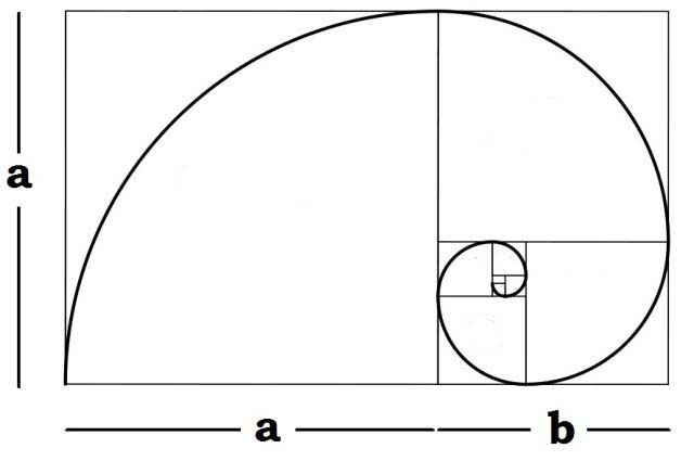
The Golden Ratio is similar to the Rule of Thirds, but slightly more advanced. It's based on a mathematical concept that we can find all throughout nature, and this concept theoretically explains why we find certain things to be aesthetically pleasing.
Simply put, the Golden Ratio describes a relationship:
In mathematics, two quantities are in the golden ratio if their ratio is the same as the ratio of their sum to the larger of the two quantities.
This ratio can be illustrated by the Golden Rectangle and the Golden Spiral, a design that's commonly found in plants, animals, and other forms of nature. The bottom line, however, is that this ratio can be simplified as 1 to 1.6.
In some sense, the Golden Ratio explains the relationship of balance between empty space and filled space. In other words, for every 1 bit of filled space, you need about 1.6 bits of empty space to balance it out. And that's how we get photos like the one above and the one below.
Seems like an ordinary photo, right? But a lot of people are praising the photo for its "Renaissance painting-like" quality. As it turns out, the photo adheres to the Golden Ratio perfectly, so no wonder why it looks so darn good.
3. The Principles of Gestalt
In the late 1800s, a concept called Gestalt psychology came into prominence, and this theory tried to explain how humans can acquire meaningful perceptions in an apparently chaotic world. In short, how does the mind organize individual bits into a cohesive whole?
Decades later, photographers began applying this theory to their shots -- with remarkable results. The actual principles are a bit abstract and vague, but they may prove helpful once they click. Here are the key ones:
- Figure: We tend to differentiate objects by contrasting with their surroundings. When composing, position the subject so that they are clearly defined by the space around them -- which helps viewers to perceive what's meant to be the focus of the photo.
- Promixity: We tend to perceive objects that are in close proximity to each other as one group. Grouping things together -- either using position or depth -- can help when you're trying to create a sense of balance throughout the photo.
- Similarity: Within a group of objects, we tend to perceive objects of the same "kind" as part of the same group or pattern. An object's kind can be defined by its color, shape, or overall feel.
- Closure: The human brain can follow contours and see patterns even when there are holes and gaps in said contours and patterns. As such, based on how you frame the scene, the viewer may see shapes and patterns that don't really exist -- and this could produce a more compelling image.
- Balance: As described in the Rule of Thirds and the Golden Ratio, balance is an important aspect of aesthetic beauty. This could mean symmetry, but more often means that there's a sense of equilibrium in the photo.
Again, the Principles of Gestalt are more like abstract guidelines than straightforward rules. They try to explain why, but don't really give much instruction on how.
4. Leading Lines
One of the most important concepts in photography is that you want the photo to "draw" the viewer's eyes somewhere, ideally on a particular path through the photo. Most people start at the top left and move to the center, but this isn't always the case.
The easiest way to pull the viewer's eyes through a photo is to provide them with a direct route -- and this is done with leading lines. A leading line could be anything: roads, fences, tree branches, walls, natural contours, or even silhouettes. It could even be an implied line, such as a beach or a queue of people.
The shape, direction, and depth of leading lines can create a sense of motion through the photo -- and this dynamism can make your photos feel alive and active rather than static and boring. It's this energy that can be the difference between a crappy and a compelling image.
So the next time you position yourself and hold the camera to your eye, make sure you look for all the potential lines in the scenes. Don't be afraid to stop and relocate if it means you can take better advantage of the lines around you.
5. Foreground and Background
For some, the greatest difficulty of photography is capturing the beauty and essence of a three-dimensional scene in a two-dimensional photo. Often, the result if a flat, static image that has none of the life that made the scene so awesome in the first place.
While there are many ways to trick the brain into thinking a two-dimensional image is three-dimensional, one of the easiest methods is to make sure that the photo has a foreground and a background that both complement the intended subject.
In the above photo, notice how the tree (which is close to the camera) and the mountains (which are far from the camera) work together to create a sense of relative 3D space, and you can tell the mountains are big. Without the tree, you wouldn't know how big those mountains are.
The foreground-background effect can be emphasized even further by manipulating depth of field. Using a wider aperture results in a shallower depth of field, which blurs things that are closer to the camera than the subject and farther from the camera than the subject -- and this blur helps establish visual depth.
In the above photo, notice how the foreground laptop and the background camera both sandwich the drawing tablet, which gives the photo a greater sense of depth and life. A smaller aperture (no blur) would have resulted in a more boring image.
Which Rules Do You Use Most?
In case you missed it before, I'll repeat it here: you do not have to use ALL of these Rules in every single photo you take. In fact, you could potentially take an awesome photo that doesn't involve ANY of the aforementioned rules.
As a general rule of thumb, if you have a photo that doesn't look good, applying one or more of the rules in this article will probably improve it. That's all we're trying to say.
Want to improve even more? Check out these free photography YouTube channels, these amazing online photography courses, and these excellent Lynda.com courses for photographers. They'll all accelerate your learning ten-fold.
Which rules of composition do you end up using the most? Which ones do you need most practice with? Did I miss any? Share with us in the comments below!
Image Credits: Centered Portrait by racorn via Shutterstock, Woman on Rocky Coastline by David P. Lewis via Shutterstock, Golden Ratio Diagram via LiveScience, Tower of Rocks by sezer66 via Shutterstock, Fence Leading Line by Gergely Zsolnai via Shutterstock, Concrete Leading Line by Prasert Wongchindawest via Shutterstock, African Landscape by Galyna Andrushko via Shutterstock, Tablet Artist by Diego Cervo via Shutterstock


