If you scroll through the available fonts in Microsoft Word, you'll eventually come to one that doesn't include the letters and numbers you're used to. Instead, you'll see things like school buses, nautical stars, airplanes, check marks, and fruits.
Welcome to the wild world of Webdings.
It seems to be the 1990s pre-emoji language that never took off... or an anomaly that exists for no reason at all. Where did Webdings come from? How is it different from Wingdings and Zapf Dingbats? Why were these weird typefaces created in the first place? And are there hidden messages within them?
I decided to find out.
Dingbat Typefaces
Printer's ornaments, known as "dingbats," have been a part of printing for a very long time — printers have used them for hundreds of years to fill up white space, signal the end of a chapter or book, or just to add a visual embellishment on the page. This tradition can be traced all the way to back to monks and scribes creating beautifully artistic illuminated manuscripts, and the tradition has continued into the digital age with dingbat typefaces.

The story of Webdings starts with Hermann Zapf, a renowned typographer involved in early computerized typesetting; Optima, Palatino, Zapf Chancery, Zapfino, and many other fonts owe their existence to his talented hand. In the late 1970s, Zapf created a set of over 1,000 symbols, 360 of which were eventually chosen by the International Typeface Corporation for the Zapf Dingbats font included with early Apple printers.
Zapf Dingbats has lived on, and is even one of the 14 typefaces guaranteed to be available for PDF files. Its legacy reaches further, though, in the many dingbat typefaces that have arisen since Zapf's classic (the number of free fonts that consist solely of symbols is mind-boggling).

Of course, the most famous of the post-Zapf dingbat typefaces are Microsoft's Wingdings and Webdings.
Where Did Wingdings Come From?
The symbols included in Wingdings were originally designed as part of the Lucida font, created by Charles Bigelow and Kris Holmes in 1985. Five years after the release of the font, the designers recognized a need for the addition of symbols to complement the alphanumeric characters that were already available.
In 1990, it wasn't easy to find images on the Internet, store them on your hard drive, or insert them into a document. Lucida Icons, Lucida Arrows, and Lucida Stars allowed users to insert scalable images right from the keyboard, significantly increasing the number of glyphs that could be typed in a document.

Later that year, the rights to the three symbol fonts were bought by Microsoft. Selections were made from each typeface and combined into Wingdings (a combination of "Windows" and "dingbats"). The font has been included in Windows since the 3.0 days, making Wingdings about 25 years old today.
In a way, Wingdings foreshadowed the rise of emoji; it was meant to add pictographic information to text. Although people occasionally use it as a standard (though unreadable) font, it was always meant to be used to add embellishments to documents when they were needed. But that hasn't stopped kids around the world from typing messages to each other using arcane Wingdings symbols.
The Evolution of Webdings
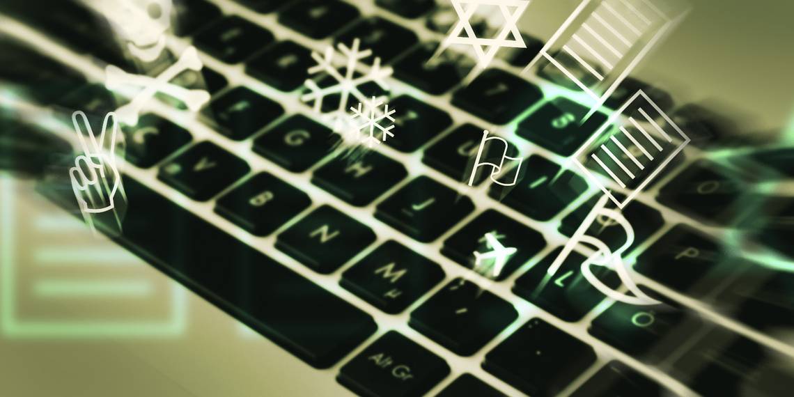
In 1997, seven years after the release of Wingdings, Webdings hit the scene. Looking at the symbols included in the typeface, it's clear that Microsoft wanted to bring its dingbats into the digital age. Gone are the fleurons (floral dingbats), zodiac symbols, hand signals, and religious icons. In their place are aliens, game console controllers, animals, and play/pause/fast forward/reverse buttons, giving Webdings a great deal more communicative potential than Wingdings.
According to Microsoft,
"Webdings is a symbol font designed in 1997 as a response to the need of Web designers for a fast and easy method of incorporating graphics in their pages.
The font contains a wide variety of Web-related images of the kind found in common use across the Web, as well as some more unusual drawings. User Interface icons suitable for creating page navigation elements are also included.
Webdings is ideal for enriching the appearance of a Web page."
And for a number of years, while computing power was still significantly behind where it is today, the font served a great purpose online. From using a speeding envelope to indicate an email link to including a "no-pirates" symbol in an email for a laugh, Webdings was used for communication. But it was not to last. The arrival of significantly more processing muscle, the ease of working with images, and the popularization of GIFs and emoji have relegated Webdings to the back shelf.
The Cultural Impact of Webdings
Few fonts have become cultural icons in the way that Wingdings and Webdings have. People around the world still play with the symbols included in the typefaces, converting their names, secret messages, and random strings of characters into fun symbols. Quirky users of Microsoft Word and PowerPoint still emphasize points with pointing fingers, funky stars, or enclosed numbers.
The use of dingbats on the web has declined significantly from its heyday, having gone the way of "under construction" GIFs, blinking lights, and GeoCities, though you can still find some examples of its use if you look hard enough. Most of the time, if you come across a dingbat online, it'll be in someone's social profile, used to jazz up someone's Twitter or LinkedIn presence.

(Unfortunately, there are no mountains or pentagrams that work with the Twitter profile interface—I checked.)
According to some typeface enthusiasts (and conspiracy theorists), Wingdings has a dark side in addition to its nutty public face. It's been known since the early 90s that if you type "NYC" in Wingdings, you get a skull-and-crossbones, a Star of David, and a thumbs-up symbol, which many people have interpreted as an anti-semitic message.

Microsoft has strongly denied these rumors, stating that the association of symbols and letters was largely random, and that they were not, in fact, encouraging Wingdings users to kill Jewish New Yorkers. The company also fired back at conspiracy-mongers in 1997's Webdings, making sure that "NYC" had a more positive message:

The rumors refused to die, however, and shortly after the attack on the World Trade Center on September 11, 2001, more surfaced when it was claimed that typing the flight number of the first plane to hit the towers, Q33 NY, showed that Wingdings had predicted the World Trade Center attacks:

There's one glaring problem: Q33 NY wasn't the flight number of either of the planes that hit the towers. They were AAL 11 and UA 175. But people are always looking for hidden meanings. They not only found them in Q33 NY, but also in "MILLENIUM," "GEORGE W BUSH," and "Osama Bin Laden." While these have been largely debunked, there are still some people out there who think there's something prophetic or supernatural about Wingdings.
Will Webdings Survive?
Now that emoji and easily obtainable high-quality images and characters have become more popular, Webdings has faded out of the lime light, only to survive as a curious holdover from the days of yore (the 90s).
But its influence will live on, its lineage traceable from monastic illuminated manuscripts, through early printers, via Hermann Zapf, all the way to emoji. It's a font that, despite being almost totally useless, still brings a smile to many faces.
Image credits: Tom Grundy via Shutterstock.com, Font Squirrel.