
PowerPoint presentations with lots of data don't have to be boring. Excel makes it easy to take multiple lines of data and convert them into easy to interpret visual charts. When you pair your data with PowerPoint, you can animate Excel charts to create an engaging presentation.
We'll take you through the process step by step. Watch your data come to life.
Creating Your Chart
The first step in animating Excel charts is to create your chart with the data that you've compiled. If you're not sure what kind of chart is right for your data, take a look at this guide on picking the right Excel chart for you.
If your data changes on a regular basis and you have to give a monthly presentation for example, you can create self-updating charts in Excel and take them over to PowerPoint to animate them.
If you're creating a one-time chart, you don't even have to open Excel on your computer. You can start right in PowerPoint by going to Insert > Chart you can choose your type of chart, and add the data with a little Excel popup right there in the program.
If you don't have a lot of data, you can actually design a pie chart right in PowerPoint, using the app's shapes feature.
PowerPoint's Animation Menu
Once you've got your chart ready to go, you can copy it into PowerPoint to animate it. Click on your chart or graph and use the keyboard shortcut Ctrl + C to copy it. Open a blank canvas in PowerPoint, and use the keyboard shortcut Ctrl + V to paste it.
In PowerPoint, you'll spend all your time in the Animation tab. This is where you'll find all the tools you need to animate charts in PowerPoint.
You should see a small selection of animations in the menu at the top of the screen. Click the arrow at the end of the animations to see all animations available to PowerPoint users.
Animating a Bar Chart
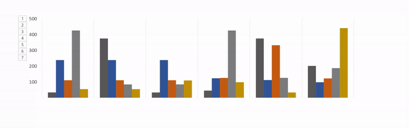
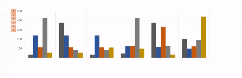
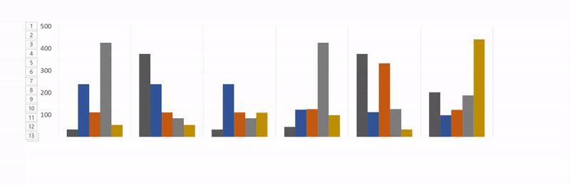
In our example, we're using the data from the Expense Trends Budget spreadsheet template, which includes a bar graph.
The best option for a bar graph is for it to appear from the bottom of the screen going up. The Wipe animation is a suitable choice for this kind of movement.
To apply the animation, do the following:
- Click to select the graph.
- Click the Wipe animation button.
- The animation will be applied to the entire graph.

Next, you'll want to change the advanced settings for your animation, so that it appears gradually rather than in one go.
These settings are found under Effect Options.
With Effect Options you can choose the direction of the animation -- it can appear from the top, the bottom, the left, or the right. You can also determine how your chart will be animated: as one object, by category, or by series.
So what do these options actually mean?
-
By category: This animates your data by each category on the X-axis of your bar chart. If each category includes one bar, each bar will be animated individually. If there are multiple bars in each category, they will all be animated at the same time.
-
By series: This option animates your data by each individual color within a category on the X-axis of your bar chart. Each set of bars of one color will be animated together.
-
By element in category: This option animates your data by each category on the X-axis, but slows down the animation considerably. Each bar will animate one after the other, so if you have a chart like the one below, it will simply animate each bar in the order in which it appears in your graph.

-
By element in series: Each series (or set of bars of one color) will be animated individually. Each bar of one color will animate individually one after the other, followed by the next color.


For each of these options, you can also check Start animation by drawing the chart background. This will allow the background to gradually appear before your graph elements begin to appear.
If you don't like the appearance of your animation, you can test other options by clicking on the animation name in the tab. The effects that you applied will be maintained with the new type of animation.
To see the whole process in action, check out the video below:
Choosing the Right Animation for Your Chart
As we mentioned, there are plenty of different types of charts available in Excel. The chart you use depends on the nature of your data, and the animation you use for that chart depends on the type of graph you've chosen.
In addition to the default chart animations that are visible in the menu, you can view more entrance, exit, and emphasis animations by clicking the down arrow at the end of the animation list.

You can see even more animations by clicking More Entrance Effects in that pane.
- Bar Charts: For bar charts like the one in the example above, the Wipe, Peek In, and Fade would all work well.
-
Pie Charts: For pie charts, try the following animations: Wheel, Zoom, and Fade. In the GIF below, you can see an example of a pie chart animated with the wheel effect.

-
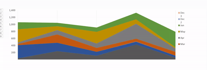
Stacked Area: For stacked area charts, try the following animations: Fade, Appear, or Wipe. In the GIF below, you can see an example of a stacked area chart with the fade effect.
-
Line Charts: A good choice for line charts is Wipe, but be sure to select the animation direction from the left.


There are other ways you can customize your animation to suit the kind of chart you are using. Open the Animation Panel and in the menu click Timing. Under the timing panel, you can control how fast your animation appears, whether you need to click for the animation to appear, and whether the animation should be repeated.
Experimentation Is Your Friend
You're probably going to find yourself testing different animations and different options to see what works best for your data, graph, and presentation style. Testing different options and speeds will ensure that you find the setting that is right for you.
Once you've done it a few times, the process of animating Excel charts will be much faster.
What kinds of charts do you use for your Excel data? Is there a different program or tool you prefer to use to animate your charts? Let us know in the comments.
Image Credit: IgorTishenko/Depositphotos