A boring PowerPoint presentation has no merit. If the information isn't presented well, your audience won't take it in, so it's crucial to put together something that people can really engage with.
A balance of visual interest and well-presented information is key to a successful Microsoft PowerPoint. By taking the time to make a well-crafted Template, you can save yourself a lot of effort later on. Follow these tips, and you can be confident that every PowerPoint you make will hit its mark.
How to Create a Template
To get started on your Template, create a new Presentation and then navigate to View > Slide Master. Then, it's time to exercise your own creativity by forging a template suited to your own tastes or the needs of a particular project.
Edit the Slide Master—that's the slide at the top of the left-hand sidebar—to establish any elements that are set to run through each different type of slide, such as a company logo or a background design.
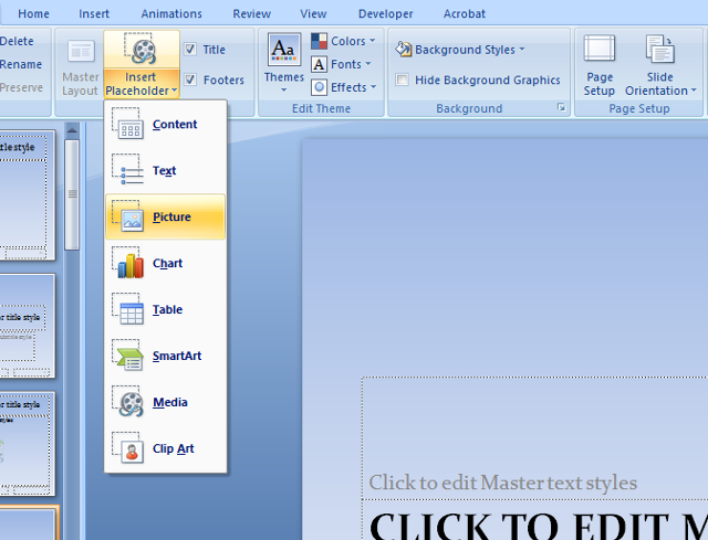
Next, work your way through the rest of the list to tweak individual variants like title cards and slides with multimedia elements. Use the Insert Placeholder tool in the Ribbon to lay out any text or multimedia elements you might want to include later.
When you're happy with your work, navigate to File > Save As and use the dropdown menu to save the file as a PowerPoint Template. To make it easy to access when you come to utilize your template, save it in Microsoft Office > Templates on your computer.
Using a Template
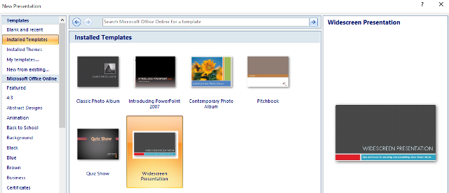
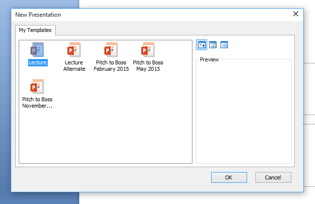
Once your Template has been saved, it's very easy to use it for your next presentation. Click the Office Button and select New, and you'll see all the Templates that you have access to. The Installed Templates folder contains the basic selection, and My Templates will house your creations.
Note that you can use the New from existing option to repurpose some of your previous work on the fly. There's also plenty of context-specific Templates available for download via Microsoft Office Online, accessible via the lower section of the left-hand menu.
Use Themes to Keep Things Consistent
If you're having trouble making a professional looking Template starting from scratch, it might help to use a prebuilt theme as a base. Making any presentation visually appealing is important, but there needs to be a sense of continuity from slide to slide. By using a theme as the foundation for your Template, you can maintain consistency throughout, and even save some time in the process.
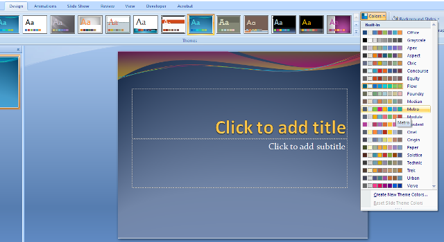
To use a theme, head to the Design tab of the Office Ribbon. You'll see a host of options in the section marked themes, and if you can't find a good fit, you can access more PowerPoint Templates online. However, remember that this theme is simply the skeleton for your Template.
Use the dropdown menus labelled Colors, Fonts, and Effects to customize it to your tastes. You may end up with something quite different to what you started with, but keeping the preset consistency in terms of fonts and color choices will help you create something that reads well from start to finish.
Don't Become Shackled to Your Template
The benefits of a well-made Microsoft PowerPoint template are obvious, but even the best theme can become a detriment if its used improperly. For instance, if you think you've perfected your Theme, then you might be tempted to re-use it time and time again. That's a sensible use of your time, but if you're presenting to the same people, they might start to think that you're simply re-hashing old content.
Freshen things up every once in a while—tweaking a theme is even easier than starting one from scratch. Moreover, if you have an idea that deviates from your chosen theme, make the extra effort to pursue it.
The way you present information can be as important as the information itself. If you can think of a novel way to do so within boundaries of common sense, it's worth trying it out. It could be the one thing that sticks in someone's mind after your presentation is over.
Check Your Image Resolution
No matter how much time you spend working on a Microsoft PowerPoint presentation, the presence of low resolution images will negate any of your efforts to make it look professional. It might not be such an obvious problem when you're creating the show on a standard size screen, but once it's being displayed on a projector it will be all too obvious.
To counteract this, carefully consider the sources that you take images from. If you have access to a library of stock photos, that's probably your best bet as they're typically offered at high resolutions. However, even if you're just using Google Images, there are steps you can take to ensure the best results.
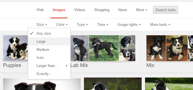
After performing a search, click on Search tools and use the Size dropdown. Large images are best, but medium resolution by Google's standards will likely do in a pinch. If possible, try to project your presentation ahead of time to make sure everything looks correct.
Legibility Trumps Style for Fonts
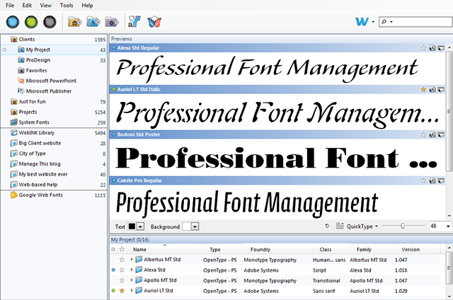
Fonts are a great way to add a bit of visual interest to your presentation, but they can be abused very easily. It's sensible to keep the amount of different fonts you use in any one document to two or three at the most.
When you're choosing those fonts, try to think of the person viewing your presentation from the back of the room. An unusual font might not be legible at that distance, which makes what you've written useless. Form has to take a back seat to functionality in this case.
Pick a font that adds interest for your titles, but use something that's easy to read for any important text. Something clean and practical will do the job just fine, so long as the words themselves are interesting enough to carry your presentation and keep your audience engaged.
Implement the 10/20/30 Rule
Guy Kawasaki's excellent article on the 10/20/30 Rule of PowerPoint presentations is a decade old this year, but the advice is as good as it ever was. Simply put, it suggests that the optimal presentation contains ten slides, lasts twenty minutes, and uses 30-point text.
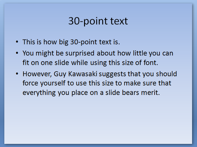
You should have this structure in mind even while you're building your template. Think about how each slide is going to tie into the presentation as a whole, and build your template accordingly. The font size is particularly important for this—put some thirty-point text on the page and see how it looks.
If you use this rule, your presentation will look less cluttered, but it also forces you to be ruthless about what information you include on your slides. There's only a certain amount of space to work with when you're using 30-point text, so any extraneous text will soon be dropped in favor of something that benefits the overall presentation.
Pacing is a vital part of any successful Microsoft PowerPoint presentation, and the 10/20/30 Rule gives you a very solid framework from which to perfect that pacing. Understand your audience—and their attention span—and you'll take a great step closer to getting your point across successfully.
Do you have your own tips for creating a winning Microsoft PowerPoint template? Why not share them with other users in the comments section below?
Once you have completed the perfect presentation, convert your PowerPoint to PDF to make sure you have a cross-platform compatible version with all your formatting secured in place. It's a backup worth having, although animations might not convert well.

