With the increasing availability of powerful graphics tools, color schemers, and logo generators, even those of us who are artistically challenged can create a professional looking logo design. But there is more to consider than simply whether the logo looks good on your website.
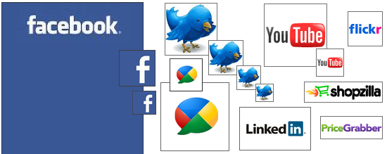
These days your logo needs to be adaptable to a variety of uses throughout social media. It should look sharp and noticeable in many different forms including a Twitter icon, Facebook thumbnail, and Flickr buddy icon.
Whatever your level of design experience, here are some tips to help you make your creation the most usable and effective for online marketing:
Watch Your Aspect Ratio
Most marketing folks will tell you that your logo design shouldn't be too short and wide or too tall and skinny because it isn't pleasing to the eye. The social web gives you another reason to keep your width and height in harmony.
Most social media sites put your logo into icons and thumbnails that are square (or close to it). While your logo design doesn't need to be a perfect square, it should conform to one nicely with little fuss. If you have ever watched a widescreen movie on a boxy 4:3 television, you will understand that the further from a square an image is, the more it will have to be reduced, clipped, or compressed in order to fit into one. In whatever icon or thumbnail your logo is used, you'd like it to be as large as possible - using as much of the available real estate as you can.
Detach Text & Graphics
Because you can't foresee all the ways you might use your logo design in the future, you want it to be versatile. You may need to rearrange or use only a portion of your logo if it doesn't fit well into a particular size and shape. For some very small icons, it is usually impossible to include your entire logo. As a result, many companies use a single letter or graphical element from their logo for social media purposes. If your text and graphics are tightly intertwined, it will be difficult to divide your logo design into separate pieces.
Keep It Simple
Avoid thin lines, too many words, and overly detailed graphical elements in your design. Anything too intricate may not be recognizable when the image is resized. If you're a real estate broker that would like to include an image of a house in your logo, don't try to include the front door, windows, and the family sitting around the dining room table. Simple geometric shapes will communicate your idea more efficiently. So don't spend time browsing clip art galleries; they generally aren't helpful for logo design.
You also want to limit the number of colors and shades that you use. If your logo is too noisy, it can get lost in the backdrop of a busy social media webpage. An uncomplicated logo with two or three colors will stand out better. Not to mention it will be easier and more economical to put it on stuff in the real world - like t-shirts and golf balls.
You can have fun with gradients, shadows, and your favorite Photoshop filters when designing your website, but when it comes to your logo, stick with the principle "less is more".
Be Consistent
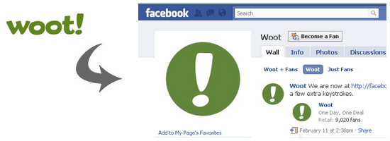
It strengthens your brand when people see the same image everywhere for your business or organization, so try not to have too many different forms in use. Many successful brands create one simplified variation of their logo design that they use for every social media outlet. For example, Woot! uses only the exclamation point as its all-purpose social media icon ... including everything from its large 200px Facebook image to its tiny 16px favicon.
This strategy is smart also because you can't always control how your image will be used by social media sites. They generally allow you to upload one image that is automatically cropped and resized for different uses. Facebook is nice enough to let you specify how your thumbnail is captured from your main image, but Twitter simply resizes your original image to, at last count, as many as 4 different versions. You want a logo that is likely to look the same no matter how it is altered.
Don't Try To Tell A Story
Take a look around and you'll notice that many great logos are simply made up of the business name (or abbreviation) in a unique font and color, with sometimes an adjacent graphical element. Don't obsess over trying to communicate everything about what you do through your logo. While you want the style to be appropriate and complementary to your business, your logo doesn't have to explicitly tell people what it is.
Your logo doesn't need a house if you're a real estate broker or a book if you're a bookstore. Even if your name doesn't clearly convey the type of business you are (i.e. "Bill's Photography"), your marketing activities and messages will associate your logo with your brand in peoples' minds. Besides, people typically won't see your logo in isolation without any context. Once you free yourself of the burden of trying to say too much with your logo, you are more likely to create one that is cleaner and more effective.
Take It For A Spin
You want to avoid having to change your logo once it is well established. So you should feel comfortable that it can be easily utilized for any purpose. Be sure to sample your logo in a range of different sizes, but also try it out in all the various social media venues that you may join.
You don't have to create a profile to test your logo in each site. Simply copy and paste a sample icon from the site into your graphics program, then transform your logo to the same size to see how it will look. Although most of the major sites represent you as a square (geometrically, not personally), there are many, such as shopping comparison sites, that use very specific dimensions. It's worth taking the time to make sure your logo will work easily everywhere that you want to be.
Conclusion
A good logo design won't necessarily adhere strictly to all of these guidelines or fit perfectly into every situation. But by taking social media usage into consideration when designing your logo, you're more likely to create one that will be easy to deploy and have a distinctive online presence.
How well do social media sites handle your logos and images? How do you make sure they look the way you would like?


