About a month ago, someone contacted me about whether I wanted to publish one of their infographics on my site. Before then, I had never really had much of an interest in such data visualizations.
For those of you that are regular readers, you know we love infographics here at MUO. I mean, come on, who wouldn't love the Wrath of the Angry Birds infographic that Mark posted? After doing a bit of MUO research, I realized that infographics are pretty cool.
In fact, any creative visualization of data is pretty cool. So, I went out in search of some other sites that offer cool and interesting ways to represent data in a non-text manner. Visualizations let you display a huge volume of information or statistics in a very small space, making them an excellent way to present study results or poll results in a way that is really easy to understand and to spot patterns.
5 Cool Places To View Data Visualizations
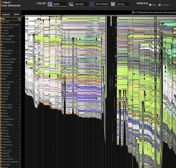
One of the first sites I came across when I was looking for creative ways to analyze Internet search trends is History Flow from IBM [Broken URL Removed]. The History Flow project actually analyzes the history of keyword trends by author and post on Wikipedia, and how those pages have changed over time.
IBM History Flow Shows Page Changes Over Time
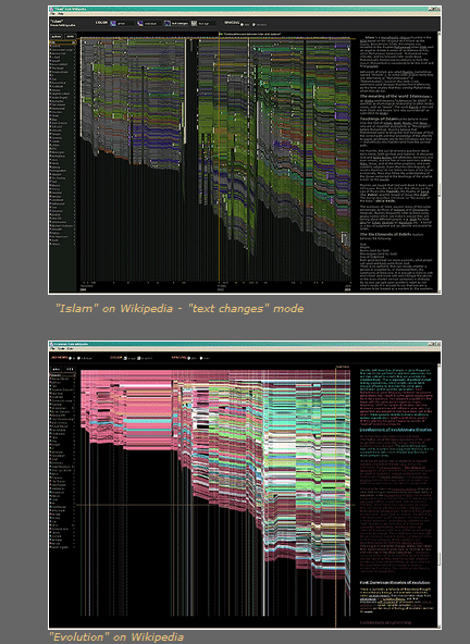
The data visualizations show specific keywords, and as IBM points out, you can actually see the "sabotage" of Wikipedia pages with black lines that show a period when the page content got deleted by malicious users.
It is interesting to see the growth of the page over time, and what specific subjects saw the most growth. You can see that growth by the expansion of colors that represent those keywords or phrases.
Highly controversial topics are really interesting to view, because you can see how dramatically content changes over time, and how many more sabotage events have taken place on those Wiki pages. The IBM History Flow page lists a long collection of Wikipedia topics that the project has analyzed already.
The gallery page displays completed/updated visualizations for topics like evolution, Iraq, abortion and Capitalism. Hopefully there will be more to come.
FleshMap - Exploring the Human Body
You might think that a site called FleshMap is some kind of perverted online game, but it's actually not. It is an interesting analysis of trends related to the human body. Some of the things you'll find there are most certainly related to human sexuality, but the real focus of the site is to "map" out revealing data related to the human body.
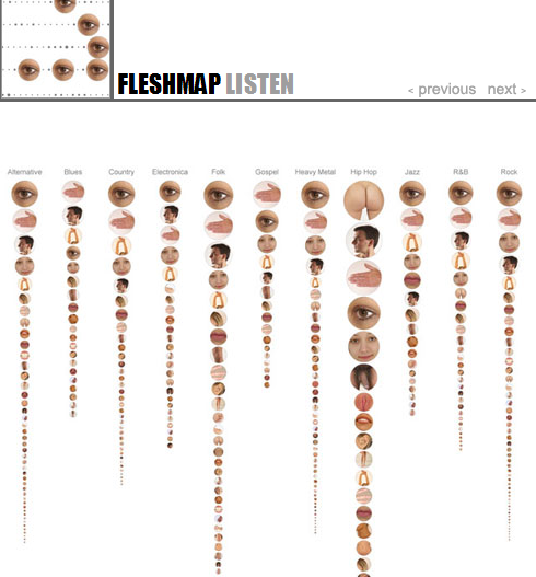
For example, FleshMap Listen provides a graphical representation of all human body parts that are referenced in popular music. You'll see how songs in the Alternative genre more frequently mention eyes, hands, head and face, while songs in the hip-hop genre much more frequently mention the human posterior far more frequently than any other genre of music out there. In fact, Hip-Hop overall is far more "human-body-part" focused than just about any other music.
You can click on any of the musical genres to see a display with all body parts mentioned, with each graphic sized according to its percentage of occurrence.
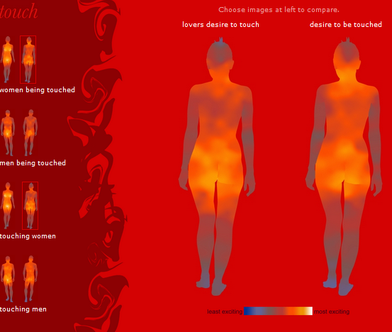
FleshMap Touch is an interesting visualization that provides statistical results of an online poll conducted, where people were asked about what specific parts of their body they enjoyed having touched, as well as what part of their partner's body they enjoyed touching.
The analysis and visualization is actually very tastefully done, and it offers a really interesting perspective revealing some small differences between areas that people like to be touched vs areas that their partners like to touch.
While there are obvious body areas both genders take pleasure from, it's those slightly faded areas that are more telling. For example, apparently men like to touch more of a woman's face, while women actually only enjoy specific spots on their neck to be touched. Have a look and see if you can also spot any other differences between where people like to touch vs where people like to be touched.
Many Eyes - Assorted Visualizations
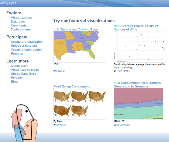
Another really useful website for finding graphic displays of data is the Many Eyes site. This is actually a library of data sets and visualization covering a really wide assortment of information. You won't know what you'll find here until you start looking.
For example, just browsing some of the available visualizations, I found a graph revealing Internet use by six U.S. schools, fuel consumption for electrical generation in Germany, and which states have banned texting and driving.
The browsing section shows a total of over 4200 visualizations, and the list continues to grow. Some are really interesting, while there are a few that are not so much. The coolest part of the IBM online effort is that it's crowd sourced, meaning that you can upload your own data set, and then design your own data visualization for publication on the site.
Visualizing.org
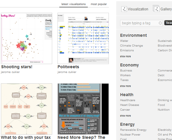
One site that I think offers more advanced visualizations than Many Eyes is Visualizing.org. The visualizations that you'll find here lean far more toward the "infographic" style of displaying data.
I spotted a French-based one called Politweets by Jerome Cukier that visualizes political tweets by month based on topic, a somewhat funny one from Column Five Media called "The Many Faces of Internet Users" (I love the troll), and another from Xerox called "The Future of Healthcare". You won't find bar charts and pie graphs here - these are infographics in every sense of the word.
Berkeley Visualizations
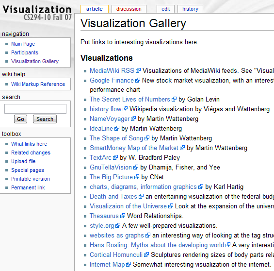
Another great resource if you're just looking to explore data visualizations from all over the web is the Berkeley collective of visualizations from throughout the Internet.
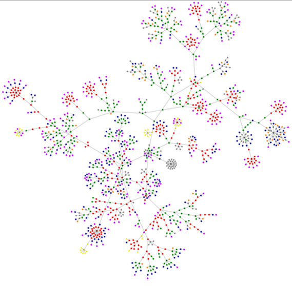
Some of my favorite highlights here are baby name voyager, style.org, and one of my favorites, Websites as Graphs where the creator developed this graphics based on the tag structure various websites use. This is really fascinating to go through. For example, here's CNN.com, with a tag structure that looks like an elaborate, beautiful flower.
Data analysts will recognize this as a sort of nodal analysis, I just wish it would be easier to identify each of those center nodes, and trace through the various paths. Of course, that's a bit more interactive than most of these data visualizations are meant to be.
I love data visualizations, and would really like to know if there are other cool ones that you may know about. Share your own discoveries in the comments section below.
Image Credits: A Technology Man via Shutterstock


