Every day, the news is filled with hate speeches, terrorism, rapes, and murders. It can seem like the world is going backwards, like mankind is de-evolving into apes. As disheartening as it is, it's a flawed notion.
We live in the most peaceful time in human history, and also the most medically safe. There have never been fewer epidemics and genocide, nor greater migration between friendly borders. But the media we are exposed to every day skews our perspective.
For an instant shot of happiness, you need to look at the bigger picture and regain your perspective. There is nothing like actually seeing progress, whether of mankind or of the world at large.
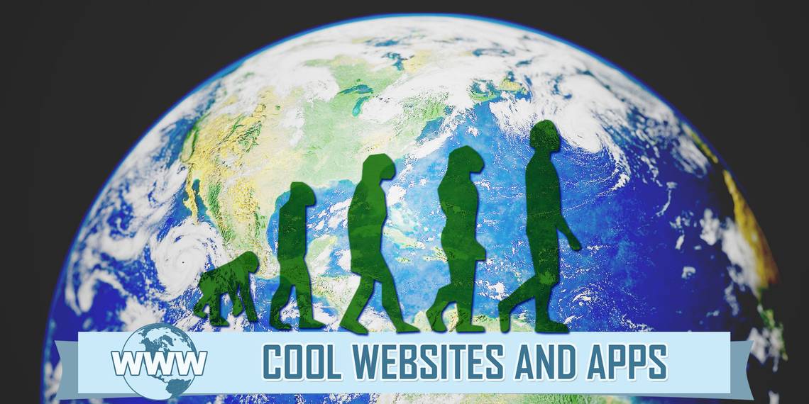
The Journey of Mankind (Web): Track the Peopling of the World
Let's start from the start, by seeing how mankind has spread across the globe, from our roots in Africa. The Internet has some fun yet educational videos to learn the basics of evolution and natural selection, but there is nothing like a world map that charts out the journey of our ancestors. The Bradshaw Foundation's interactive map is the most well-made of several such endeavors.

The map, presented over the last 160,000 years, depicts how climate and geographical conditions affected the decisions made by our forefathers. Each step of the migration is explained in a brief synopsis, and there is always an extra video or link available for those who want to learn more. There are some startling facts here, like how Australia was inhabited before the Americas, or how the Ice Age changed the population of the world.
Histography (Web): An Interactive Timeline of History Through Wikipedia
One of the greatest signs of our progress as a race is Wikipedia, the wondrous publicly-edited encyclopedia of knowledge that is available for free to anyone. It is a chronicle of almost anyone and anything that is remotely of significance in our world. Histography takes this massive data and turns it into an interactive timeline of history.

Histography stands out among fascinating sites that make history come alive. A bar at the bottom asks you to choose a time period, going from 13 billion years ago to today. The graph jots historical articles as little dots, interspersed with image previews of the bigger events, which also indicates how much was happening across the Earth in that period.
There are shortcuts for the stone age, the middle ages, and other important eras, and a lovely background score to keep you company as you read through the annals of man, both educational and weird. Be warned, this one is a time sinkhole. Did you know about the Stink Age, for example, which is one of the craziest things you'll find on Wikipedia?
Maps Timelapse (Web): See Your City Change Through Years of Google Earth Photos
The timelapse photography technique is a wonderful way to show the passage of long periods of time in a short, sped-up version. Timelapse videos can show the world go by, and that's kind of the aim of this little web app. Except instead of people, all the images are satellite photos of our Earth taken from Google Maps.

The end result is fascinating. Point the app to a city, and it will play satellite images from 1984 to 2012. You can choose between fast, medium, and slow speeds, and of course, you're free to pan and zoom like you would normally do with Google Maps. It's breath-taking to watch a major bridge come up, or see the erosion of a coastal line over the years. You will see your city transform before your eyes.
Human Progress (Web): Hard Data About Our Progress, Presented in Cool Charts
Every time you feel cynical about the state of the world today, do yourself a favor and visit Human Progress. This non-profit project has only one agenda. It relies on cold, hard data — collected from independent and reliable sources — to see if we are better off than we were before.

You will be surprised at how much better we are doing now. For example, check the story about the huge increase in environmentally protected areas worldwide. In 2014, we have almost doubled the area from where we were in 1990. Globally, people are happier than ever before, healthier than ever before, and more educated than ever before. And there are statistics to back up all these claims.
When we are pained with worries that technology is dumbing down the human race, Human Progress is the balm you need to put a smile on your face.
People Movin' (Web): Migration Patterns Across the World Today
Global conflict is at an all-time low, at the same time that transportation has advanced to an all-time high. It's no wonder then that soft borders and friendly relations between countries has seen people immigrating, our races mixing, and humanity as a whole evolving. Sometimes, migration reasons are forced, but it can now be tracked at People Movin and seen as an opportunity to learn.

For example, if you are curious about which country most of your fellow citizens migrate to, click on that nation in the first column of countries in People Movin. A neural network will chart where people are moving, and a simple chart shows you the numbers that matter.
To find out which are the countries that people come to your nation from, click on your nation in the right column. Again, a neural network and statistics will give you all the data you need. It's enthralling!
Are You Surprised We're Better Off?
All the data clearly states that mankind is better off than ever before, but I'll be honest, it caught me by surprise. Are you also astonished to find that the world is better place, and it seems to be getting better all the time?
I'd also like to invite you to share one fascinating fact you found on any of the above sites, which reaffirms your faith in humanity