<firstimage="https://www.makeuseof.com/wp-content/uploads/2011/01/compare-icon.png">
Numbers are fun; interactive charts are better. Find useful and fascinating information to compare your country to others online.
We live in a large, increasingly interdependent world. For example: MakeUseOf is brought to you by a team that spreads from Europe to Australia to North America to North Africa. It's never been more important than right now to grasp what's going on around the world. The Internet means you're more connected to other countries than ever before.
Numbers give you a great way to get an overview of a country, so it's nice to be able to find international statistics quickly. But interactive charts can make finding such numbers a lot of fun.
Whether you're an American looking to get some context on global issues or a proud citizen of the developing world wanting a basis of comparison, the Internet is full of information that's fun to browse. Let's highlight some!
If It Were My Home
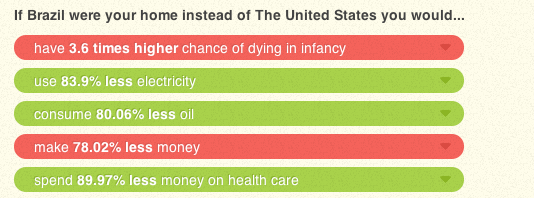
Do you ever wonder what life would be like if you lived in another country? If It Were My Home might not answer all of your questions, but it gives a nice overview:
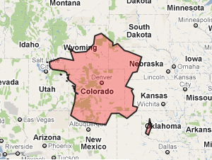
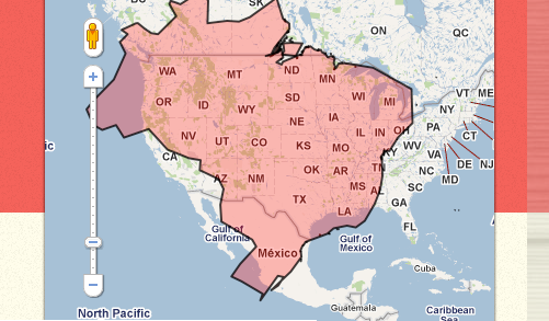
These stats are supplemented by a collection of reading about the given country as well as a map, comparing the size of your country to any other one:
If you want a quick way to compare life in your country with another, this is a fantastic place to start.
Economist Daily Chart
Every day British news magazine "The Economist" shares a fascinating chart with the planet. Some are interactive, some are graphical but all help to shed light on the way our planet works. Check out their Daily Chart blog here.
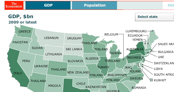
Recently they featured an interactive map comparing the population and GDP of individual American states to countries around the world:
Who would have thought Texas' GDP matches that of the entire nation of Russia, or New Jersey that of Switzerland? Explore the above chart here.
Carbon Footprint Of Nations
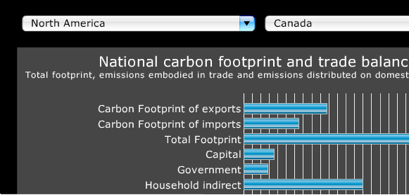
Carbon usage is an increasingly hot-button issue, particularly once you start crossing international borders. Most governments acknowledge the need to reduce output but few are taking concrete steps toward doing so. If you want to see how your country compares to other nations when it comes to carbon output check out Carbon Footprint Of Nations. This site, provided by the Norwegian University of Science and Technology, gives an overview of any nation's carbon output:
Explore this site to learn all about where carbon is coming from on a global scale.
Wolfram Alpha
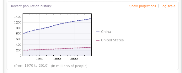
Have a specific question in mind? Ask Wolfram Alpha. This knowledge engine can calculate almost anything if you ask it correctly. For example, you could compare the population of China with the population of America:
This is a great way to quickly compare one country with another when it comes to a variety of issues, from land mass to GDP.
Know of More?
I love finding fun and fascinating charts like this, so please share any you know of. We have comments below for just this reason.
Also feel free to discuss any interesting stats you stumbled upon with the above tools, or rant about how carbon output monitoring is a global conspiracy against whatever country you happen to be from.

