It's more important than ever that your content is as visually arresting as the data behind it.
Presenting information doesn't have to be dull and dry. Whether you're looking for a quick and easy solution or more complex data processing, these four tools will ensure that, whatever data you're working with, your visuals will leave a lasting impression.
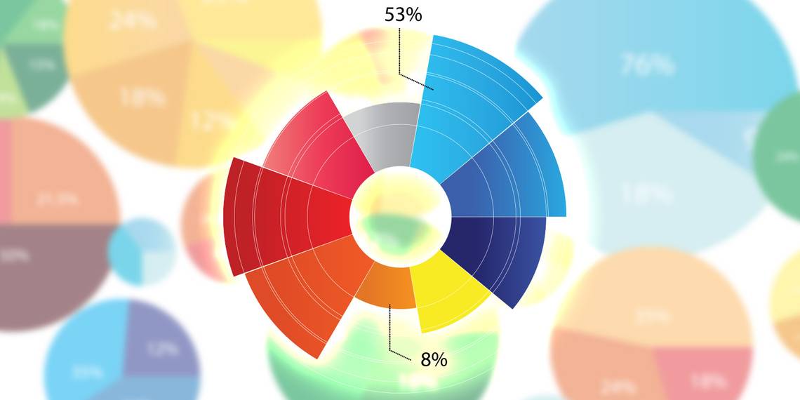
Tableau Public
Intuitive program for beginners, with the scope for advanced use as familiarity increases.
Data visualization can be a very complex process, and as such the programs and tools used to achieve good results can be similarly complex. Tableau Public, at first glance, is not — it's a very accommodating, intuitive piece of software to start using. Simply import your data as a text file, an Excel spreadsheet or an Access database, and you're up and running.

You can create a chart simply by dragging and dropping various dimensions and measures into your workspace. Figuring out exactly how to produce the sort of visualizations you're looking for might take some experimentation, but there's no great challenge in creating simple charts and graphs.
That said, if you're looking to go further, Tableau Public can cater to you. It'll take some time on your part to really understand the breadth of what's on offer, but it's a matter of learning a skill rather than the program itself being difficult to use.
If you can commit the time to learning the intricacies of Tableau Public, there's no end to what you can produce; there's plenty of analysis tools on offer, and you can even create interactive dashboards from inside the software.
Google Fusion Tables
Quick and easy data visualization with useful links to other Google services.
Google Fusion Tables is a service that can really take the legwork out of data visualization — there's a certain rigidity to what you can do with your data once it's been uploaded, but the overall process is very simple and quick. It's also part of the Google Docs family of web apps, so if you have any experience working with those programs, you'll immediately be at home with its interface.

What's great about Fusion Tables is how much of the process is automated. Some web services of this kind can struggle to process your data, but here there's no fuss at all; simply choose a spreadsheet from your computer, a file on your Google Drive or use a built-in tool to search public data tables.
From there, you'll be able to use your data to create a range of charts and graphs that can then be shared or embedded across the web. There's even Google Maps integration so that you can present location-based data visually, as above — I used colored pegs to depict my population-based data, but you can also produce a heat map if that's a better fit.
Google Fusion Tables is a solid Jack-of-all-trades service, but it's real strengths are its place in the Google family and its ease of use, as it's not as flexible as some other more complex tools.
Infoactive [No Longer Available]
Robust infographic builder with plenty of options for user customization.
While individual charts and graphs certainly have their uses, infographics that combine several different sets of data have become a very popular way of presenting information in recent years. These slick, aesthetically pleasing pieces of data visualization typically take a lot of design work to look so appealing — but Infoactive offers similar results through a web-based template.

While it might not boast quite the array of different types of visualization as some other tools and services — although all the standards that you'd expect are present, like bar charts, line graphs and some mapping functionality — Infoactive excels at creating a cohesive long-form document. By combining several different types of visualizations with text and images, you're sure to be able to get your point across.
One drawback comes from the fact that Infoactive is still quite a new service — its interface can sometimes be a little buggy, and in general the user experience could do with a little bit of polish. However, if you can look beyond that, Infoactive is as close as you'll get to a professional-quality infographic without hiring a designer.
R
Complex, time-intensive program that offers precise control to expert users.
There are no two ways of saying it — R is software that will only be of use to the most experienced of users. If you don't have the time to spend hours getting to grips with it, you likely won't have any sort of fruitful results. However, if you're looking to create data visualizations that fit your specifications perfectly, there's really no alternative.

Rather than being a data tool in its own right, R is an environment in which users can write specialized programs to suit their needs. As a result, it's incredibly flexible, but it also means that a working knowledge of JavaScript, as well as its proprietary 'S' programming language is required to really be able to get the most out of the program.
If you're looking to produce a data visualization as a one-off, then R is not the program for you. However, if you're going to produce this sort of content on a regular basis, it's very much worth looking into. R is obtuse and far from user friendly, but the payoff for your commitment to learning how to use the program is that it'll remain relevant while more rigid tools become obsolete.
This is a very difficult program to begin working with, but if you can give up the time to take a free course offered by a site like Coursera, it might be a very useful skill to have under your belt.
Do you use another program, tool or service to create data visualizations? Share it with us in the comments section below.
Image Credits: Graphs and elements Via Shutterstock