Building a complex user interface in React, like a dashboard, can be daunting if you’re doing it from scratch. Thankfully, you don't have to do so.
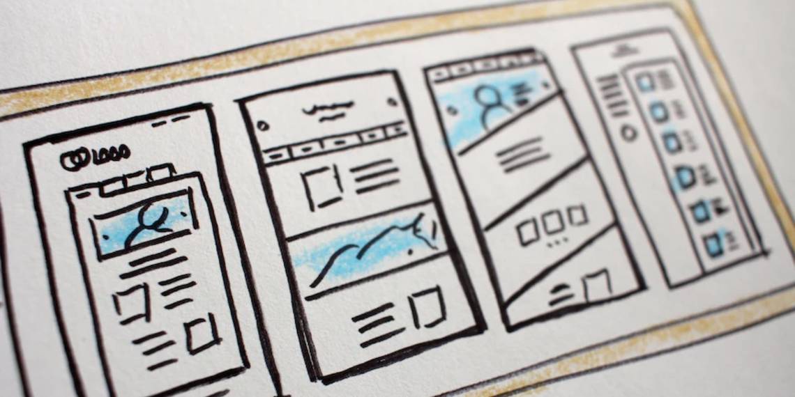
One of the best component libraries you can use is Tremor which allows you to create modern, responsive dashboards in React with little effort. Find out how to use Tremor to create dashboards in React.
What Is Tremor?
Tremor is a modern, open-source, low-level UI component library for building dashboards in React. Tremor builds on top of Tailwind CSS, React, and Recharts (another component-based charting library for React). On top of that, it uses icons from Heroicons.
It boasts over 20 components with all the essentials for building a fantastic analytical interface like charts, cards, and input elements. The library includes small, modular components like badges, buttons, dropdowns, and tabs, that you can combine to create full-fledged dashboards.
What makes Tremor stand out is that it's highly opinionated, so as long as you're okay with the library's decisions, you can fire up a professional-looking dashboard in a breeze.
Tremor supports customization, of course, and makes it easy to do so via React's props system.
How to Get Started With Tremor

Start by creating a new React app using the create-react-app package (or Vite if that's what you prefer).
You'll need to already have Node.js and npm installed on your system. You can confirm this by running node --version and then npm --version on a command line. If either command is missing, you can install them using a simple process; see this guide to installing Node.js and npm on Windows, for example.
Setting Up Your React Project With Tremor
- Open your terminal and navigate to your preferred directory using the cd command.
- Run npx create-react-app tremor-tutorial. This command will create a new React application called tremor-tutorial on your system in the current directory.
- Switch to the app directory by running cd tremor-tutorial.
-
Install Tremor in your React project using the following command:
npm install @tremor/react -
Once you've installed Tremor, import the package in your App.js (or main.jsx if you used Vite) by adding the following line at the bottom of your imports:
import "@tremor/react/dist/esm/tremor.css";
Although Tremor uses Tailwind CSS, you don't need to install it in your React app to use the library. This is because Tremor already has Tailwind set up internally. However, if you want to, check out our tutorial on installing Tailwind CSS in React.
Next, install Heroicons in your project using the following command:
npm i heroicons@1.0.6 @tremor/react
Now, let's remove unnecessary code in our src/App.js file. Here's our starter code in App.js:
        import "./App.css";
import "@tremor/react/dist/esm/tremor.css";
export default function App() {
  return (
    <div>
      <h1>Our Awesome React Dashboard</h1>
    </div>
  );
}
Next, create a dedicated components subfolder in your src folder. In that components folder, create a new Dashboard.js file and add the following code:
        function Dashboard() {
  return <div>Dashboard</div>;
}

export default Dashboard;
Import the Dashboard component in App.js by adding the following statement after other imports:
import Dashboard from "./components/Dashboard";
Finally, display the component in your React app by adding <Dashboard /> below the h1 element.
Creating a Dashboard With Tremor
To create a complete dashboard using Tremor, with a minimum of fuss, select one of the available blocks. Blocks are prebuilt layouts made up of different small modular components.
A good starting point is Tremor's blocks section which showcases different types of prebuilt block components that you can use. Layout shells, for example, let you piece together different components to create a dashboard.
First, add the following code to your Dashboard.js file:
        import {
  Card,
  Title,
  Text,
  ColGrid,
  AreaChart,
  ProgressBar,
  Metric,
  Flex,
} from "@tremor/react";

function Dashboard() {
  return (
    <main>
      <Title>Sales Dashboard</Title>
      <Text>This is a sample dashboard built with Tremor.</Text>

      {/* Main section */}
      <Card marginTop="mt-6">
        <div className="h-96" />
      </Card>

      {/* KPI section */}
      <ColGrid numColsMd={2} gapX="gap-x-6" gapY="gap-y-6" marginTop="mt-6">
        <Card>
          {/* Placeholder to set height */}
          <div className="h-28" />
        </Card>
      </ColGrid>
    </main>
  );
}

export default Dashboard;
The shell block contains different components that you import at the top of the file. If you preview this in your browser, you'll only see two empty blocks.
You can populate your blocks with Tremor's prebuilt components, like a chart, card, or table. You can pull data from an API (REST or GraphQL) or store it in an array of objects right inside your component.
To add a component to your shell block, replace the <div className="h-96" /> line with the following:
        <Title>Performance</Title>

<Text>Comparison between Sales and Profit</Text>

<AreaChart
  marginTop="mt-4"
  data={data}
  categories={["Sales", "Profit"]}
  dataKey="Month"
  colors={["indigo", "fuchsia"]}
  valueFormatter={valueFormatter}
  height="h-80"
/>
After that, add the following array before your return statement (this is the data that the dashboard's main section will display):
        // Data to display in the main section
const data = [
  {
    Month: "Jan 21",
    Sales: 2890,
    Profit: 2400,
  },
  {
    Month: "Feb 21",
    Sales: 1890,
    Profit: 1398,
  },
// ...
  {
    Month: "Jan 22",
    Sales: 3890,
    Profit: 2980,
  },
];

const valueFormatter = (number) =>

$ ${Intl.NumberFormat("us").format(number).toString()};
Next, add the following code to your file after valueFormatter:
        // Data to display in KPI section
const categories = [
  {
    title: "Sales",
    metric: "$ 12,699",
    percentageValue: 15.9,
    target: "$ 80,000",
  },
  {
    title: "Profit",
    metric: "$ 45,564",
    percentageValue: 36.5,
    target: "$ 125,000",
  },
  {
    title: "Customers",
    metric: "1,072",
    percentageValue: 53.6,
    target: "2,000",
  },
  {
    title: "Yearly Sales Overview",
    metric: "$ 201,072",
    percentageValue: 28.7,
    target: "$ 700,000",
  },
];
For the categories array of objects, you have to map through each object to display the data in separate Card components. First, delete the Card component in the KPI section and then replace it with this code:
        {categories.map((item) => (
  <Card key={item.title}>
    <Text>{item.title}</Text>
    <Metric>{item.metric}</Metric>
    <Flex marginTop="mt-4">
      <Text
        truncate={true}
      >{`${item.percentageValue}% (${item.metric})`}</Text>

      <Text>{item.target}</Text>
    </Flex>

    <ProgressBar
      percentageValue={item.percentageValue}
      marginTop="mt-2"
    />
  </Card>
))}
And that's it. You've created your first dashboard with Tremor. View your dashboard by running npm start. It should be similar to the screenshot above.
Customizing Tremor Components
Tremor allows customization using props. You'll need to review the documentation of the component you want to customize and check all the properties included with their default values.
For instance, if you have a <LineChart />, you can hide the x-axis by passing the prop showXAxis={false} or change the height using height={h-40}. For props declaring values found in Tailwind CSS, like sizing, spacing, colors, and the rest, you must use Tailwind utility classes.
Build Complex React Dashboards With Ease
Thanks to component libraries like Tremor, you don't need to build every single part of your UI from scratch. Using a library like Tremor can save you both the time and the headache of creating complex responsive UIs.