
Alert messages are often used in web apps to display warnings, errors, success messages, and other valuable information.
There are a few popular packages and frameworks for making alert messages in React. React-Toastify is a React library that lets you add notifications and alert messages to your applications.
Installing React Toastify
To install Toastify in your React project, run this command in your project directory:
npm install --save react-toastify
Setting Up Toastify
To use the Toastify package, you will need to import the ToastContainer, toast method, and accompanying CSS file provided by the package.
The ToastContainer inside the App component stores all toast notifications created.
        import { ToastContainer, toast } from "react-toastify";
import 'react-toastify/dist/ReactToastify.css';

function App() {
  return(
    <div>
      <ToastContainer/>
    </div>
  );
}
You can use the toast methods to create toast notifications for your React project:
        function App() {
  const notify = () => toast.success("Hello There!");

  return(
    <div>
      <button onClick={notify}>Notify</button>
      <ToastContainer/>
    </div>
  );
}
Clicking on the button this code generates will call the toast.success method, passing it the "Hello There!" string. This will create a toast notification that displays the message on screen, like this:

Note there are different types of toast methods you can call, such as toast.info(), toast.error(), toast.success(), toast.warning(). Each of these methods has some subtle color styling to reflect the type of message.
Positioning Your Toast Notifications
By default, toast notifications pop up from the top-right side of the web app’s screen. You can change this by setting the position property on the ToastContainer. There are six position values available: top-right, top-center, top-left, bottom-right, bottom-center, and bottom-left.
For example:
        function App() {
  const notify = () => toast.success("Hello There!");

  return(
    <div>
      <button onClick={notify}>Notify</button>
      <ToastContainer position="top-left"/>
    </div>
  );
}
Setting the position prop on the ToastContainer to the top-left ensures that all toast notifications pop up from the top-left side of the screen.
You can change the default position for individual toast notifications by using the position prop of the toast methods:
        function App() {
  const notify = () => toast.success("Hello There!", {position: toast.POSITION.TOP_CENTER});

  return(
    <div>
      <button onClick={notify}>Notify</button>
      <ToastContainer position="top-left"/>
    </div>
  );
}
You can also position Toast notifications using the CSS position property, but Toastify’s position prop is the standard way to do this.
Handling the autoClose Prop of the Toast Method and ToastContainer
You can alter the display time of toast notifications. You can control how long a toast notification stays open using the autoClose prop. You can alter the delay time for all toast notifications and individual-specific toast notifications. The autoClose prop only accepts the boolean value false or a duration in milliseconds.
To alter the delay time for all toast notifications, use the autoClose prop within the ToastContainer element.
For example:
        function App() {
  const notify = () => toast.success("Hello There!");

  return(
    <div>
      <button onClick={notify}>Notify</button>
      <ToastContainer autoClose={5000}/>
    </div>
  );
}
With the above settings, all toast notifications will display for exactly five seconds (5,000 milliseconds).
Using the autoClose property of each toast method, you can customize the delay time for individual toast notifications.
For example:
        function App() {
  const notifyOne = () => toast.info("Will close in 10 seconds", {autoClose: 10000});
  const notifyTwo = () => toast.info("Will close in 15 seconds", {autoClose: 15000});

  return (
    <div>
      <button onClick={notifyOne}>Notify One</button>
      <button onClick={notifyTwo}>Notify Two</button>
      <ToastContainer />
    </div>
  );
}
To prevent the toast notification from closing by default, you can set the autoClose prop to false. You can ensure the user must manually close each toast notification by setting the autoClose prop of the ToastContainer to false.
For example:
        function App() {
  const notify = () => toast.info("Hello There!");

  return (
    <div>
      <button onClick={notify}>Notify</button>
      <ToastContainer autoClose={false} />
    </div>
  );
}
Setting the autoClose prop of individual toast methods to false will also ensure that those specific toast notifications do not close by default.
Rendering Non-String Notifications With Toastify
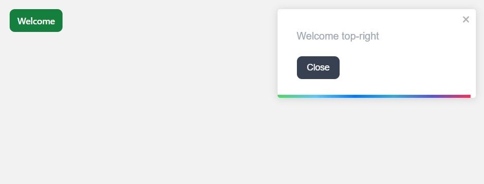
You can render strings, react components, and numbers as notification messages when working with toast notifications. To render a React component as a toast notification, you create the component and render it using a toast method.
For example:
        function Message({toastProps, closeToast}) {
  return (
    <div>
     <p>Welcome {toastProps.position}</p>
     <button onClick={closeToast}></button>
    </div>
   )
}

export default Message;
This code block creates a component, Message. When rendering a component as a notification, toast adds toastProps and closeToast props to your component. The closeToast prop is a function that you can use to close the notification. The toastProps prop is an object with properties that store details about the toast notification including its position, type, and other characteristics.
Import the Message component, then pass it to the toast() function, rendering it as a toast notification:
        import { ToastContainer, toast } from "react-toastify";
import 'react-toastify/dist/ReactToastify.css';
import Message from "./components/Message";

function App() {
  const msg = () => toast(<Message />);

  return (
    <div>
      <button onClick={msg}>Welcome</button>
      <ToastContainer />
    </div>
  );
}
Clicking on the button will cause a notification containing a question and two buttons to display on your screen.
 Styling Toast Notifications
You don't have to use the default styling for your toast notifications. You can customize them to fit a desired design theme or pattern suited to your web application.
To style your toast notification, give it a className and apply the customizations within a CSS file.
For example:
        function App() {
  const notify = () => toast.success("Hello There!", {className: "toast-message"});

  return (
    <div>
      <button onClick={notify}>Notify</button>
      <ToastContainer position="top-center" />
    </div>
  );
}
With the className attached to your notification, you can style the toast notification to your preference inside the CSS file:
        .toast-message {
  background-color: #000000;
  color: #FFFFFF;
  font-size: 20px;
  padding: 1rem 0.5rem;
}
As a result of the above custom styling, the notification will look like this:

Toast Notifications for Your Web Application
You can now create custom alerts in React using the React-Toastify package and its available methods. By styling these custom alerts/notifications to your preference, you can enhance the user experience of your web application.
React-Toastify offers a quick and effective method for including custom alerts in your React project without fuss.