Adding a date picker to your React.js app is a great way of improving its user-friendliness. A date picker allows users to select a date from a calendar directly in a form field, rather than having to type the date manually. This can greatly improve your app's user experience, making it easier for users to select the dates they need.
You can add a date picker to your React.js app using native features or with an external library.
What Is a Date Picker?
A date picker is an interface element that allows a user to select a date from a calendar.
It usually appears as a text box with a calendar icon beside it that when clicked, opens a calendar allowing the user to select a date. The user can then type in the date or select it from the calendar, depending on the application’s configuration.
How to Add a Date Picker to Your React.js App
There are several ways to add a date picker to your React.js application. These include using native features and integrating third-party libraries. You can also add additional features to your date picker.
Using Built-In Features
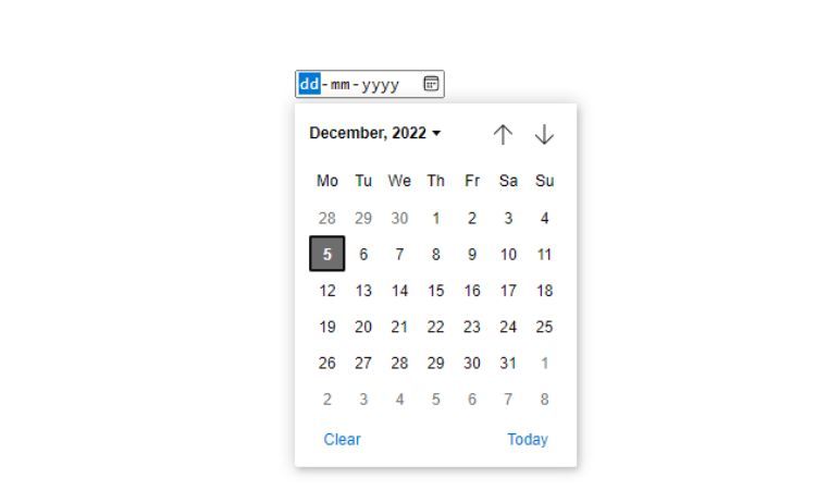
You can use React hooks and the native HTML5 date input type to add a date picker to your application. This is a straightforward way of adding a date picker, as it requires no additional libraries or code. However, it has some drawbacks, such as the limitations of default styling and basic features.
        import React, { useRef, useState } from 'react';

const DatePicker = () => {
  const [date, setDate] = useState('');
  const dateInputRef = useRef(null);

  const handleChange = (e) => {
    setDate(e.target.value);
  };

  return (
    <div>
      <input
        type="date"
        onChange={handleChange}
        ref={dateInputRef}
      />
      <p>Selected Date: {date}</p>
    </div>
  );
};

export default DatePicker;
The above code uses the native HTML5 date input type to create a date picker. It uses the useState hook to keep track of the selected date and the useRef hook to get a reference to the date input field. It then creates an onChange handler that updates the date state when the user selects a date.
Disadvantages of Using Built-In Features
The main disadvantage of using the native HTML5 date input type is that it does not offer any additional features or customization. It’s limited to a small set of default features and does not offer any additional options, such as selecting a range of dates.
While you can add styling to the input field, it is not possible to add any additional features.
Using the react-datepicker Library
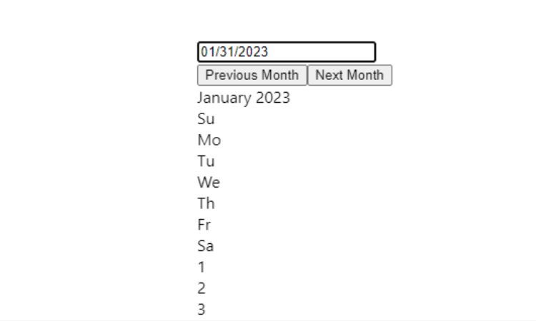
The react-datepicker library is a popular and widely used library for adding a date picker to your React.js app. It provides a wide range of options and features, such as the ability to select a range of dates, customize styling, and add additional features.
        import React, { useState } from 'react';
import DatePicker from 'react-datepicker';

const DatePickerExample = () => {
  const [startDate, setStartDate] = useState(new Date());

  return (
    <DatePicker
      selected={startDate}
      onChange={date => setStartDate(date)}
    />
  );
};

export default DatePickerExample;
This code uses the react-datepicker library to create a date picker. Use the useState hook to keep track of the selected date and then pass it to the DatePicker component. This will render a date picker with the selected date.
Using the react-date-picker Library
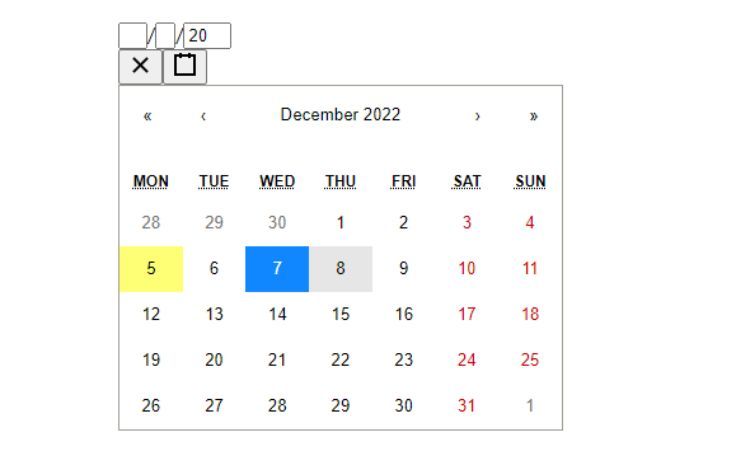
The react-date-picker library is another popular library for adding a date picker to your React.js app. It offers similar features and options to the react-datepicker library, such as the ability to select a range of dates, customize the styling, and add additional features. It is a good choice if you are looking for a more robust date picker with additional features.
        import React, { useState } from 'react';
import DatePicker from 'react-date-picker';

const DatePickerExample = () => {
  const [startDate, setStartDate] = useState(new Date());

  return (
    <DatePicker
      value={startDate}
      onChange={date => setStartDate(date)}
    />
  );
};

export default DatePickerExample;
This code uses the react-date-picker library to create a date picker. It’s similar to the previous code, but it uses the react-date-picker library instead of react-datepicker. This library provides different styling and features in the date-picker calendar. You can also add custom styling using CSS or a CSS framework like Tailwind.
Adding Additional Features
Once you have added a date picker to your React.js app, you can add additional features and options to make it more user-friendly and intuitive. For example, you can add the ability to select a range of dates, customize the styling, and add additional features such as time selection. You can also add custom validation to ensure the user selects a valid date.
        import React, { useState } from 'react';
import DatePicker from 'react-date-picker';

const DatePickerExample = () => {
  const [startDate, setStartDate] = useState(new Date());
  const [endDate, setEndDate] = useState(new Date());

  return (
    <div>
      <DatePicker
        value={startDate}
        onChange={date => setStartDate(date)}
      />
      <DatePicker
        value={endDate}
        onChange={date => setEndDate(date)}
      />
    </div>
  );
};

export default DatePickerExample;
This code uses the react-date-picker library to create a date picker. It uses the useState hook to keep track of the start date and end date, passing them to the DatePicker components. This will render two date pickers, one for selecting the start date and one for selecting the end date.
You can also add custom validation to ensure the user selects a valid date. You can do so by using the onChange event handler to check for valid dates and display an error message if the user selects an invalid date.
Improve User Engagement With Date Pickers
With a date picker, users can select dates more quickly, with greater reliability. This makes it easier for users to select the dates they need, making them more likely to use your application. In addition, you can customize a date picker to fit your application’s look and feel, making it more user-friendly and intuitive.
You can also add validations to your date pickers and forms to ensure users enter valid dates. This helps to prevent users from entering invalid dates that can cause errors in your application.


