Accessibility should be one of your top priorities during development. Accessible components improve an application’s usability and widen its audience base. However, creating accessible applications can be costly in terms of build and test time.
To save time, you can use a UI component library that provides accessible components that have been thoroughly tested. Examples of accessible UI component libraries are Chakra UI, Radix UI, Material UI, Headless UI, and Next UI.
1. Chakra UI
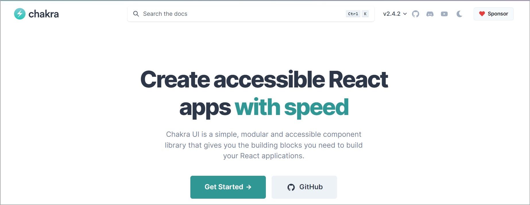
Chakra UI is a simple component library that’s great for creating applications that are accessible. With 1.4 million downloads per month, this UI library is growing rapidly, and you're sure to find answers when you get stuck using it. It’s composable and provides components that are small with minimal complexity. This approach increases its customization capability as developers can combine these small components to build larger ones.
Chakra UI has a free version and paid versions. The free version is however sufficient for small projects.
Key Features of Chakra UI
- Chakra UI components follow the WAI-ARIA standards and are all accessible.
- Components are customizable, and you can change them to match your design requirements.
- Components are composable. You can easily combine them to build larger components.
- Chakra UI library is type-safe as it's written in TypeScript.
- It has great community support and extensive documentation.
- It offers a light and dark UI which eliminates the complexity of implementing a dark mode in your React app.
- It supports a mobile-first design and each component is responsive.
Follow the Chakra UI installation guide to start using Chakra UI in your project.
2. Radix UI
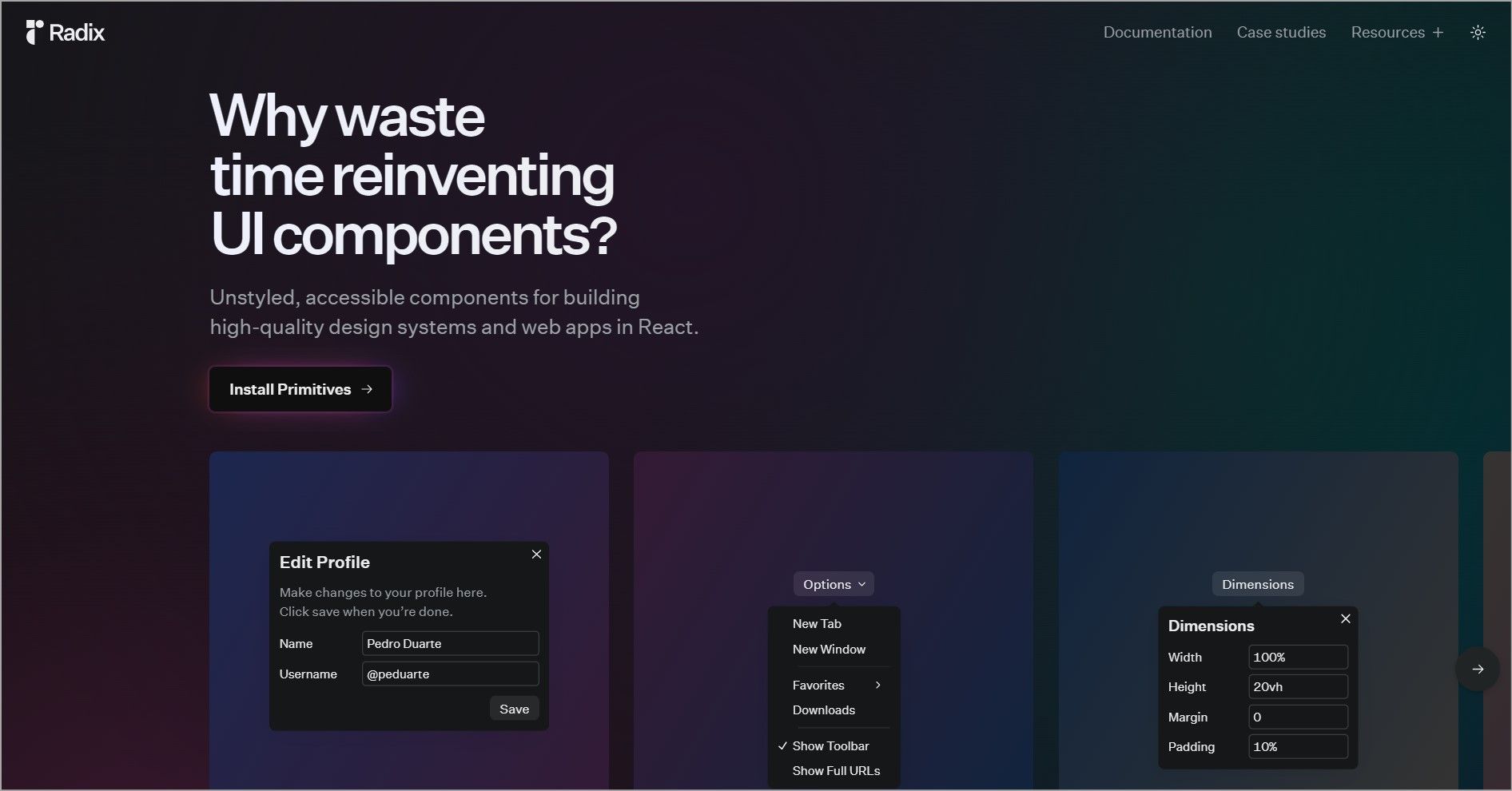
Radix UI is an open-source library for building accessible web applications and design systems. Radix offers primitives, icons, and colors.
Radix primitives are the unstyled, accessible components. Primitives speed up development by taking care of tricky parts like WAI-ARIA compliance, keyboard navigation, and focus management. Because they come unstyled, you are free to implement your design with a styling solution of your choosing.
Radix colors provide an accessible color system for designing UI components that fit into your theme and brand. It has an automatic dark mode applied via a class name and multiple color combination options that pass the WCAG contrast ratio.
Radix icons are a set of 15*15 icons available as individual React components. These icons are also available as SVG files, and you can also open them in Figma or Sketch.
Together, primitives, colors, and icons simplify the way you build the front end of your application.
Key Features of Radix UI
- Radix components follow the WAI-ARIA design patterns.
- Radix UI components are unstyled which gives you the freedom to customize them to your liking.
- Components can either be controlled or uncontrolled. By default, they are uncontrolled, allowing you to use them without needing to manage the local state.
- Each primitive can be installed individually meaning you can install primitives as you need them.
- Components share a similar API that’s fully typed.
Follow this primitives tutorial to start using Radix.
3. Material UI
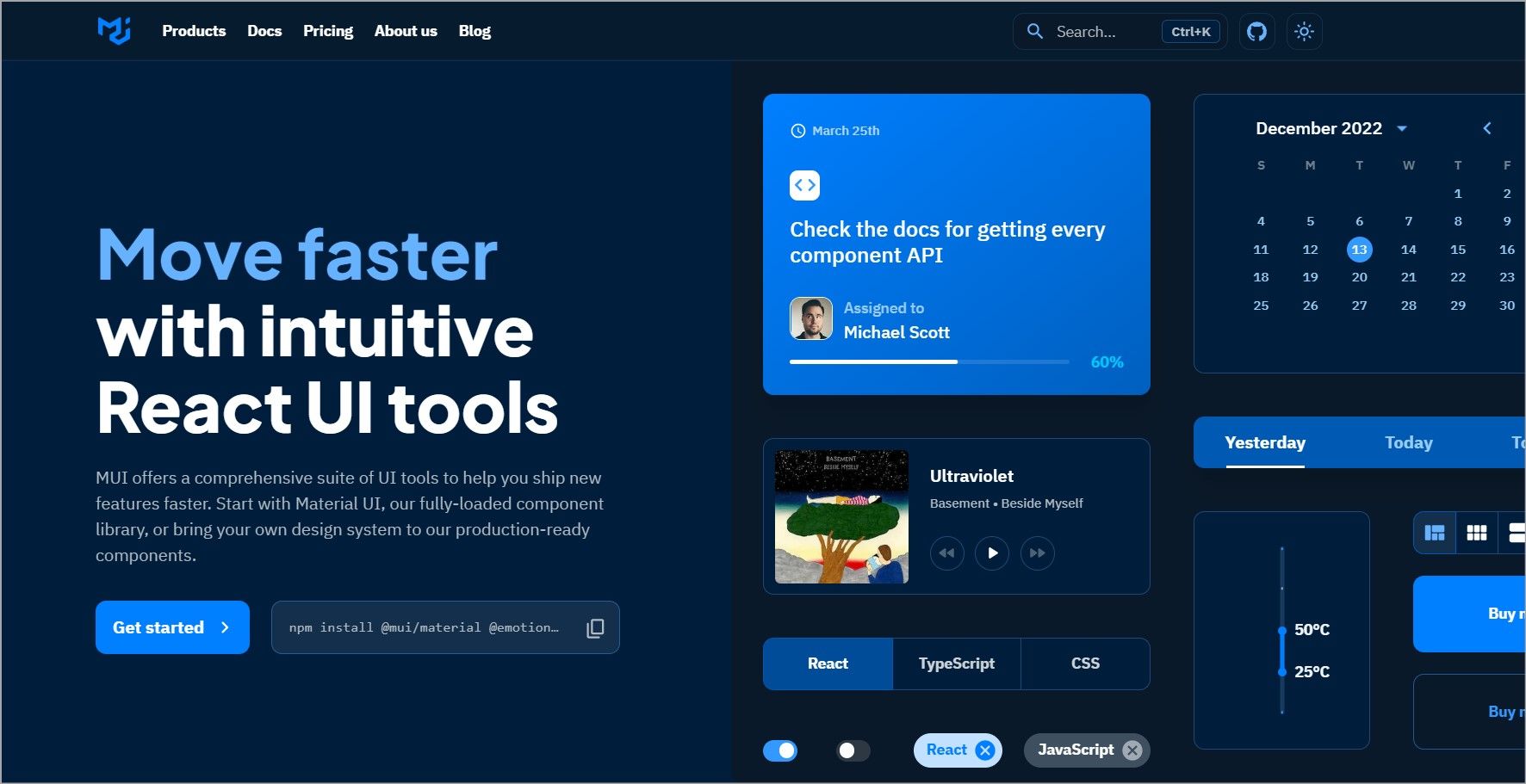
Material UI (MUI) is one of the most popular React component libraries with more than 80k stars on GitHub. By default, MUI offers components that follow Google’s material design standards. You can however customize these components to fit your design needs.
Aside from components, MUI also offers templates and design kits. Templates are pre-designed UI designs that help you build front ends quickly. A design kit is a collection of design elements and styles aimed at helping designers and developers achieve a consistent design.
MUI’s community version is free but there is a pro and premium version with more advanced features.
Key Features of Material UI
- Components are highly customizable with theming capabilities.
- The components are production ready.
- Accessibility is a core priority for all the components that MUI ships.
- It has comprehensive documentation that’s easy to navigate.
- It has several MUI usage examples of technologies like Remix, Next.js, Gatsby.js, and many more that demonstrate how to use MUI.
- It supports TypeScript.
- It's very popular and has a large community that can help with questions about MUI.
- It offers pre-built UI kits for material design components for Figma, Adobe XD, Sketch, and UXPin.
- MUI provides a large selection of icons.
Install Material UI in your project to start using MUI components.
4. Headless UI
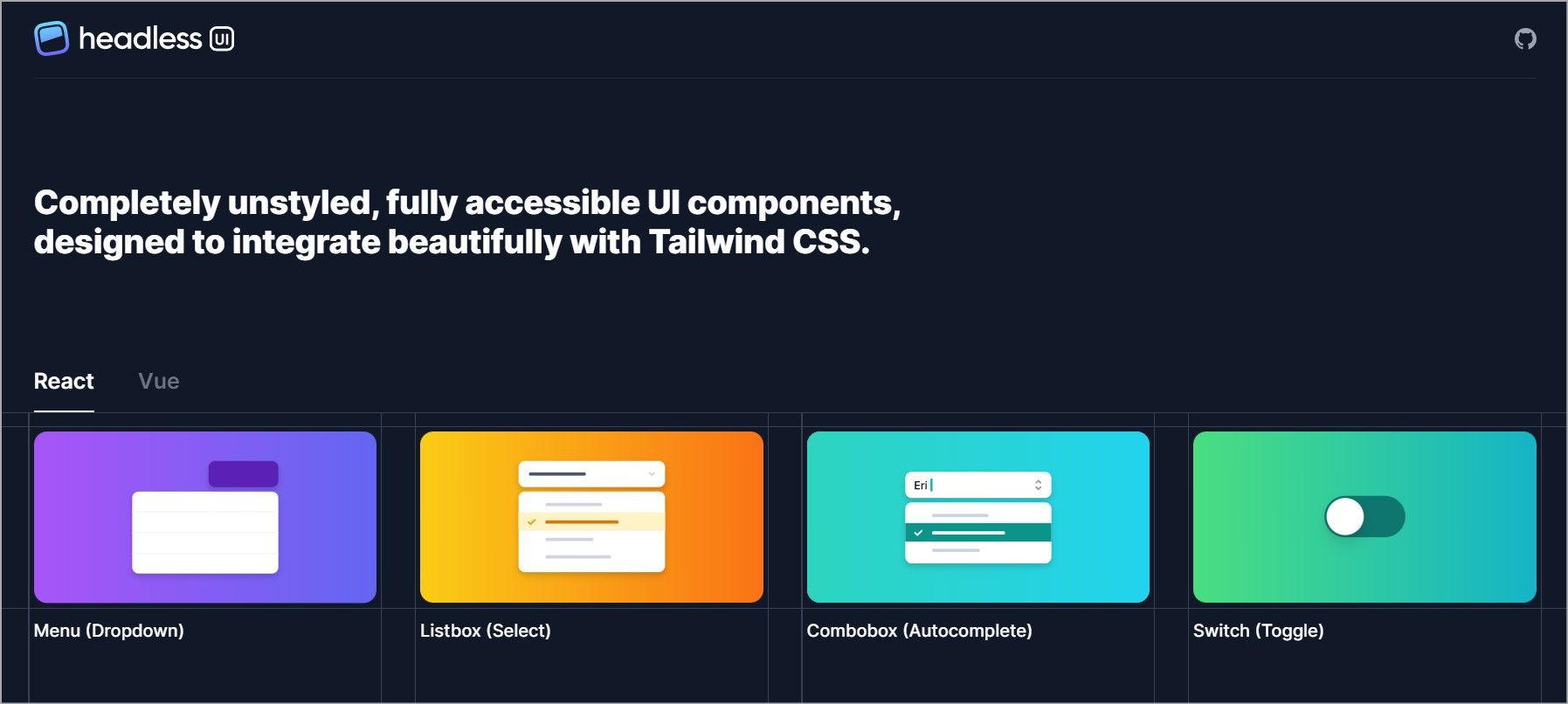
Headless UI is a library of unstyled and accessible components. Headless UI helps you build inclusive components by handling aria attributes and roles, focus management, keyboard navigation, and ensuring they support screen readers.
These components work well with Tailwind CSS.
Key Features of Headless UI
- Its components are unstyled giving you total control over how they look.
- Headless UI components are fully accessible which helps you create inclusive applications without spending a lot of time building and testing components.
- It offers pre-styled examples via Tailwind UI that you can use in your project.
5. Next UI
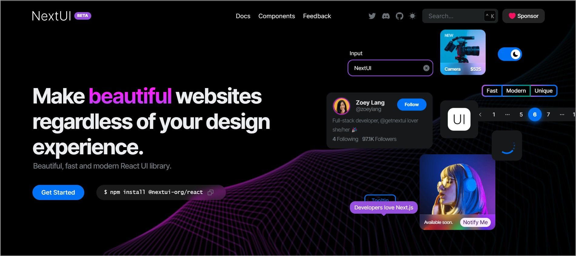
Next UI is a relatively new React library. It is fully compatible with Next.js allowing you to create a Next.js project with minimal setup.
Next UI is still in beta but has numerous features for building stunning and accessible websites.
Key Features of Next UI
- All the components follow the WAI-ARIA guidelines and support keyboard navigation and focusing.
- It comes with default themes, that you can customize to match your needs.
- You can also implement dark mode with just a few lines of code.
- It provides a set of CSS media queries for building responsive layouts.
- It has a fully typed API helping you create a type-safe application.
- Next UI components support server-side rendering.
Choose Your Library With Care
Creating accessible applications can be time-consuming; using a UI library is easier. For React projects, there are several libraries to choose from. When picking a library, decide if you want a headless component that’ll give you total control of styling and functionality or pre-styled, customizable components.
Radix UI and Headless UI are great if you want full control over the design while Material UI and Next UI are good options if you want a ready-to-use library.


