Adding a color picker to a React app can make it much easier for users to make decisions about the colors they want to use. Color pickers are a great tool for users working with a graphics application or any app that supports personalization.
The react-color library offers a wide range of options and many color picker styles to suit your needs.
Adding a Color Picker to Your App
The react-color library makes it easy to add a color picker to your React App. This library provides a simple and intuitive way for users to select colors for their applications. The code is simple to use and provides a great user experience. Before adding a color picker, you first need to create a simple react app.
An Overview of react-color
The react-color library is a great way to add a color picker to your React app. It offers an easy-to-use interface that allows users to pick from a range of colors. The library also provides props that you can use to customize the color picker.
The code to add a color picker to your React app is straightforward. To use the react-color library, you first need to install the library using npm, the package manager for Node.js.
npm i react-color
Then, simply add the following code to the component you want to display the color picker:
        import React from 'react'
import { SketchPicker } from 'react-color'

class Component extends React.Component {
  render() {
    return <SketchPicker />
  }
}

export default Component
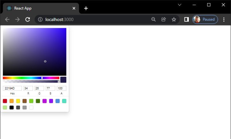
The above code will render a basic color picker. It will allow users to select from a range of colors. The picker will also display the HEX code of the selected color, which you can use in other parts of your app.
Available Props
The react-color library provides props to customize the color picker. You can use these props to change the size of the picker, the colors available, and much more.
Below are the available props for the Color Picker:
- width: The width of the color picker in pixels.
- height: The height of the color picker in pixels.
- color: The initial color of the selector.
- onChange: A callback function that runs when the color changes.
- onChangeComplete: A callback function that runs when the color change completes.
The following code shows how to use all the available props for the Color Picker:
        import React from 'react'
import { SketchPicker } from 'react-color'

class Component extends React.Component {

  render() {
    return (
      <SketchPicker
        width={200}
        height={200}
        color="#ff0000"
        onChange={(color) => console.log(color)}
        onChangeComplete={(color, event)=> console.log(color)}
        />
      )
  }
}

export default Component
The above code will render a color picker with a width of 200px, a height of 200px, an initial color of #ff0000, and a palette of colors. It will also show an input field for the color code and will display the alpha channel. When the color changes, it will call the onChange callback and log the new color to the console.
Adding Additional Color Pickers
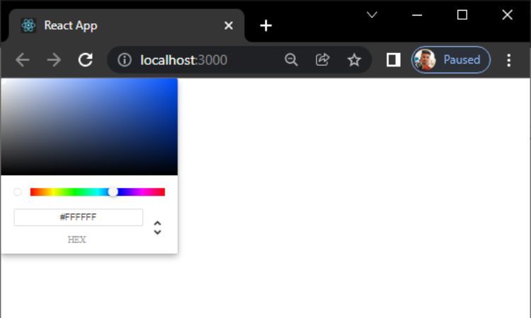
The react-color library provides a range of different color pickers to choose from, and in addition to the SketchPicker used in the last section, you can also use the ChromePicker.
Import the ChromePicker the same way you imported the SketchPicker:
import { ChromePicker } from 'react-color';
Once you’ve imported the ChromePicker, you can use it in your app by adding the following code:
        <ChromePicker
    color={ this.state.background }
    onChangeComplete={ this.handleChangeComplete }
    disableAlpha={true}
/>
The ChromePicker takes the same props as the SketchPicker, but also has a few additional options, such as the ability to disable the alpha channel, which you can do with the disableAlpha prop. You can also set the color directly with the color prop.
There are also other color pickers available in the react-color library, such as Block, Twitter, and GitHub. Each of these pickers has its own props, so be sure to check the documentation for more information.
Improve Your User Experience With a Color Picker
Adding a color picker to your React app is a great way to improve the user experience. It allows users to quickly and easily select colors for their applications. You can also make the color picker more user-friendly using the Tailwind CSS.


