Undoubtedly, you can create a togglable mobile menu using CSS frameworks like TailWind or BootStrap.
But what's the concept behind it? And how can you make one from scratch without depending on these CSS frameworks?
Doing the above yourself gives you full customization control. So, with out further ado, here's how to create a togglable mobile menu using your preferred programming language.
How to Create Your Togglable Mobile Menu
If you've not done so already, open your project folder and create your project files (HTML, CSS, and JavaScript).
Below, you'll see examples of the code you need for all three types. And if you haven't already, consider downloading these apps to learn code before reading on.
We'll start off with HTML:
        <!DOCTYPE html>
<html>
<head>
	<title>Mobile Navigation Menu</title>
</head>
<body>
	<section>
               <strong><!-- Create three divs to represent the three-line dropdown menu bar --></strong>
		<div id="toggle-container">
			<div id="one"></div>
			<div id="two"></div>
			<div id="three"></div>
		</div>

                <strong><!-- Add your navigations here --></strong>
                <div id="toggle-content" class="toggle-content">
			<a href="#home">Home</a>
			<a href="#about">About</a>
			<a href="#contact">Contact</a>
		</div>
	</section>
</body>
CSS:
        /*This section demarcation is solely for the purpose of the tutorial*/
		section{
			width: 800px;
			height: 600px;
			margin-top: 50px;
			margin-left: 250px;
			border: solid black 1px;
			background: #e6e3dc;
		}

	<strong>/*position the divs container in your DOM*/</strong>
		#toggle-container{
			display: grid;
			width: fit-content;
			margin-left: 720px;
			margin-top: 10px;
		}

	<strong>/*Stack the three divs above each other. Then set a height and width for them.*/</strong>
		#one, #two, #three{
			background: black;
			width: 30px;
			height: 3px;
			margin-top: 5px;
		}

		.toggle-content{
			display: none;
			margin-left: 700px;
			margin-top: 20px;

		}

		.toggle-content a{
			display: block;
			text-decoration: none;
			color: black;
			font-size: 30px;
		}

		.toggle-content a:hover{
			color: blue;

		}
	<strong>/*Display the class instance created by JavaScript in block*/</strong>
		.displayed{
			display: block;
		}
Add JavaScript:
        var toggler = document.getElementById("toggle-container");
var toggleContents = document.getElementById("toggle-content");
document.addEventListener("click", function(){
<strong>//Apply a class intance to each navigation and set display to toggle:</strong>
     toggleContents.classList.toggle("displayed");
});
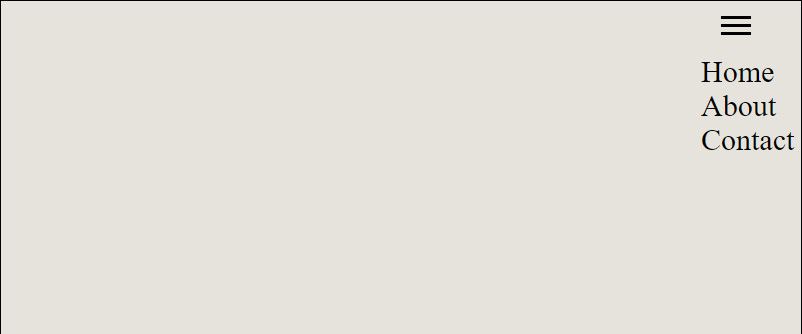
Here's how a working output looks like when you click the menu bar:
The menu is togglable, so clicking the bar again—or anywhere within the page—hides the navigations.
Your browser may not support hiding the content when you click anywhere within your webpage. You can try to force this by using an event target and JavaScript loop. You can do that by adding the following block of code to your JavaScript:
        <strong>//Add a click event to your webpage:</strong>
window.onclick = function(event) {

  <strong>//Target the click event on the menu bar to allow the webpage body to track it:</strong>
  if (!event.target.matches('#toggle-container')) {
    var dropdowns = document.getElementsByClassName("toggle-content");

    <strong>//Hide the navigations by looping through each of them:</strong>
    for (var i = 0; i < dropdowns.length; i++) {
      var dropped = dropdowns[i];
      if (dropped.classList.contains('display')) {
        dropped.classList.remove('display');
      }
    }
  }
}
So here's a summary of what you just did: You created three lines using the div tag of HTML. You adjusted their height and width and positioned them in your DOM. Then you gave these a click event using JavaScript.
You set the initial display of your navigations to none to hide them when the page loads. Then the click event on the three lines toggles these navigations based on a JavaScript instantiated class (displayed). Finally, you used this new class to display the navigations using CSS, and JavaScript's toggleContents method.
The rest of the CSS, however, depends on your preference. But the one in the example CSS snippet here should give you an idea of how to style yours.
Get More Creative When Building Your Website
Making a visually appealing website requires some creativity. And a user-friendly website is more likely to convert your audience than a bland one.
Although we've shown you how to create a custom navigation menu here, you can still go beyond this and make it more compelling. For instance, you can animate the display of the navigations, give them a background color, and more. And whatever you do, ensure that your website uses the best design practices and layouts easy for users to use.


