Data analytics and visualization are vital skills that help any team plan tasks, make new project proposals, or impress clients with beautiful presentations. Google Data Studio and Microsoft Power BI are two top trending apps that enable you to materialize this skill.
However, not all data analytics tools are similar, and different sets of data need separate tools. That’s why it’s smart to know the difference between these two business intelligence tools.
What Is Microsoft Power BI?
Microsoft Power BI is a data analytics and visualization tool from Microsoft. This scalable tool is efficient in delivering high-performance data analysis for small, medium, and large projects.
The tool saw widespread adoption from enterprises in the past. However, recently, individuals and small ventures are also trying it out because of its powerful features of slicing and dicing data to deliver various insights on projects.
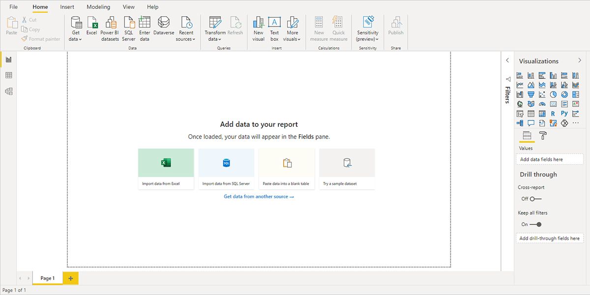
The tool has an easy-to-understand user interface (UI). You can connect data from multiple sources to create outstanding reports. Power BI is available as a standalone desktop app, mobile app, browser-based app, and on-premise server.
Download: Power BI for Windows | Android | iOS (Free)
What Is Google Data Studio?
Data Studio is an easy-to-use tool that anyone can use to produce beautiful data visualizations in minutes. The tool automatically delivers stunning and insightful reports without much action from the user.
It’s a cloud-based app that runs on leading web browsers like Chrome, Firefox, and Safari. Data Studio also comes with a free-to-use license for personal or commercial use. You can access various charts like Bar, Pie, Line, Area, Scatter, etc., which adds value to your data reports.
On top of that, the tool’s navigation is similar to Google Drive, Google Docs, etc. Therefore, you don’t have to invest much time when you start using the tool for the first time.
Features Compared
Both of the tools help users to create meaningful and professional data visualizations effortlessly. However, there are some fundamental differences in how these tools deliver services. You’ll find a thoughtful comparison between Power BI and Data Studio in the following features:
1. Sources for Data Input
Combining Microsoft productivity apps and third-party apps, Power BI supports more than 500 data sources. The following are the headers that organize all the data connectors:
- File: In this category, you’ll find Excel, XML, JSON, PDF, SharePoint folder, etc.
- Database: SQL Server database, Oracle database, MySQL database, Amazon Redshift, etc., are some data connectors in this category.
- Power Platform: This section lets you connect data sources of Power BI datasets, Power BI dataflows, etc.
- Azure: You can source data from various Azure databases by using connectors from this category.
- Online Services: Get data from platforms like GitHub, Salesforce, Asana, etc.
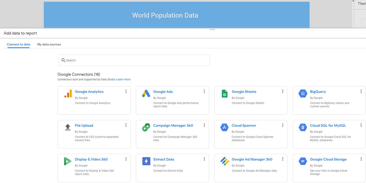
Data Studio supports limited data connectors. Spread across two categories, namely Google Connectors, and Partner Connectors. You can pull data from up to 500 platforms, combining both of the categories.
2. Functionalities
Power BI is for beginner to advanced level data analysts. It has tons of data manipulation features. It also gives you access to many data visualization elements like charts, tables, graphs, etc. Moreover, the tool automatically refreshes itself eight times a day.
Data Studio comes with fewer features as it’s only a data visualization app. However, its in-memory BI engine is a powerful feature that eliminates any data visualization lags, especially for large data sets. The app refreshes source data at 12-hour intervals.
3. Editing Raw Data and Customizations
You’ll find the Power Query feature in Power BI, similar to Excel. Therefore, before plugging in your data source, you can edit your data. You can perform actions like sorting, filtering, cleaning raw data, renaming columns, etc.
Power BI also lets you customize the visualization of the reports, and a few of these are:
- Replace a dimension or measure
- Insert a legend or remove an existing one
- Compare measures
You can’t edit your source data in Data Studio. You’ll need to use Excel or Google Sheets to clean up the raw data. However, raw data doesn’t need any formatting if you connect to data sources like Google Analytics or Google Ads.
You can customize almost all the elements that you use in your report. After you click on a chart or table, a right-side menu will open up. You can customize data and style from this menu.
4. Sharing Data Visualizations
Reports sharing is a complex task in Power BI. You won’t be able to share a report directly from the desktop app. You’ll have to publish the report in the Power BI service. However, mobile apps let you share a dashboard or report directly from the app.
You can share your Power BI reports and dashboards with external or internal collaborators. However, the recipient also needs to have a Premium Per User (PPU) or Power BI Pro subscription to access those files.
On the other hand, sharing a report is easy in Data Studio. You can either add an email in the sharing field or share a public link with anyone. The recipient doesn’t need to pay for any subscription because Data Studio is a free tool from Google.
5. Ease of Use
Users need to know the basics about the extract, transform, and load or ETL process to use Power BI effectively. ETL is vital when working with M language and PowerQuery.
You’ll also need to know DAX language for metrics and measures, PowerPivot for data modeling, etc. In short, you’ll need to go through some training to become Power BI conversant.
On the contrary, Data Studio is a no-code platform that anyone can use. If you have some basic idea about tables, scorecards, and charts, you’re good to go. You can plug in the data source and drag widgets to the board to create professional data visualizations.
6. Community and Online Resources
The Microsoft Power BI Community is a huge knowledge base to learn and resolve doubts about Power BI. You’ll find a lot of content on this platform in sections like Themes Gallery, Data Stories Gallery, Custom Visuals Ideas, Developer, etc.
Similarly, Data Studio also has a robust community platform. The Community Gallery section of the tool gives you access to various third-party visualization widgets. For learning content on Data Studio, you can visit the Data Studio Help Center.
7. Mobile Compatibility
Power BI has native apps for Android, Windows, and iOS smartphones. You can perform many tasks on the Power BI smartphone app, and some vital ones are:
- Visualize data reports
- Filter data from a report
- Add notes to the reports
- Get notifications and set alerts
- Explore on-premise data
On the contrary, Data Studio doesn’t have a mobile app. You may visualize reports using the mobile browser, but editing a report could be challenging.
Data Analytics and Visualization in a Smart Way
Whether to use Power BI or Data Studio, that’ll depend on your objective of data analysis and presentation. You’ll come across that most teams use both tools.
When you need to send a quick and simple report to the client on an ongoing project, it’s okay to use Data Studio. But, if you need to slice and dice raw data and come up with different forecasts for that project, Power BI is the ideal tool.

