There are a fair few JavaScript libraries for plotting various charts, ranging from bar graphs to line charts and more. If you're learning how to display data dynamically on your website with JavaScript, Chart.js is one such library you should try out.
How can you start creating data visualizations with Chart.js? You'll learn how in this article.
Let's get started.
What Is Chart.js?
Chart.js is an open-source data visualization JavaScript library used to plot HTML-renderable charts. It currently supports eight different interactive charts types that you can also animate. To make an HTML-based graph with chart.js, you need an HTML canvas to hold it.
The library accepts a set of datasets and other customization parameters such as the background color, border color, and more. One of the datasets is the label, which represents the values on the X-axis. The other is a set of numerical values, which typically lie on the Y-axis.
You also need to specify the graph type within the chart object so the library knows which graph to plot.
How to Create Charts With Chart.js
As we mentioned previously, you can create various types of charts with chart.js. For this tutorial, you'll start with line and bar graphs. Once you grasp the concept behind these, you'll have all the tools and confidence you need to plot the other available charts.
To start using chart.js, create the necessary files. For this tutorial, the file names are chart.html, plot.js, and index.css. You can use any naming convention for your files.
Now, paste the following in the head section of your HTML file to link to the Chart.js content delivery network (CDN).
In chart.html:
        <head>
        <script
src="https://cdnjs.cloudflare.com/ajax/libs/Chart.js/2.8.0/Chart.min.js">
        </script>
    </head>
Next, create an HTML canvas to hold your chart and give it an ID. Also, connect to the CSS (index.css) file in the head section and point to your JavaScript (plot.js) file in the body section.
The structure of the HTML file looks like this:
        <!DOCTYPE HTML>
<html>
    <head>
        <title>
            Chart
        </title>
        <link rel="stylesheet" href="index.css">
        <script src="https://cdnjs.cloudflare.com/ajax/libs/Chart.js/2.8.0/Chart.min.js"></script>
    </head>
    <body>
        <header>
            <h1>
                Charts
            </h1>
        </header>
        <canvas id="plots" style="width:100%;max-width:700px"></canvas>
<script src="plot.js">
</script>
</body>
</htm/>
And in your CSS:
        body{
    background-color:#383735;
}

h1{
    color:#e9f0e9;
    margin-left:43%;
}
#plots{
    margin:auto;
    background-color:  #2e2d2d;
}
The CSS styling above isn't a set convention. So you can style yours as you like depending on your DOM structure. Once your HTML and CSS files are ready, it's time to plot your charts with JavaScript.
The Line Chart
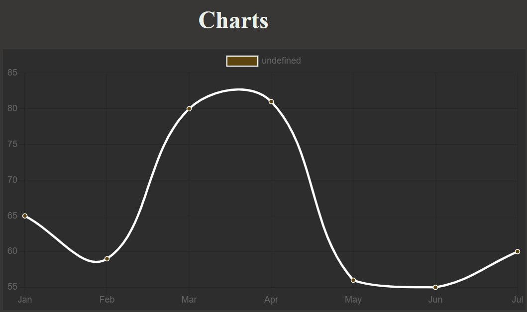
To make a line chart with chart.js, you'll set the chart type to line. This tells the library to draw a line chart.
To demonstrate this, in your JavaScript file:
        <strong>// Get the HTML canvas by its id</strong>
plots = document.getElementById("plots");

<strong>// Example datasets for X and Y-axes</strong>
var months = ["Jan", "Feb", "Mar", "Apr", "May", "Jun", "Jul"]; <strong>//Stays on the X-axis</strong>
var traffic = [65, 59, 80, 81, 56, 55, 60] <strong>//Stays on the Y-axis</strong>

<strong>// Create an instance of Chart object</strong>:
new Chart(plots, {
  type: 'line', <strong>//Declare the chart type</strong>
  data: {
    labels: months, <strong>//X-axis data</strong>
    datasets: [{
      data: traffic, <strong>//Y-axis data</strong>
      backgroundColor: '#5e440f',
      borderColor: 'white',
      fill: false, <strong>//Fills the curve under the line with the babckground color. It's true by default</strong>
    }]
  },
});
Output:
Feel free to change the fill value to true, use more data, or tweak the colors to see what happens.
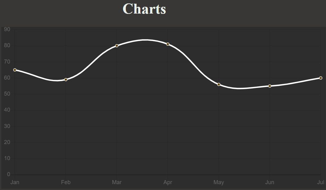
As you can also see, there's a little legend box at the top of the chart. You can remove that inside an optional options parameter.
The options parameter also helps with other customizations besides removing or including the legend. For example, you can use it to force an axis to start at zero.
To declare an options parameter, here's how the chart section looks in your JavaScript file:
        // Create an instance of Chart object:
new Chart(plots, {
  type: 'line', <strong>//Declare the chart type</strong>
  data: {
    labels: months, <strong>//X-axis data</strong>
    datasets: [{
      data: traffic, <strong>//Y-axis data</strong>
      backgroundColor: '#5e440f', <strong>//Color of the dots</strong>
      borderColor: 'white', <strong>//Line color</strong>
      fill: false, <strong>//Fills the curve under the line with the babckground color. It's true by default</strong>
    }]
  },
<strong>     //Specify custom options:</strong>
  options:{
    legend: {display: false}, <strong>//Remove the legend box by setting it to false. It's true by default.</strong>
    <strong>//Specify settings for the scales. To make the Y-axis start from zero, for instance</strong>:
    scales:{
      yAxes: [{ticks: {min: 0}}] <strong>//You can repeat the same for X-axis if it contains integers.</strong>
    }
  }
});
Output:
You can also use different background colors for each dot. Varying the background colors this way is usually more helpful with bar graphs, though.
Making Bar Graphs With Chart.js
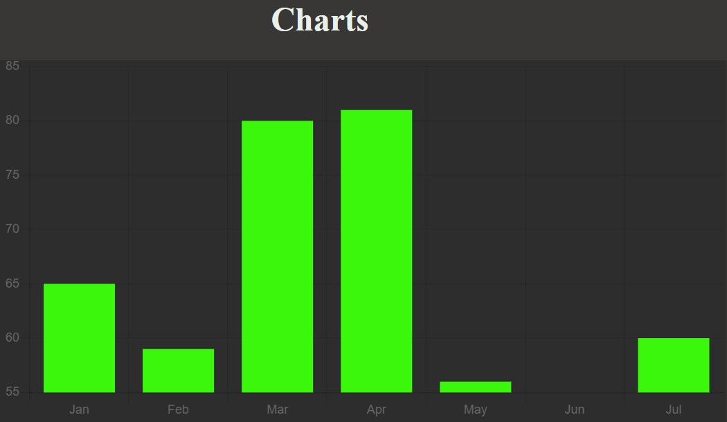
Here, you only need to change the chart type to bar. You don't need to set the fill option because the bars inherit the background color automatically:
        <strong>// Create an instance of Chart object</strong>:
new Chart(plots, {
  type: 'bar', <strong>//Declare the chart type</strong>
  data: {
    labels: months, <strong>//X-axis data</strong>
    datasets: [{
      data: traffic, <strong>//Y-axis data</strong>
      backgroundColor: '#3bf70c', <strong>//Color of the bars</strong>
    }]
  },
  options:{
    legend: {display: false}, <strong>//Remove the legend box by setting it to false. It's true by default.</strong>
  }
});
Output:
Feel free to force the Y-axis to start from zero or any value as you did for the line chart.
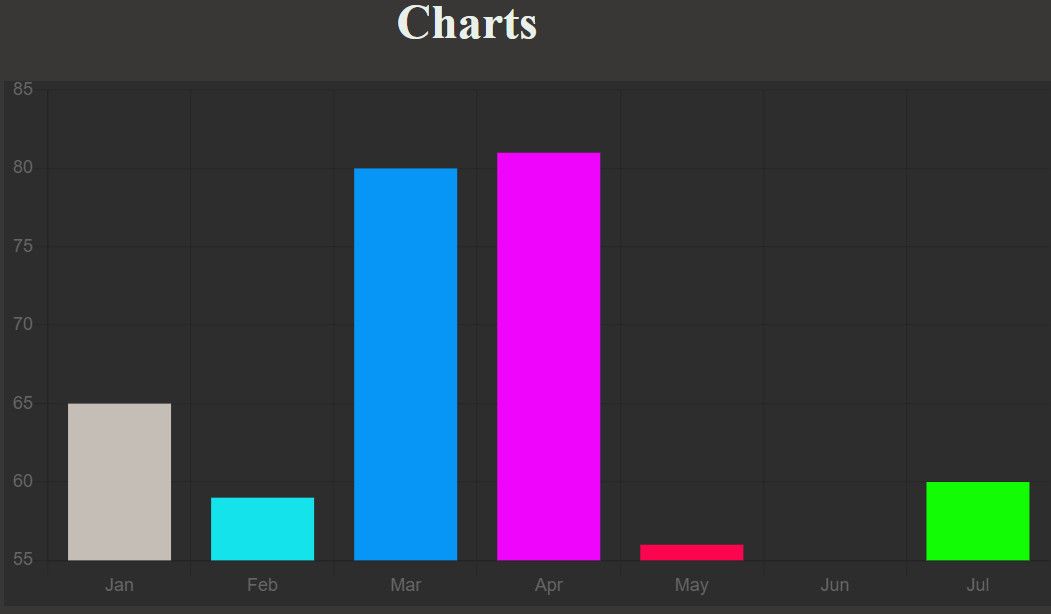
To use different colors for each bar, pass an array of colors that match the number of items in your data into the backgroundColor parameter:
        <strong>// Create an instance of Chart object</strong>:
new Chart(plots, {
  type: 'bar', <strong>//Declare the chart type</strong>
  data: {
    labels: months, <strong>//X-axis data</strong>
    datasets: [{
      data: traffic, <strong>//Y-axis data</strong>
      <strong>//Color of each bar</strong>:
      backgroundColor: [
                  "rgba(196, 190, 183)",
                  "rgba(21, 227, 235)",
                  "rgba(7, 150, 245)",
                  "rgba(240, 5, 252)",
                  "rgba(252, 5, 79)",
                  "rgb(0,12,255)",
                  "rgb(17, 252, 5)"],
    }]
  },
  options:{
    legend: {display: false}, <strong>//Remove the legend box by setting it to false. It's true by default.</strong>
  }
});
Output:
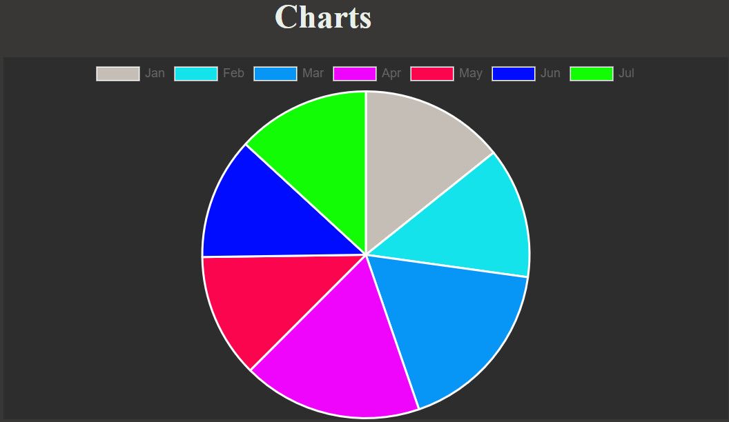
Making a Pie Chart With Chart.js
To draw a pie chart, change the chart type to pie. You might also want to set the legend's display to true to see what each segment of the pie represents:
        // Create an instance of Chart object:
new Chart(plots, {
  type: 'pie', //Declare the chart type
  data: {
    labels: months, //Defines each segment
    datasets: [{
      data: traffic, //Determines segment size
      //Color of each segment
      backgroundColor: [
                  "rgba(196, 190, 183)",
                  "rgba(21, 227, 235)",
                  "rgba(7, 150, 245)",
                  "rgba(240, 5, 252)",
                  "rgba(252, 5, 79)",
                  "rgb(0,12,255)",
                  "rgb(17, 252, 5)"],
    }]
  },
  options:{
    legend: {display: true}, //This is true by default.

  }

});
Output:
As you did in the examples above, you can try out other charts by changing the type.
Nonetheless, here's a list of supported chart.js chart types you can try out using the above coding conventions:
- bar
- line
- scatter
- doughnut
- pie
- radar
- polarArea
- bubble
Play Around With Chart.js
Although you've only gotten your hands around line, pie, and bar graphs in this tutorial, the code pattern for plotting other charts with chart.js follows the same convention. So feel free to play around with the others, too.
With that said, if you want more than what chart.js offers, you might want to take a look at some other JavaScript chart libraries as well.


