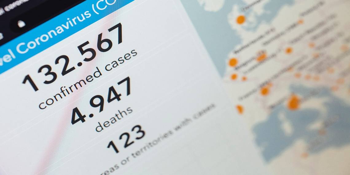
The private research university, Johns Hopkins, has one of the most thorough websites available for tracking up-to-date trends during the COVID-19 pandemic. Both on a global and local scale, the site can be used to look at critical trends, how the pandemic evolved, state by state breakdowns, and a lot more.
All of this data is provided in a variety of interactive graphs and charts, each of which has slightly different functionality. Here, we'll explain how you can start tracking the latest trends of this pandemic firsthand with Johns Hopkins.
Tracking Critical COVID-19 Trends

To get started, head to the Johns Hopkins Coronavirus Resource Center. Click Tracking along the top of the screen to get to their tracking page. From here, click Critical Trends to open the dropdown menu.
Johns Hopkins offers eight different critical trends that you can track. Simply click the trend you’d like to track and you’ll be taken to a corresponding graph or map which lays out the relevant information.
Each trend displays information in the form of a graphic. Let's break down each one.
State Timeline

The State Timeline features a line graph that displays the impact of different COVID-19 containment measures over time. The x-axis has the timeline, while the y-axis features new confirmed cases.
There’s a dropdown menu that you can use to see a new graph for each state. Along the top of the graph, there is a small circle you can click that corresponds with different policy events. This way, you can see how they affected the total number of cases.
New Cases of COVID-19 in the US

The data for the New Cases in the US section is represented by a series of line graphs. When clicking this link, you’ll be taken to a menu where you can click on the state you’re interested in tracking. There’s also a dropdown menu you can use to quickly switch between states. The x-axis features the timeline, and the y-axis has the number of cases.
You can click any point on the graph and zoom in on a specific time period to get a closer view of a month, week, or even a specific day. You can also move your cursor along the line to see the number of new cases for a specific day.
New Cases

In the New Cases trends section, you’ll find a series of line graphs that display the number of new cases in countries hit hardest by the pandemic. The first graph you’ll see shows the 10 countries with the largest number of new cases on a single graph.
By scrolling down, you can find 20 additional graphs that break down the information by individual country. Each of the 21 graphs allows you to zoom in on a point or move your cursor along the line to get specific case data for a time period.
Hubei Timeline

The Hubei Timeline uses a hybrid bar and line graph to bring you a visual representation of how the pandemic began. The confirmed cases and deaths are shown on the y-axes, and the timeline is on the x-axis.
The bars represent the number of confirmed cases while the line tracks the death count. Along the top of the graph are circles representing key events that took place during the initial outbreak in China. You can click these for even more information.
US State COVID-19 by Race

The US State COVID-19 by Race section shows a map-based graphic. It includes states that have collected COVID-19 data by race. The states that track cases by race are blue and those that don’t are light gray. There are three buttons you can use to change the map to display states that track testing, confirmed cases, or deaths across races.
Animated Maps

The site also offers a section for two animated maps. The first shows the cumulative COVID-19 cases reported by each country over the course of the outbreak. The second map contains similar information but displays it using a five-day moving average to account for data variability and changes in reporting methods. Simply hit the Play button to watch the animation.
Cumulative Cases

In the Cumulative Cases section, there are 22 different line graphs, each of which contains quite a bit of information. The first two graphs show data for the 10 countries that experienced the worst outbreaks. The next 20 display information for individual countries.
Using a dropdown menu, you can change each graph to feature either total confirmed cases, total deaths, confirmed cases per 100,000 population, or deaths per 100,000 population. There’s also a dropdown menu to change the graph from linear to logarithmic.
Mortality Analysis

The Mortality Analysis section gives you a bar graph, a scatter plot, and a chart that lays out the mortality rate of the COVID-19 pandemic across different countries.
The two graphs feature buttons to change the data to display either the observed case-fatality ratio or deaths per 100,000 population. You can use the chart to see the total confirmed cases, total deaths, case-fatality percentage, and deaths per 100,000 population for countries across the globe.
On the scatterplot, hover over any individual point to see which country it represents and to display the corresponding data. The points representing the 20 countries hit hardest by the pandemic have a black circle around them.
Track COVID-19 Data Using the Global Map

Johns Hopkins' Global Map has tons of data for tracking the pandemic, all of which is broken down country by country. This information can be used to get a better understanding of the pandemic, find the countries that it’s safest to travel to during the pandemic, and track the success of different containment measures across the world.
Along the bottom of the map itself, there are five clickable tabs to change the display to show either cumulative cases, active cases, incidence rates, case-fatality ratio, or testing rate. Along the left side of the map is a scrollable chart with the number of cases by country, starting from the worst-hit countries to those with the least cases. On the left of the map, you’ll find the global death rate total, as well as a breakdown by country.
There’s also a section showing the number of deaths and recovered cases by US state and the daily cases. The information displayed on each of these charts and graphs can be changed by clicking the arrows below them. The data here is regularly updated throughout the day.
Track COVID-19 Data Using the US Map

The US Map features COVID-19 data by state and county across the United States. It’s color-coded, with the hardest-hit counties appearing maroon. Those that were spared the worst of the pandemic are a shade of beige.
You can click on each county for more detailed information. There’s also a dropdown menu you can use to choose individual states and counties.
The left side of the map has a scrollable chart showing the top 50 counties with the highest number of confirmed cases. The left-hand side shows the 20 counties with the most COVID-19 related deaths. There’s also a small line graph that can be changed to display the number of confirmed cases or deaths over time.
Using and Analyzing COVID-19 Trends
At first glance, all of this data may seem a bit overwhelming and pretty depressing. But, as they say, knowledge is power. The more you know about how the pandemic is evolving in your area, the better.
This information can be used to judge how safe it is to go out, travel to different counties or countries, and better track how a pandemic like this spreads over time.