If you've avoided using Instagram's web platform, you might just try it out again. That's because Instagram just made a case for using it with an update.Instagram has made a lot of changes in 2022, but this is one of its most significant changes to date. The Meta-owned social media network has improved the design of its web platform. You've probably heard some snippets, but we're here to tell you more about it. Let's jump right in.
Instagram Web Has a New Look
Instagram's web platform has a new and improved look. The new design was announced by Instagram head Adam Mosseri on Twitter as one of its "finally features". As explained by Mosseri:
We know a lot of people use the web to multitask, and we wanted to make sure Instagram was as great an experience as possible online. So, it is cleaner, faster, easier to use, and it's redesigned now to take advantage of large-screen monitors, which have become more and more the norm.
And he's right. Many Instagram users have been lamenting about the subpar web platform for some time now. They rightfully want to quickly scan their feeds while working, as they do on Facebook. But the experience just hasn't been the same on Instagram's web platform.
Instagram's mobile and web platforms are vastly different. Users have typically preferred using the mobile app because it's just more user-friendly. For instance, for a long time, you couldn't even upload posts on the web platform until Instagram started testing a PC upload feature with some users in June 2022.
But Instagram has, instead, been focused on improving the mobile app. In May 2022, Instagram rolled out a visual refresh that changed how the app looked. Apart from adding a PC upload feature, the web platform had clearly taken a back seat, and users had no choice but to lean on the mobile app.
Be that as it may, the long-awaited web platform update is a step in the right direction. But what has changed exactly? Let's take a look.
What Has Changed in Instagram Web's Redesign?
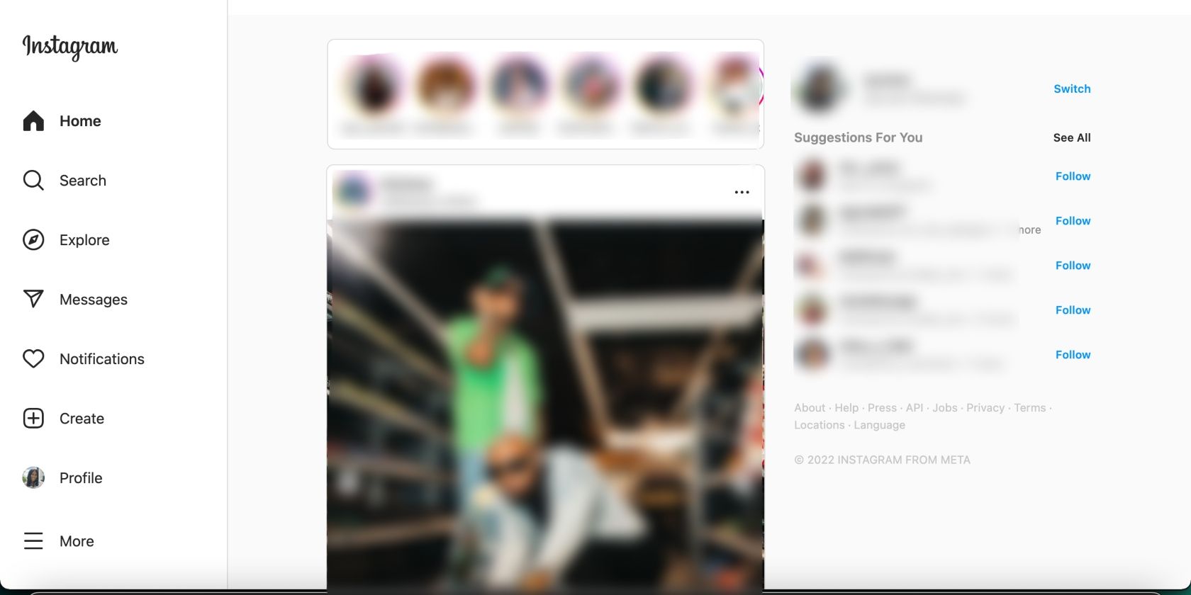
You'll immediately notice the difference upon logging into Instagram online. The layout is much more streamlined and organized. There are four main sections: the feed in the middle, two side panes on either side of the screen, and Stories at the top.
The Home, Search, Messages, and Notifications tabs have moved to the left pane, along with the Explore, Create, Profile, and More tabs. These tabs collapse into icons and expand depending on your screen.
The side pane on the right hosts your Profile, where you can easily switch to another profile at the click of a button. Below are Profile Suggestions, which fill up most of the space.
When you select and view a post in the feed, click through someone's profile, or select a profile suggestion on the right, the left pane remains unchanged. That means you can quickly select any tab on the left while scrolling through someone's profile without having to go back, making navigation easier.
The new layout undoubtedly makes Instagram web more user-friendly. It makes it easier to navigate and quickly access what you need. Instagram is rolling out the new design slowly to users.
Give Instagram Web a Chance
Now that Instagram has improved its online platform, you can try using it more often to avoid dozing off at work. Or you can switch to it in your browser during your lunch break, unless you'll be using your mobile phone anyway.
As for whether you'll be using it more than the mobile app, that would be a stretch. But the changes are a good start, especially while we wait for Instagram to drop an iPad app.


