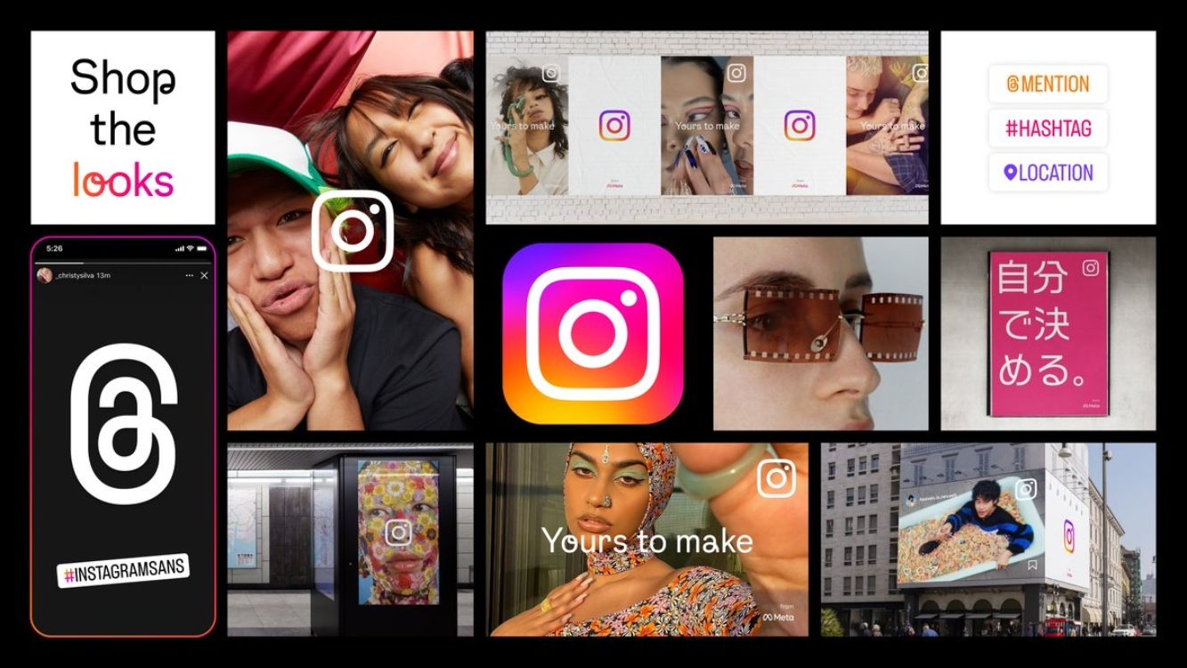
If you use Instagram, you might notice minor differences in the app as you use it. That's because the app is giving its social media brand a visual refresh to bring it in line with what the platform is about.While this isn't a design overhaul and won't have a major impact on you as a creator, it helps to know how the app is changing and why. Here, we'll outline three ways Instagram's visual refresh changes how the app looks.
Instagram Is Getting a Visual Refresh
Instagram has changed its brand identity, which translates to the app. The affected elements include the Instagram logo, typeface, and Instagram's marketing layouts.
The changes are more of a refresh or update than an overhaul, so you might miss them at first glance. The update was officially announced in an Instagram blog post on May 23, 2022. It read:
Today, we're bringing new energy and purpose to our colors, typeface, logo and other brand elements with a refreshed visual identity. Our new system is designed to embrace continued evolution to help us create more immersive and inclusive experiences for our community.
Instagram's visual refresh is geared towards strengthening its brand elements to ensure they're a better reflection of what the platform is about, which is creative expression and its community.
Now, let's look at the three ways Instagram is refreshing its appearance:
1. An Illuminating Gradient
Instagram's colorful gradient gets a boost with a more lively update. Previously static, the bright and energizing colors move in a rotating yet irregular motion behind the Instagram logo.
As explained on Instagram's blog post:
Through illumination, the gradient signals moments of discovery in our marketing, logo and even in-app as seen in Create mode, stickers and Instagram Story rings.
Meta tapped 3D digital artist and motion designer Rose Pilkington for this design. Pilkington likens the illuminating gradient to being "made of light" in a Meta blog post.
In line with the update, the gradient on Instagram Story rings appears more vivid and eye-catching than before.
2. A Custom-Made Typeface
Instagram has created its own typeface called Instagram Sans, which you can use in your Instagram Reels and Stories.
This adds yet another way for creators to express themselves on the platform. According to Instagram head Adam Mosseri's tweet, it could also encourage them to produce original content, which the app favors on its algorithm.
The typeface is inspired by Instagram's logo and wordmark and comes in three styles—Regular, Headline, and Condensed. Instagram has adapted the typeface to global scripts like Arabic, too.
3. Layout Changes
Instagram will make its logo feature more prominently when you open the app. It will also put content at the forefront of its layouts in its marketing campaigns to mirror its platform.
This will give Instagram's marketing layouts more of a lifestyle feel, as they will feature real people that reflect its community. It also makes creative expression, which is the essence of Instagram, consistent across the platform and its marketing efforts.
Instagram Is Consolidating Its Brand Experience
Instagram's visual refresh brings its design elements and marketing efforts in line with its in-app experience. This makes Instagram's brand experience consistent across the board.
Because Instagram made these changes with its community in mind, it also shows that the platform values the people who use it. So, you could say this move is a step in the right direction for its parent company, Meta.


