Instagram is planning on releasing a new home screen layout that includes Shop and Reels tabs. The platform is currently testing out three different possible layouts.
Instagram Experiments With New Layouts
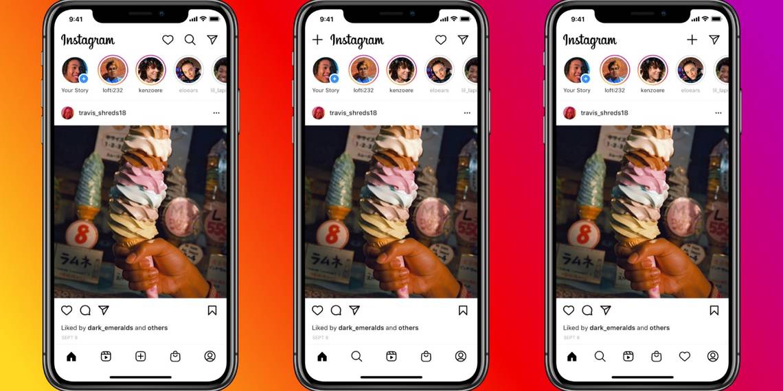
Instagram's home screen is about to get busier. In a Tweet, Instagram said that the platform is experimenting with the arrangement of icons on the bottom and top-right menus in the app. These menus will soon see the additions of a tab for Reels, as well as for shopping.
The current Instagram home screen is relatively simple. It has five tabs at the bottom of the page---the middle button allows you to create a new post, while the rest lead you to the home screen, Explore page, Activity page, and your profile. Meanwhile, the inbox button sits in the top-right corner of the screen.
The platform is testing three possible layouts for the new home screen, each of which has a slightly different arrangement. Although the layouts are experimental, you may see one of them on the app in the near future.
Reels, Instagram's short-video feature, will soon have its own icon on the home screen. Instagram plans on adding a Shop tab somewhere on the home screen as well.
In one layout variation, Instagram puts the Activity and Explore tabs to the top-right of the screen, while the Shop and Reels tabs fill in the bottom row.
Another layout is a bit bolder, and stuffs all six tabs on the bottom menu bar. The new post button gets placed all the way in the top-right corner of the screen, next to your inbox.
Will the New Instagram Tabs Overwhelm Users?
Having two extra tabs on Instagram's home page might prove to be an annoyance to some users. No matter what layout Instagram chooses, it'll certainly take some getting used to.
But if Instagram starts looking too cluttered, you can always move to an alternative photo-sharing app.