Understanding what a trend is and projecting them are useful skills as trends give you an image of which direction a series is going and how hard it is going in that direction.
You can create a trend for your series in Excel using the TREND function. Furthermore, you can visualize this trend and its projected values alongside your known values to get a complete demonstration of your data.
In this article, we'll cover what a trend is, how to use the TREND function and visualize it, and how to calculate a trend's slope in Excel.
What Is a Trend Line?
In statistics, a trend is an upwards or downwards straight line that shows where a series of data is headed to. This is mostly used in the case of time series, where a parameter's value is displayed for given times.
You can use a trend line to visualize a trend. A trend line is a straight line that best fits your series of data, and though it's likely that it won't be passing through every input, it's the closest a line can be to all the values in your series. The only way a trend line can go through every value is when your values are in a straight line already.
You can use trends to get a projected value. With the trend line, you can see where your data is headed and predict the value for a given time. The trend line shows you if your series is going upwards or downwards, and with what slope is it going in that direction.
Calculating trends is time-consuming, and prone to human error. One of the most popular methods of calculating a trend is the least square method. Luckily, Excel has incorporated this method into its TREND function.
What Is the TREND Function in Excel?
TREND is a statistic function in Excel that takes the known Ys and the known Xs, creates a trend line, and then projects new Ys for given Xs using that trend line. The syntax is as below:
=TREND(known_y's, [known_x's], [new_x's], [const])
The const parameter determines how the b value in the line equation y = ax + b is calculated. If it's left blank, or TRUE, then it is calculated as it is. If it is set to FALSE, then b is set to zero, and the trends are calculated in a trend line with the y = ax equation.
TREND is mostly used to analyze past data, to see how a series has been doing in the past, whereas the FORECAST function is used to predict how a series will do in the future. However, since these two functions use the same equations, they will both return the same results when used on time series, as we will in this article.
How to Use the TREND Function in Excel
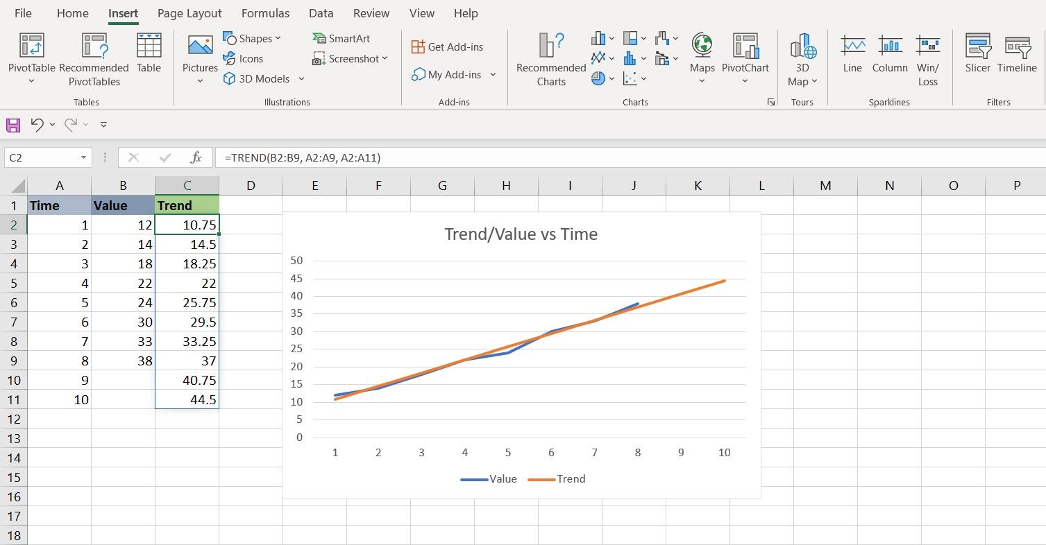
Now that you know what the TREND function is and what it does, let's put it to use. In this sample spreadsheet, we have a time series. However, we have 10 Ys from 1 to 10, but only 8 Xs which are for the values 1 to 8. The goal is to draw a chart of the series, and its trend, using the TREND function. We will also calculate the projected value for times 9 and 10.
- Select the first cell of the new Ys for the TREND function. In this spreadsheet, that's cell C2.
-
Go to the formula bar and enter the formula below:
=TREND(B2:B9, A2:A9, A2:A11)
This formula summons the TREND function, and feeds cells B2 to B9 as the known Ys. Then it feeds the TREND function cells A2 to A9 as the known Xs. Finally, the formula tells TREND that A2 to A11 will be the new Ys. These new Ys are calculated off the trend line. - Press Enter. Excel will fill the cells with the trend values. Observe how the projected Ys in the trend, despite being linear, are close to the known Ys.
Now that you have your projected values from the TREND function, let's visualize it with a chart.
- Select the two columns containing the known Ys and the new Ys. In this spreadsheet, that will be columns B and C. You can select the columns by clicking on their headings.
- With the columns selected, go to Insert.
- In the Charts section, click the line chart icon, and then select Line with Markers. Excel will create a chart of your two columns.
- Right-click on the chart, and from the drop-down menu, click on Select Data.
- Click Edit under Horizontal Axis Labels.
- Select the known X values. That'll be A2 to A11 in this example.
- Click OK.
You now have a chart of your time series, along with their values, based on the trend line calculated by the TREND function. Notice how you can get a prediction of the Ys for times 9 and 10 with the TREND value.
Getting a Trend's Slope in Excel
Now that you know how to calculate trends and visualize them, you might wonder what exactly is the slope of this trend line. Since the trend line is a straight y = ax + b line, you can calculate the slope (a) yourself. But this is Excel and around these parts of the town, we let Excel do the calculations.
The SLOPE function in Excel is a handy function that calculates the slope for a series of data.
=SLOPE(known_Ys, knownXs)
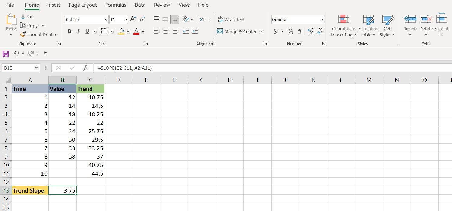
Let's try and get the slope for the trend in the example from the last section. To achieve this, we're going to use the SLOPE function on the projected Ys from the TREND function.
- Select the cell where you want to show the slope.
-
In the formula bar, enter the formula below:
=SLOPE(C2:C11, A2:A11)
This formula will indicate cells C2 to C11 as the known Ys and the cells A2 to A11 as the known Xs for the SLOPE function. - Press Enter. Excel will now calculate the slope for your series.
Predict the Trend and Visualize It with Excel
With Excel, you can use the TREND function to create a trend line for your series and use it to see how your series has performed, and even get a projection of the unknown values. You can also visualize this trend line by creating a line chart for it and comparing the projected Ys with the known Ys.
The TREND function is a powerful tool for managing your finance with Excel, and it's not the only one of its kind. There's an arsenal of Excel functions that you can utilize to make managing your finances easier.


