
Effective data analysis requires a clear understanding of the relationship between the variables and quantities involved. And if you have good data, you can even use it to predict data behavior.
However, unless you're a mathematician, it's impossibly difficult to create an equation from a data set. But with Microsoft Excel, almost anyone can do this by using a scatter plot. Here's how.
Creating a Scatter Chart in Microsoft Excel
Before we can start predicting a trend, you first need to create a scatter chart to find one. The scatter plot presents the relationship between two variables along the two axes of the chart, with one variable independent and the other dependent.
The independent variable is usually displayed on the chart's horizontal axis, while you can find the dependent variable on its vertical axis. The relationship between them is then represented by the graph line
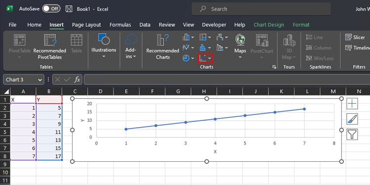
To create a scatter chart on an Excel sheet, follow the steps below:
- Open the worksheet containing the data that you want to plot on the Scatter chart.
- Place the independent variable on the left column and the dependent variable on the right column.
- Select the value of both the columns you want to plot.
- Click on the Insert Tab and go to Charts group. Now click on Insert Scatter(X, Y) or Bubble Chart.
- Here, you will find different styles of the scatter chart. Choose one of them by clicking on it.
-
It will display the chart on the screen. Change the name of the axes and chart title.

Drawing a Trend Line on a Scatter Plot Graph
In order to present the relation between the variables of the chart, a trend line is required. The trendline should be similar to or overlap with data values on the chart in order to accurately estimate the relationship between the variables. To draw a trend line on the scatter chart:
- Right-click on any data point on the scatter chart.
- From the list of options that appear, select Add trend line.
-
A Format Trendline window will pop up on the right side with the Linear option selected as default.
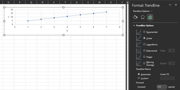

This will add a trendline (straight dotted line) to your scatter chart.
Formatting Trendline Options to Curve Fit the Data Values
We want to curve fit the trendline as close to the curve plot as possible. That way, we can get insight into the approximate relationship between the variables. To do so, follow the steps below:
- Choose different curves from TRENDLINE OPTIONS in the Format Trendline window to curve fit the trendline with a curve plot.
- Tick the Display Equation on chart check box to display the curve fit equation on the scatter chart.
Forecasting Forward and Backward Values Based on Trends
After curve fitting, you can use this trend line to predict the previous and future values that are not part of this data set. You can achieve this by assigning a value under the Forecast section of the Format Trendline window. Add your desired periods under the Forward and Backward options to observe the expected values on the scatter chart.

Predicting the Relationship Between Multiple Independent and Dependent Variables to Formulate an Equation
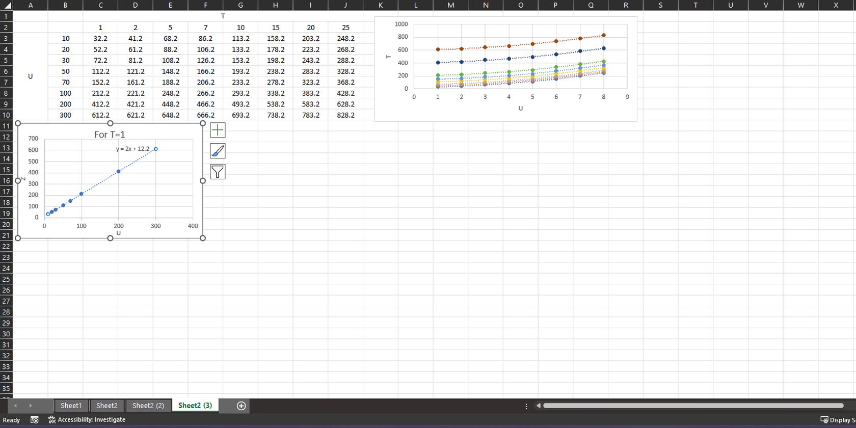
Data sometimes contain multiple independent variables that create resultant values. In such cases, the trend may not be straightforward. To identify the relationship, you may have to look for trends among the dependent quantity and individual independent variables.
In the figure below, we have a data set that contains two independent variables. In the graph, the horizontal axis is representing the variable u and the vertical axis is representing the resultant dependent variable. Each line on the chart is also a function of variable T.

Here, we will find a way to find the approximate relationship between the dependent variable Y(U,T) (or resultant value) and independent variables U and T. This would enable us to extrapolate these variable values to predict the data behavior.
To do this, follow the steps below:
- First, we will find the relationship between one independent variable (U) and the resultant dependent Y. Keep the value of other independent values (T) constant by choosing only one column at a time.
- Select Cells B3 to B10 to select U and Cells C3 to C10 (resultant value at T=1) and use a scatter chart to plot them.
- Now draw the trend line and use the best-fit trend line shown in the Format Trendline window that fits the data set. In this case, we observed the “linear” trend line best fits the curve.
- Click on Display equation on chart in the Format Trendline line window.
-
Rename the axes of the chart as per data variables.
-
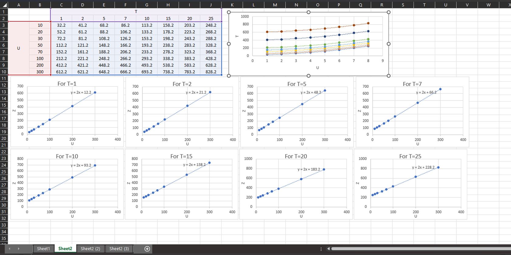
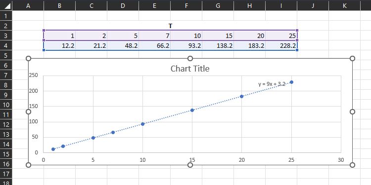
Next, you need to create a scatter chart for all the other variables under T. Follow steps one through five, but choose columns D3 to D10 (T=2), E3 to E10 (T=5), F3 to F10 (T=7), G3 to G10 (T=10), H3 to H10 (T=15), I3 to I10 (T=20)and J3 to J10 (T=20) separately with variable U containing cells B3 to B10.
-
You should find the following equations displayed on the charts.
We can observe that all the equations are linear and have the same coefficient on the variable U. It brings us closer to the conclusion that Y is equal to 2U and some other different values that can be a function of variable T.
T
Y
T=1
Y=2U+12.2
T=2
Y=2U+21.2
T=5
Y=2U+48.2
T=7
Y=2U+66.2
T=10
Y=2U+93.2
T=15
Y=2U+138.2
T=20
Y=2U+183.2
T=25
Y=2U+228.2
-
Note these values separately and arrange them as shown below (each value with its noted variable value, like 12.2 with T=1 and 228 with T=25, etc.). Now scatter plot these values and display the equation representing the relation between these values with variable T.
- Finally, we can relate Y(U,T) as


Y(U,T)=2U+9T+3.2
You can verify these values by plotting this equation for different values of U and T. Similarly, you can predict the behavior of Y(U,T) for different values of variables U and T not available with this data set.
You Don't Need to Be an Expert Mathematician to Predict Trends in Microsoft Excel
Now that you know how to find the relationship between a function and its dependent conditions, you can draw valid conclusions about the function's behavior. Provided you have all the necessary variables that affect the mathematical function, you can accurately predict its value in the given conditions.
Microsoft Excel is a great tool that allows you to plot multivariable functions as well. Now that you have your data, you should also explore the different ways you can create powerful graphs and charts to present them.