In this comprehensive guide, you’ll learn how to build a simple yet attractive website from scratch using only HTML and CSS. And, what could be better than creating a website for your beloved pet? It’ll be divided into three sections: Home, Services, and About. We’ll add a navigation menu at the top and a footer at the end.
So, without any further ado, here's how to create a website from scratch in HTML and CSS.
Building the Navigation and Hero Section
Add a <head> section to give your project a title. Link a style.css file, and add the Rubik font from Google fonts using a <link> tag.
HTML Section: <head>
         <head>

   <meta charset="UTF-8" />

   <meta http-equiv="X-UA-Compatible" content="IE=edge" />

   <meta name="viewport" content="width=device-width, initial-scale=1.0" />

   <link rel="preconnect" href="https://fonts.googleapis.com" />

   <link rel="preconnect" href="https://fonts.gstatic.com" crossorigin />

   <link rel="stylesheet" href="style.css" />

   <link

     href="https://fonts.googleapis.com/css2?family=Rubik:wght@400;500;600;700&display=swap"

     rel="stylesheet"

   />

   <title>Pawfect</title>

 </head>
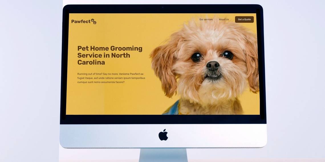
Add a <body> section and structure the first-fold of your website. Add a header class for the logo and navigation menu. Then, add a section-hero class for the primary heading with a little description of the site's services.
HTML Section: <body>
           <div class="first-fold">

     <header class="header">

       <a href="#">

         <p class="logo">Pawfect🐾</p>

       </a>


       <nav class="main-nav">

         <ul class="main-nav-list" role="navigation">

           <li><a class="main-nav-link" href="#services">Our services</a></li>

           <li><a class="main-nav-link" href="#about">About Us</a></li>

           <li>

             <a class="main-nav-link nav-cta">Get a Quote</a>

           </li>

         </ul>

       </nav>

     </header>


     <section class="section-hero">

       <div class="hero">

         <div class="hero-text-box">

           <h1 class="heading-primary">

             Pet Home Grooming Service in North Carolina

           </h1>

           <p class="hero-description">

             Running out of time? Say no more. Veniome Pawfect ea fugiat itaque, aut unde ratione veniam ipsum temporibus cumque sunt nemo assumenda facere?

           </p>

         </div>

       </div>

     </section>

   </div>
Output:

Now it’s time to style the navigation menu and hero section.
General CSS
Add the general CSS styling at the top of your style.css file. The hero section has a background image. You can access the complete code including images on GitHub, or use your own image.
        * {

 margin: 0;

 padding: 0;

 box-sizing: border-box;

}


html {

 /* 10px / 16px = 0.625 =62.5*/

 font-size: 62.5%;

 overflow-x: hidden;

 scroll-behavior: smooth;

}


body {

 font-family: 'Rubik', sans-serif;

 line-height: 1.5;

 font-size: 1.5rem;

 font-weight: 400;

 overflow-x: hidden;

 color: #523414;

 background-color: #e9be5a;

}


.heading-primary,

.heading-secondary,

.heading-tertiary {

 font-weight: 700;

 color: #523414;

 letter-spacing: -0.5px;

}


.heading-primary {

 font-size: 5.2rem;

 line-height: 1.05;

 margin-bottom: 3.2rem;

}


.heading-secondary {

 font-size: 4.4rem;

 line-height: 1.2;

 margin-bottom: 5.6rem;

 text-align: center;

}


.heading-tertiary {

 font-size: 3rem;

 line-height: 1.2;

 margin: 1.2rem;

}


a {

 text-decoration: none;

}


.first-fold {

 background-image: url(img/Pawfect-bg.png);

 min-height: 80rem;

}
Styling the Navigation Bar
Use CSS flexbox to adjust the logo and navigation menus in a row. Set background-color to transparent and give a border-radius of 9px to the Call-To-Action (CTA) button.
Navigation Bar CSS
        /* ****************** */

/* Logo */

/* ****************** */


.header {

 display: flex;

 justify-content: space-between;

 align-items: center;

 background-color: transparent;

 height: 9.6rem;

 padding: 0 4.8rem;

}


.logo {

 height: 2.2rem;

 font-size: 3.6rem;

 text-decoration: none;

 text-align: center;

 font-weight: bold;

 color: #462d12;

}


/* ****************** */

/* Navigation */

/* ****************** */


.main-nav-list {

 list-style: none;

 display: flex;

 align-items: center;

 gap: 4.8rem;

}


.main-nav-link {

 display: inline-block;

 text-decoration: none;

 color: #462d12;

 font-weight: 400;

 font-size: 1.8rem;

}


.main-nav-link.nav-cta {

 padding: 1.2rem 2.4rem;

 border-radius: 9px;

 color: #fff;

 background-color: #523414;

}
Output:

Styling the Hero Section
Set a max-width on the hero class nesting the primary heading and description. Otherwise, it’ll extend out to the end instead of staying on the left side. Set the font-size and padding according to your requirement.
Hero Section CSS
        /* ****************** */

/* Hero section */

/* ****************** */

.section-hero {

 padding: 15rem 0 9.6rem;

}


.hero {

 max-width: 75rem;

 padding: 0 9.6rem;

 align-items: left;

}


.hero-description {

 font-size: 2rem;

 line-height: 1.6;

 margin: 4.8rem 0;

}
Output:

Building the Services Section
The site provides four services: full grooming, self serve dog wash, wash & blow dry, and body and paw massage.
Services Section HTML
Create a parent class=”grid services” and add all four services using <div>. Add the image, service name, and a little description of it.
           <section class="our-services" id="services">

     <div class="container">

       <h2 class="heading-secondary">Our Services</h2>

       <div class="grid services">

         <div class="first-service">

           <img src="img/Full Grooming.jpg" />

           <h3 class="heading-tertiary">Full Grooming</h3>

           <p>Lorem ipsum consectetur adipisicing elit.</p>

         </div>

         <div class="second-service">

           <img src="img/Self Serve Dog Wash.jpg" />

           <h3 class="heading-tertiary">Self Serve Dog Wash</h3>

           <p>Odit aliquam dolor ex doloremque sed itaque.</p>

         </div>

         <div class="thrid-service">

           <img src="img/Wash & Blow Dry.jpg" />

           <h3 class="heading-tertiary">Wash & Blow Dry</h3>

           <p>Voluptatem suscipit ut omnis quas saepe.</p>

         </div>

         <div class="fourth-service">

           <img src="img/Body and Paw Massage.jpg" />

           <h3 class="heading-tertiary">Body and Paw Massage</h3>

           <p>Sapiente quos qui hic porro voluptatibus impedit.</p>

         </div>

       </div>

     </div>

   </section>
Services Section CSS
Create a grid with two equal columns and set the gap to 4rem. Adjust all the grid-items at the center and set the image width to 80% of the original size.
        /* ****************** */

/* Our Services */

/* ****************** */

.our-services {

 padding: 9.6rem 0;

}


.container {

 max-width: 120rem;

 margin: 0 auto;

 padding: 1.5rem 3.2rem;

}

.grid {

 display: grid;

 grid-template-columns: 1fr 1fr;

 gap: 4rem;

 align-items: center;

 justify-content: center;

 text-align: center;

}

.services img {

 width: 80%;

 border-radius: 9px;

}
Output:

.jpg?q=50&fit=crop&w=1500&dpr=1.5)
Building the About Section
The About section will have an image and a text box with some brief information about the team.
About Section HTML
        Create a <div> and place the image and the text inside it.

   <section class="about" id="about">

     <div class="container">

       <div class="grid grid-about about">

         <img src="img/About.jpg" />

         <div class="text">

           <h2 class="heading-secondary">About Us</h2>

           <p>

             Lorem ipsum dolor sit amet consectetur adipisicing elit. Quas

             officiis, perferendis iure possimus dolor aspernatur incidunt rem

             ipsa, consectetur temporibus dolor ea? Tenetur nobis laboriosam

             dolor perspiciatis aspernatur incidunt rem placeat quis assumenda

             dicta!

           </p>

         </div>

       </div>

     </div>

   </section>
About Section CSS
Style the image and text-box using CSS Grid and add a drop-shadow to make it more attractive. Use a negative margin to set the text box above the image.
        /* ****************** */

/* About Us */

/* ****************** */


.grid-about {

 grid-template-columns: 1.2fr 0.8fr;

 gap: 0;

}


.about {

 padding: 2rem 0 7rem 0;

}


.about img {

 width: 98%;

 justify-self: end;

 border-radius: 9px;

}


.about p {

 font-size: 2.2rem;

}


.text {

 max-width: 45rem;

 background-color: #e7ac21;

 padding: 10rem 5rem;

 margin-left: -5rem;

 border-radius: 9px;

}


.text h2 {

 margin-bottom: 4.5rem;

 text-align: center;

}
Output:

Signing Off With a Footer
A website’s footer leaves a lasting impression in visitors' minds, so make sure that it's clean and well-organized.
Footer HTML
Add a primary heading saying thanks to the visitors. © is an HTML entity for the © symbol.
<footer>
<h1 class="heading-primary">Thank You For Visiting Pawfect🐾!</h1>
<p>© Copyright 2022 Pawfect🐾</p>
</footer>
Footer CSS
Style the footer by giving it a different background-color and setting appropriate padding.
        /* ****************** */

/* Footer */

/* ****************** */


footer {

 text-align: center;

 background-color: #e7ac21;

 padding: 2.5rem;

}
Output:

You can view the final Pawfect website by following this link.
Publish Your Website
Congratulations, you created a complete website from scratch using HTML and CSS! It’s time to publish your website and get feedback from the community. We hope you enjoyed the process of making the site. If you're new to hosting, take a look at how to host a website for free using GitHub Pages.