Waterfall charts are one of the lesser-known Excel chart types. However, it's a popular choice in finance. A waterfall chart is similar to the column chart in looks, but has an entirely different function.
Chart types reveal their full potential when they're used in the correct context. The first step in using a waterfall chart is to know when to use it. Read on to find out when you should use a waterfall chart, and how you can use it in Excel.
What Is a Waterfall Chart?
A waterfall chart is a chart that shows the values added or subtracted to the initial value, and the final total as vertical rectangles. Excel shows the negative and positive values with different colors. The size of the rectangle representing these values is proportional to their size.
Waterfall charts are often used in finance, but you can use them in any field where an initial value goes through changes. These changes can be negative or positive.
A waterfall chart begins with the initial value and ends with the final value, and the changes are displayed between these two. If you're curious about the other chart types in Excel and when to use them, you can read our article on types of charts in Excel and when to use them.
How to Create a Waterfall Chart in Excel
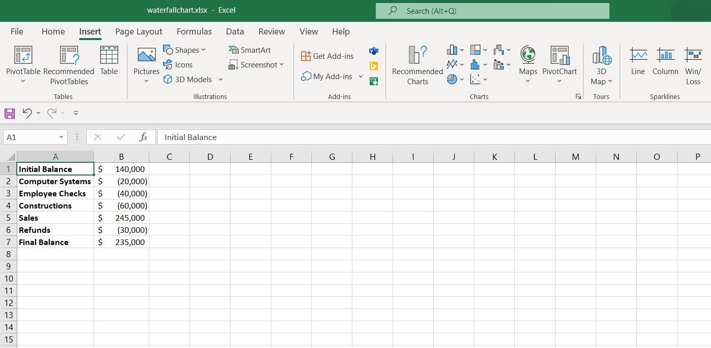
Waterfall charts are a standard chart type supported by Excel. You can create a waterfall chart from the Charts section of Excel. As an example in this spreadsheet, we have the initial balance of a company, and the costs and profits it has sustained in the first year. Let's visualize this table using a waterfall chart.
- Select the table. That will be cells A1:B7 in this example.
- Go to Insert.
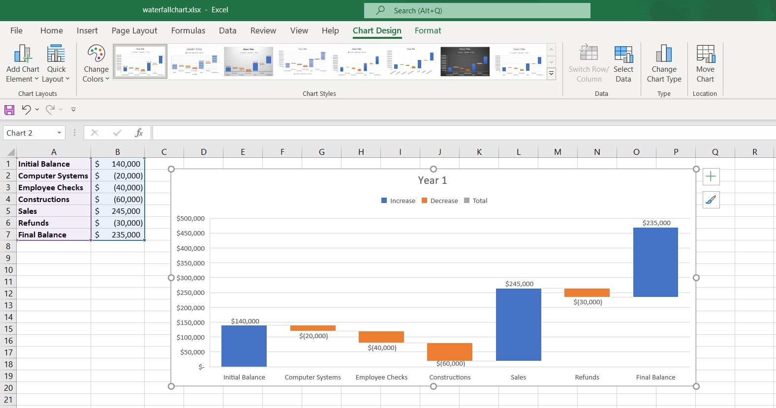
- From the Charts section, click the Insert Waterfall Chart icon and then select Waterfall.
Now you have a waterfall chart, but there's a slight problem. The initial and final values are marked as increases, and not as total values. Let's fix this.
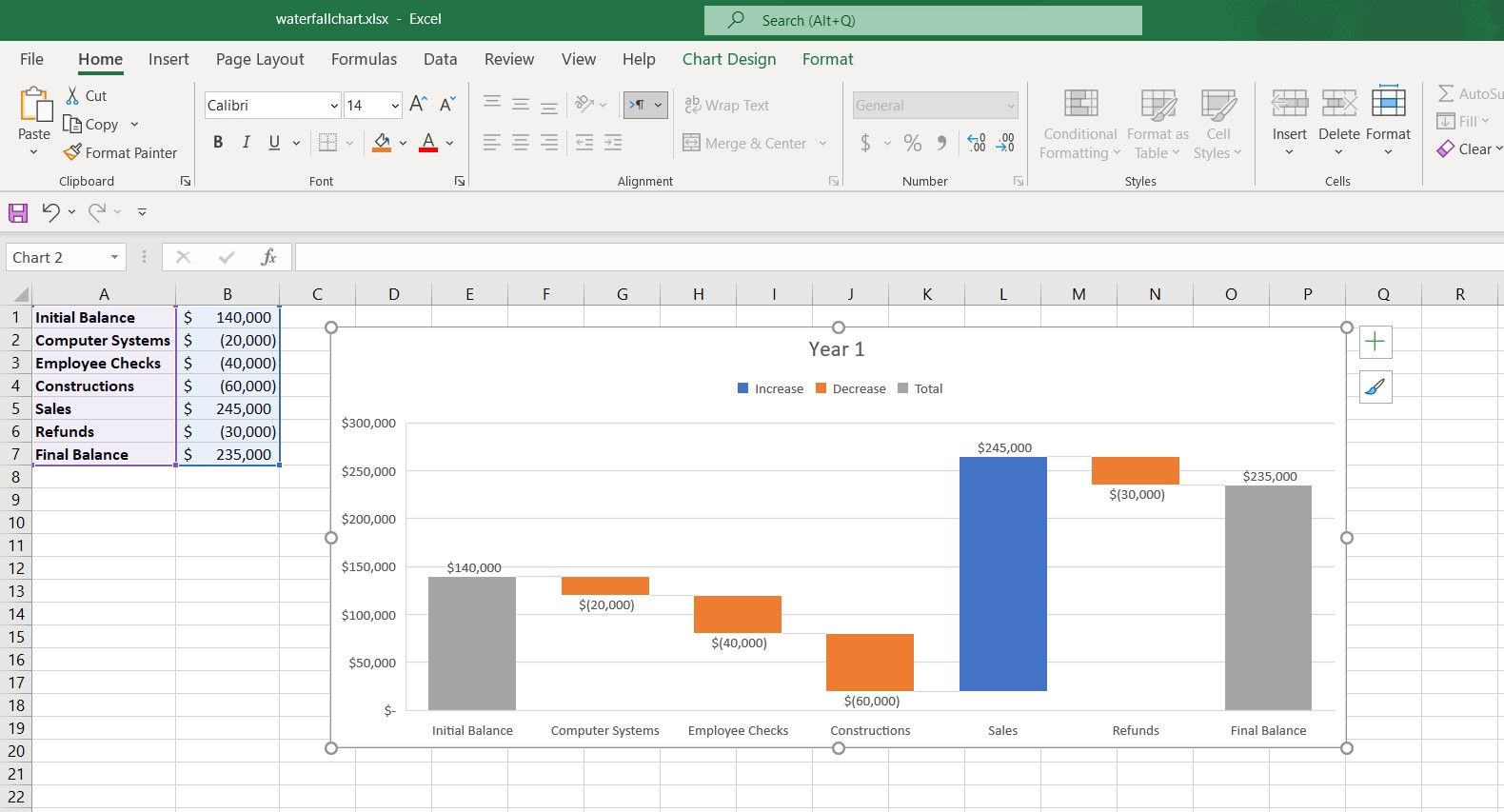
- Double-click the rectangle representing the initial value in the chart. The Format Data Point settings will appear on the right.
- Under Series Options, check Set as total.
- Double-click the final value in the chart.
- Check Set as total.
Now you have your data properly displayed in the waterfall chart. The waterfall chart gives you a good load of information at a glance.
For instance, by looking at this chart, you can see that the company would have had a final balance of $265,000 if there had not been any refunds. You can format this chart further (or make a new chart in Excel) to make it easier on the eye, and give it a more informative look.
Visualize Your Data With a Waterfall Chart
There are many types of charts in Excel, but each is best used in particular scenarios. A waterfall chart is best used when you want to show the changes that an initial value has gone through and the final value these changes have led to.
Now that you know how to create a waterfall chart and when to use it, it's a good time to expand your Excel knowledge by mastering other chart types.


